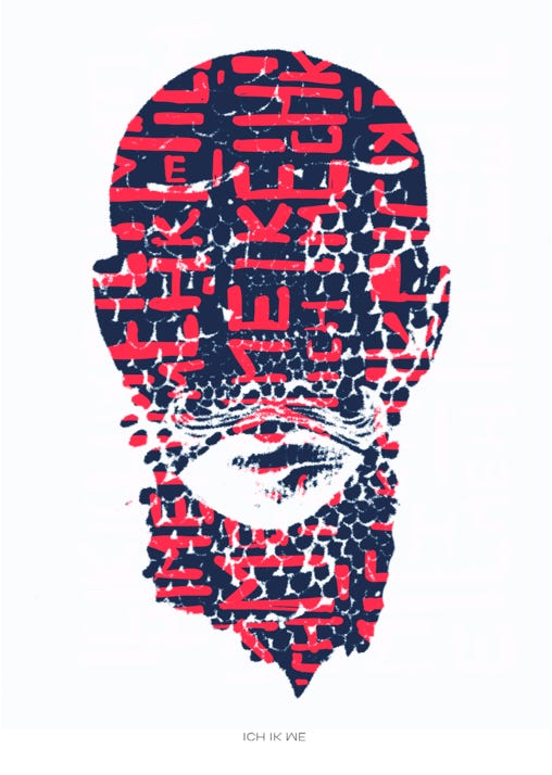
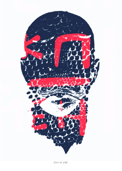
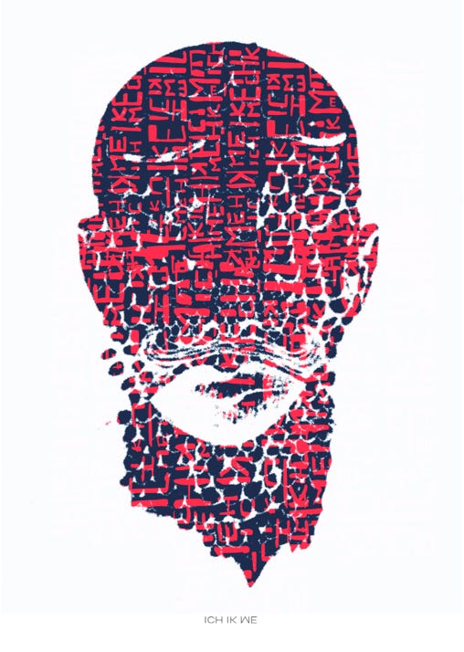
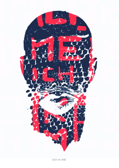
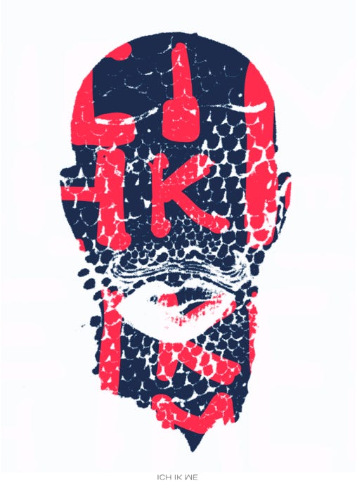
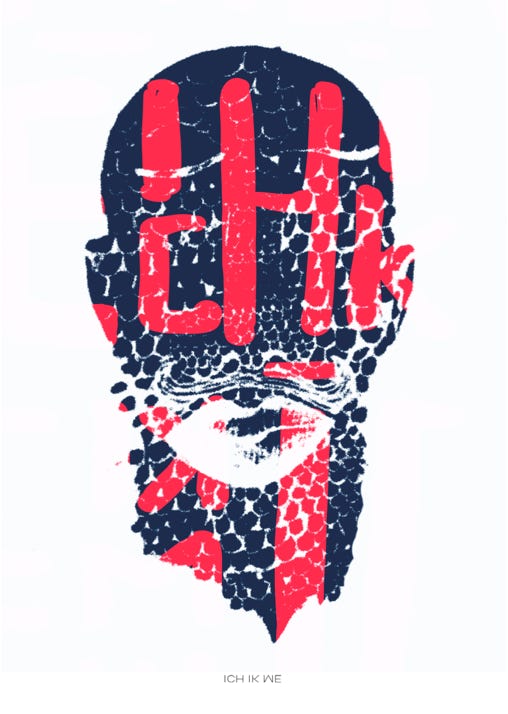
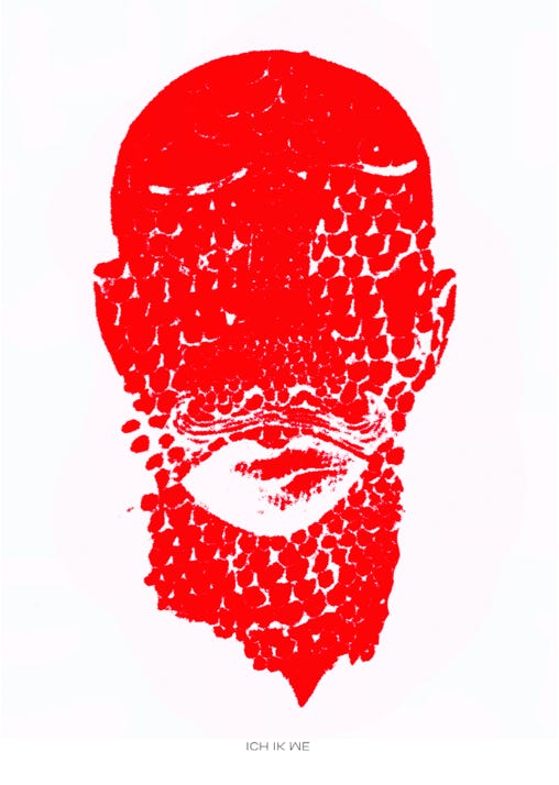
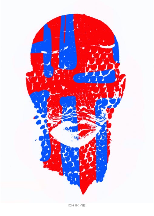
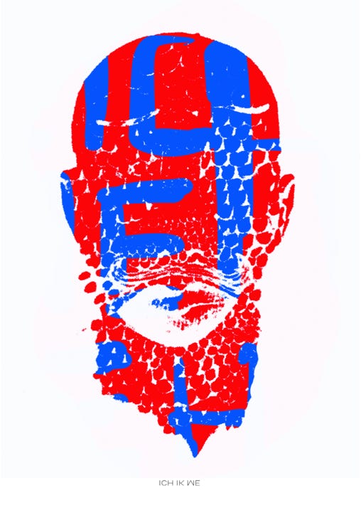
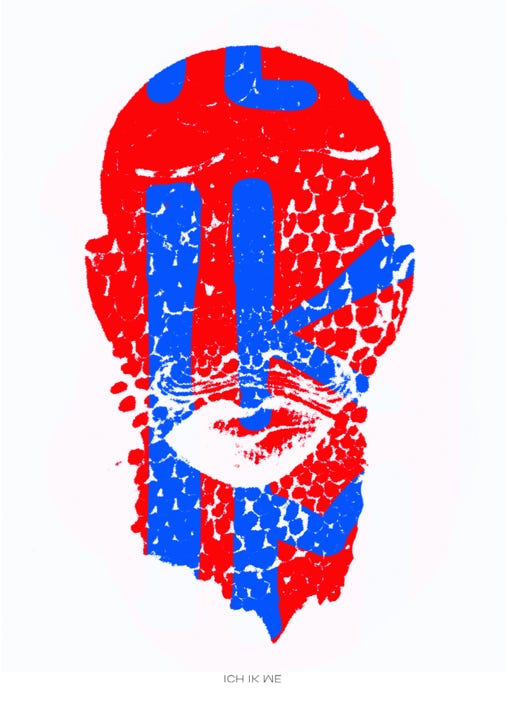
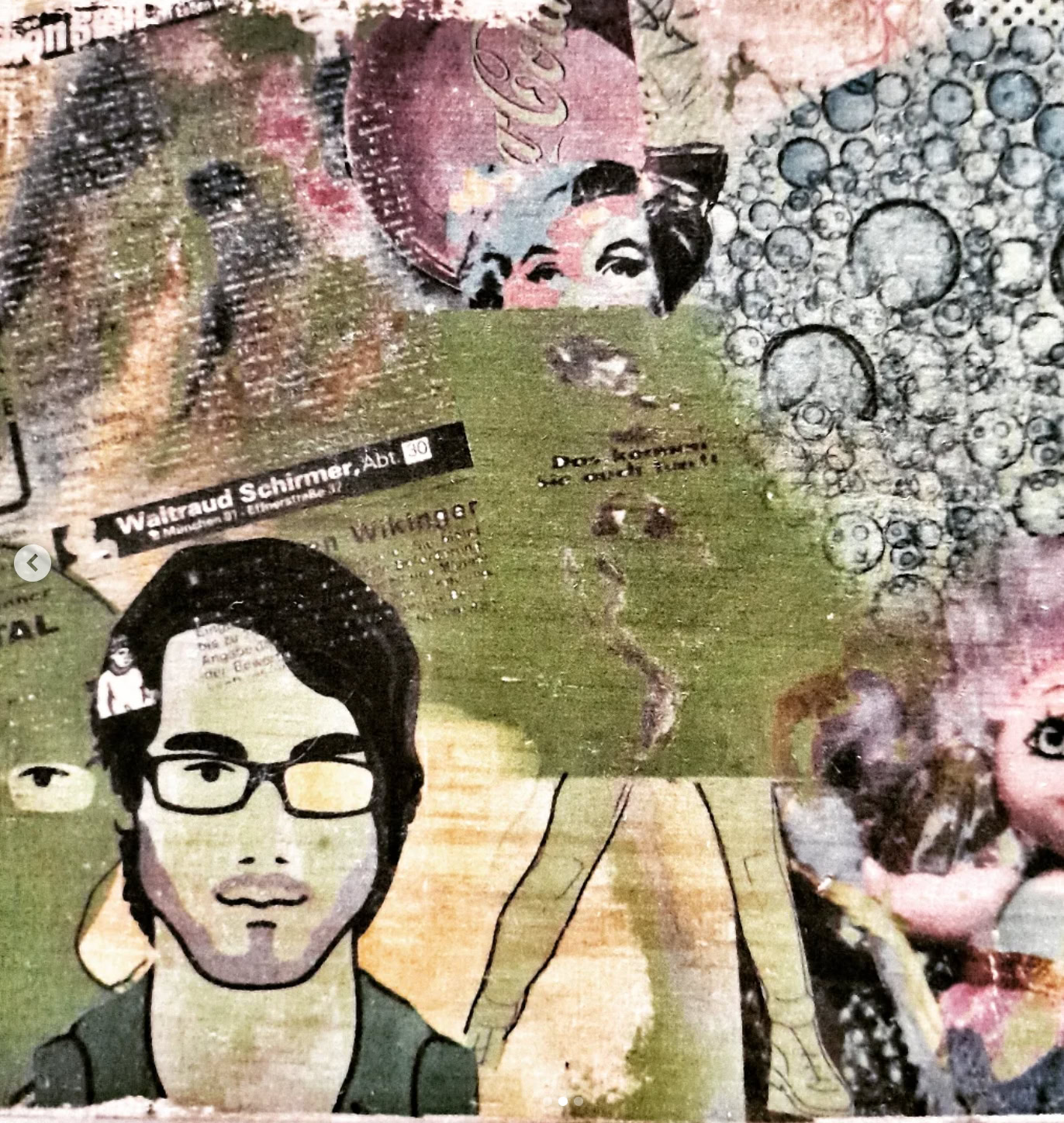
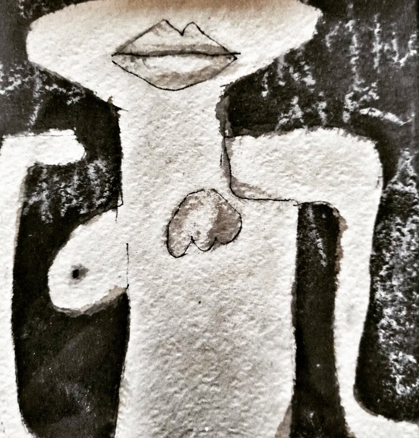
"Curious to know more? Let's Talk, explore more about Me, Ik and Ich or dive into my Blog!"
Sorry, no Cookies here ;-)
"This site is a no-cookie, no-tracking zone. No analytics, no snooping. Why? Because we believe in giving you a space where you can roam freely, without someone constantly watching your every move. It's all about pure, unfiltered browsing—just how I like it."
Impressum & Datenschutz
Structuring chaos...
ORGANIZING PIXELS... 0%
PLAY
GROW
ACT
FLY
Welcome to a no-cookie, pure analog-digital playground where creative chaos is structured into visual impact. This space functions as an active matrix for experimental design, modern pedagogy, and conceptual breakthroughs. Step inside to explore raw ideas, distorted layouts, and the fine line between thinking everything and absolutely nothing. Browse the concepts, disrupt your routine, and enjoy the trip.
To experience the playground in its full glory, switch to desktop — more space, more chaos, more possibilities.
Ruud Hendrikx | It’s all about concept
Creative Educator & Visual Designer
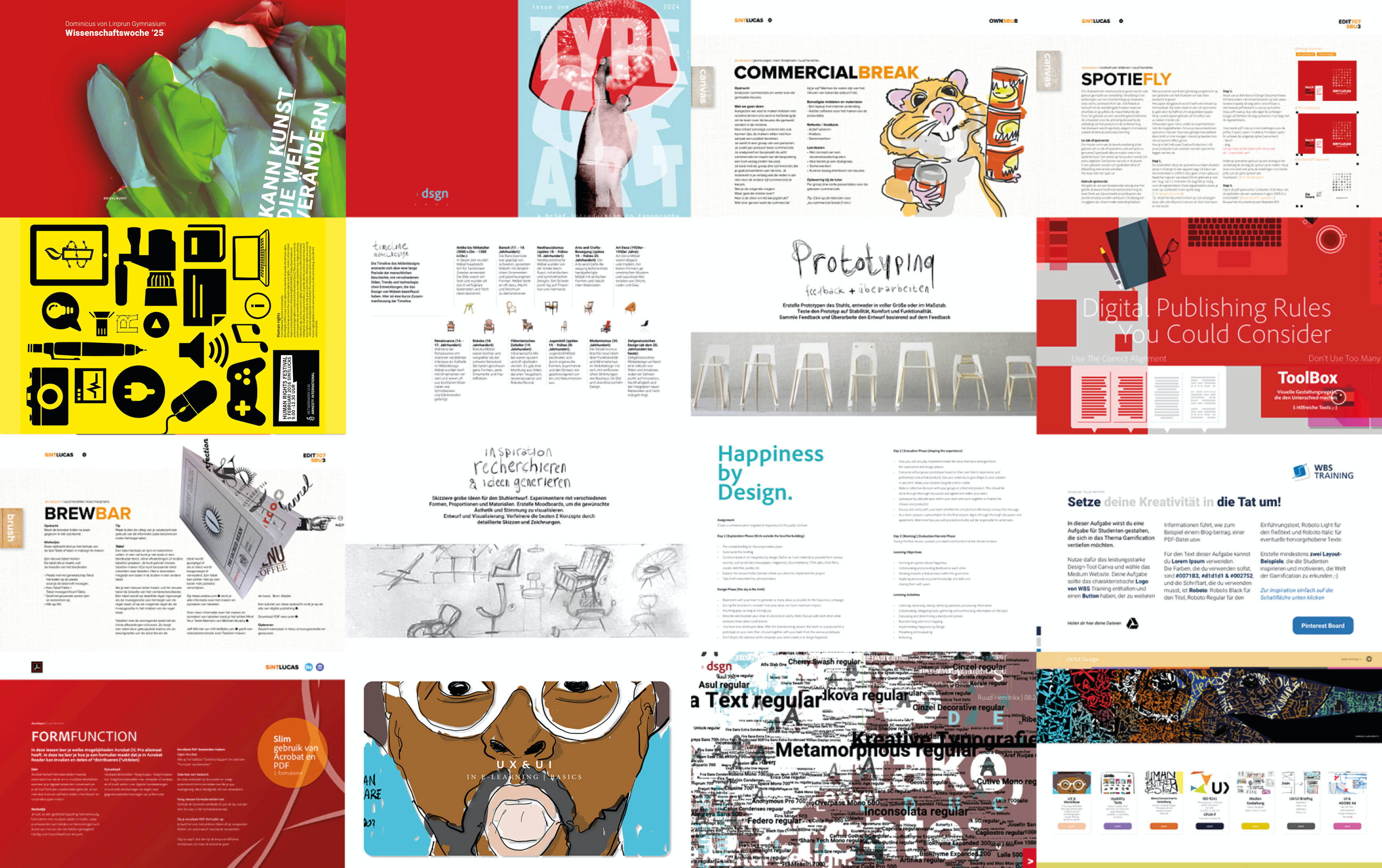
A selection of developed and designed
Assignments | Readers | E-learning development & Presentations

See this symbol?
Click to experience ;-) >
Ruud Hendrikx | It’s all about concept
Creative Educator & Visual Designer
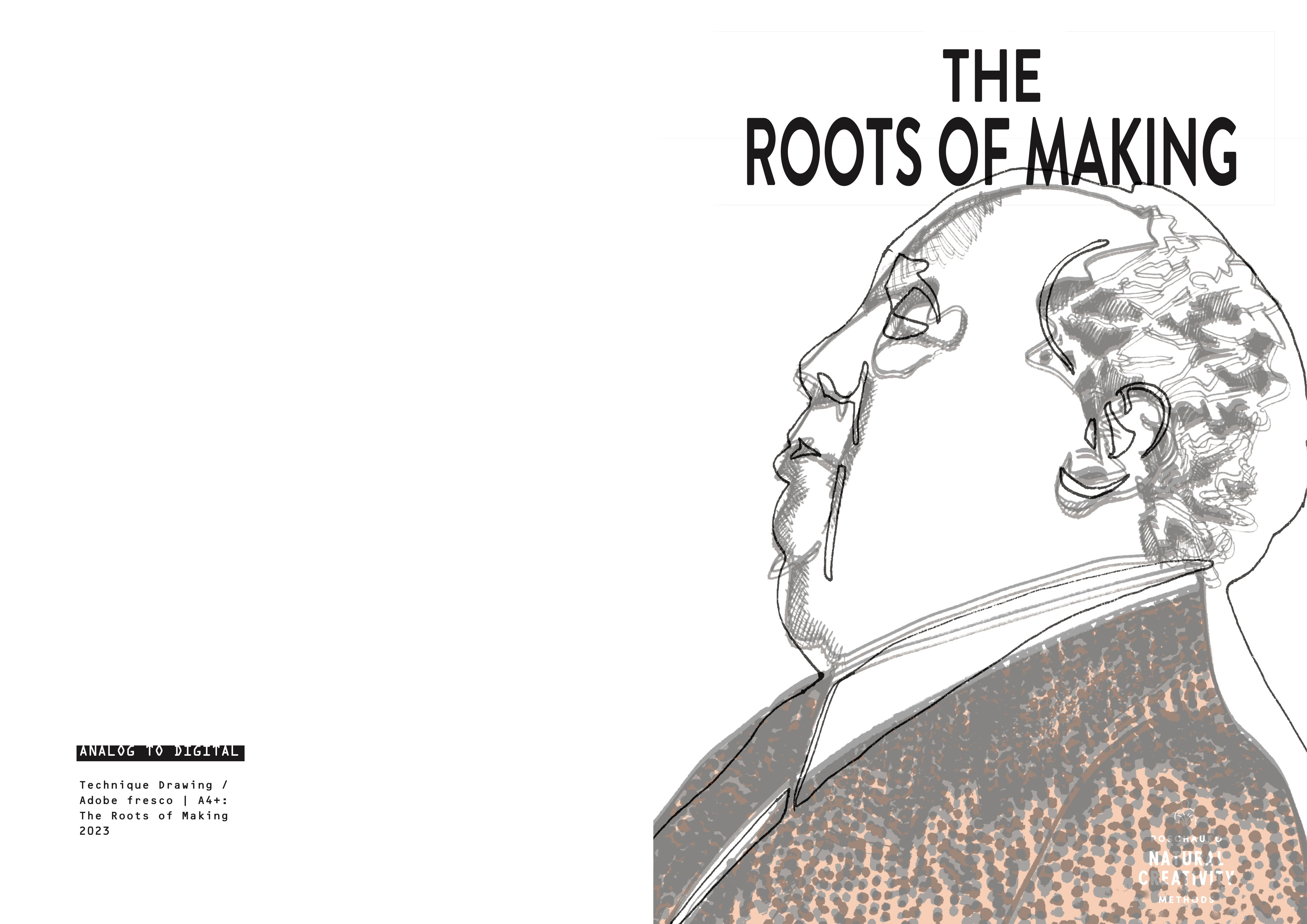
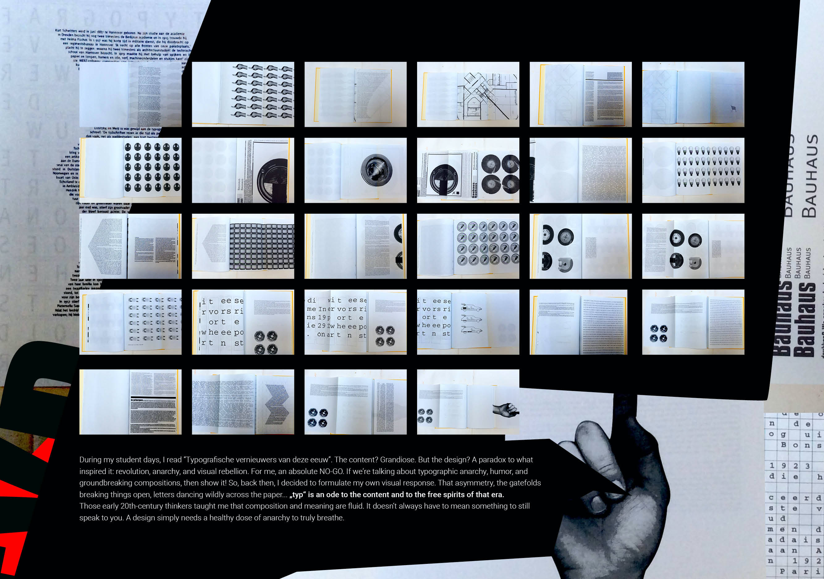
The Roots of Making
Ruud Hendrikx | It’s all about concept
Creative Educator & Visual Designer
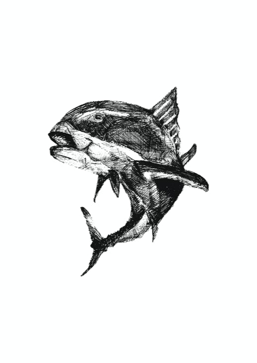
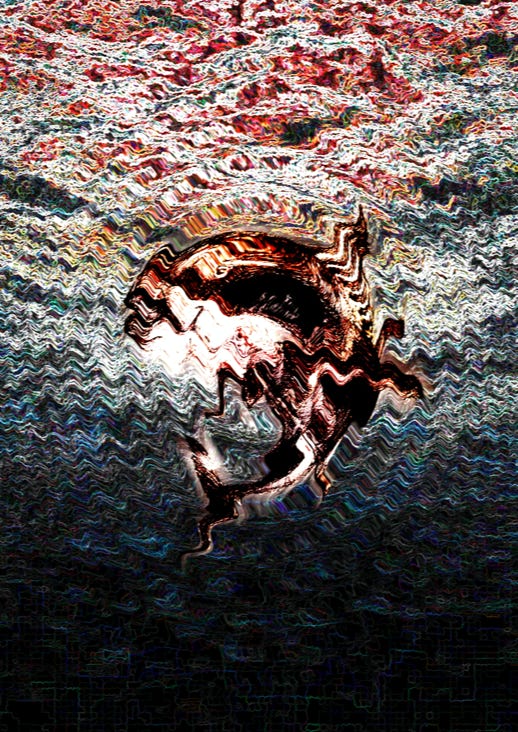
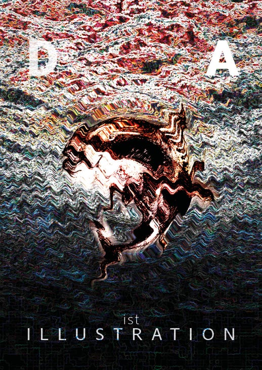
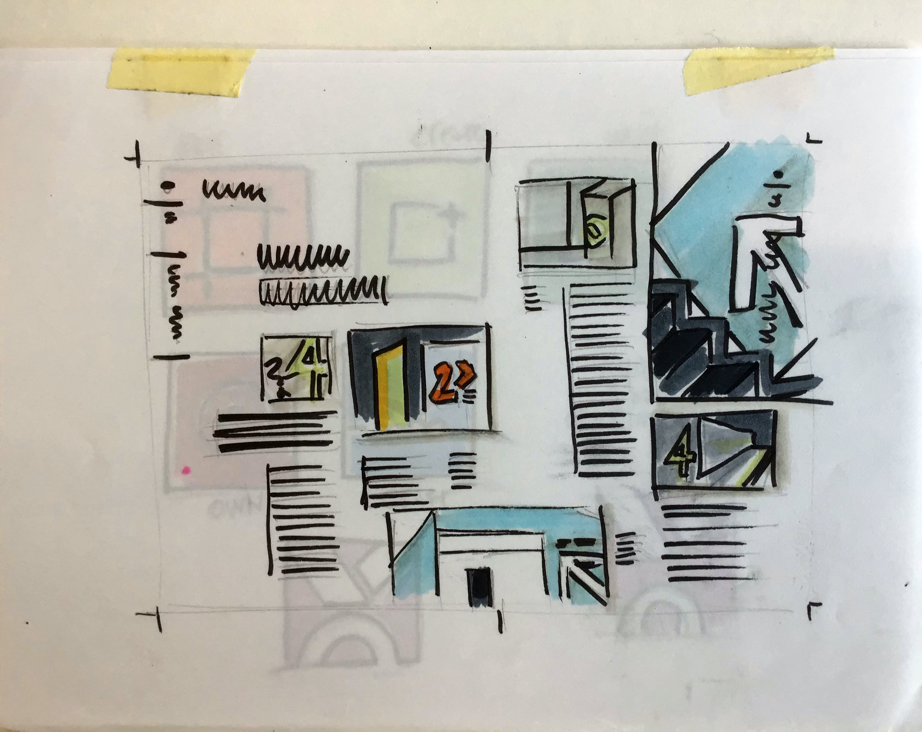
Work proces cover „DA ist illustration“
Ever come across kindred spirits who share your fiery passion for your chosen profession? In my case Visual Design & Creative Education. Well, buckle up, because last week, I had the electrifying experience of meeting Thomas Poschauko in the flesh!
Let me tell you, I've been a fervent admirer of their mind-blowing creative prowess ever since the dazzling release of their masterpiece, "Nea Machina." The Poschauko brothers aren't just creators; they're visionaries, weaving dreams into reality.
Their work has become my personal wellspring of inspiration, a dynamic force that fuels my own creative journey. Meeting Thomas was like adding a spicy kick to the already flavourful mix of my creative pursuits. Here's to the trailblazers who ignite the spark in our creative souls!"
Ruud Hendrikx | It’s all about concept
Creative Educator & Visual Designer
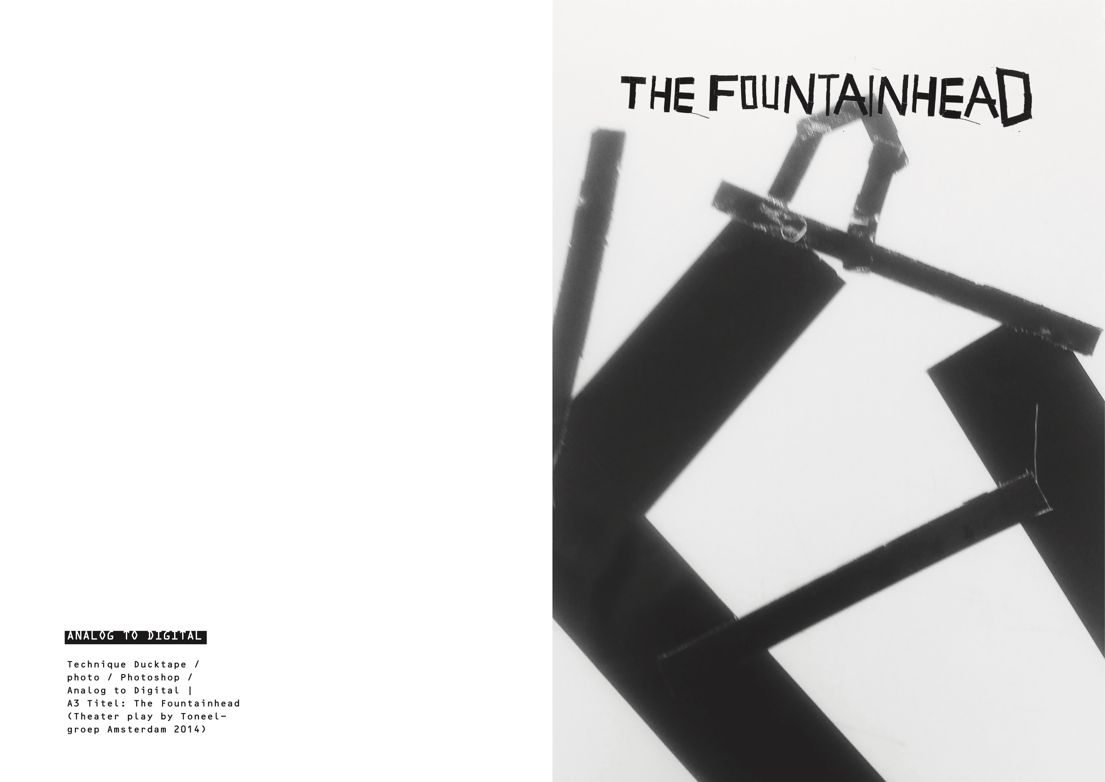
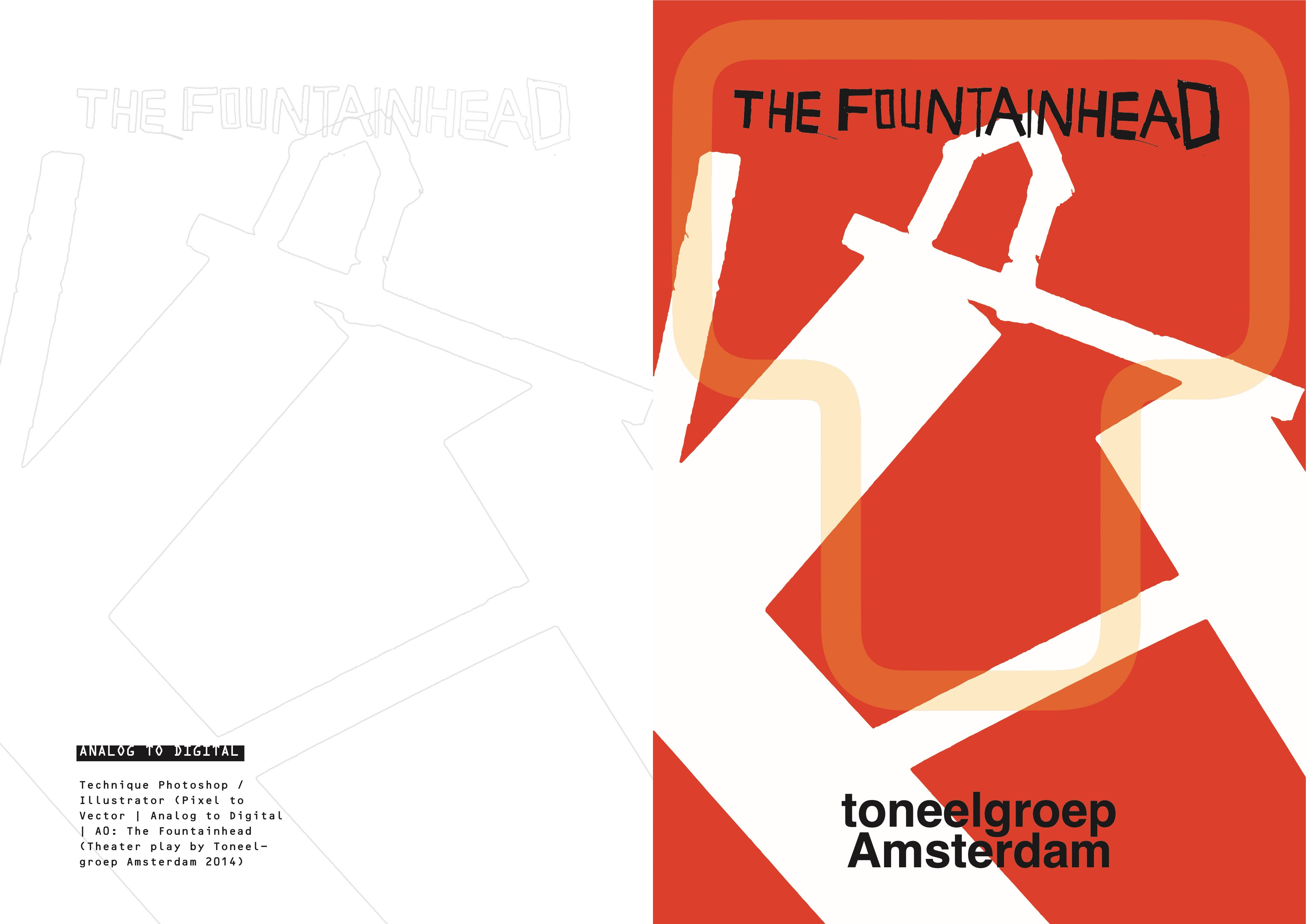
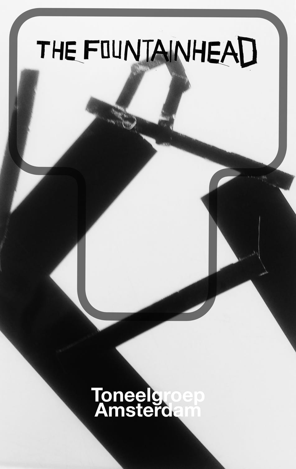
The Fountainhead - Toneelgroep Amsterdam
Ruud Hendrikx | It’s all about concept
Creative Educator & Visual Designer
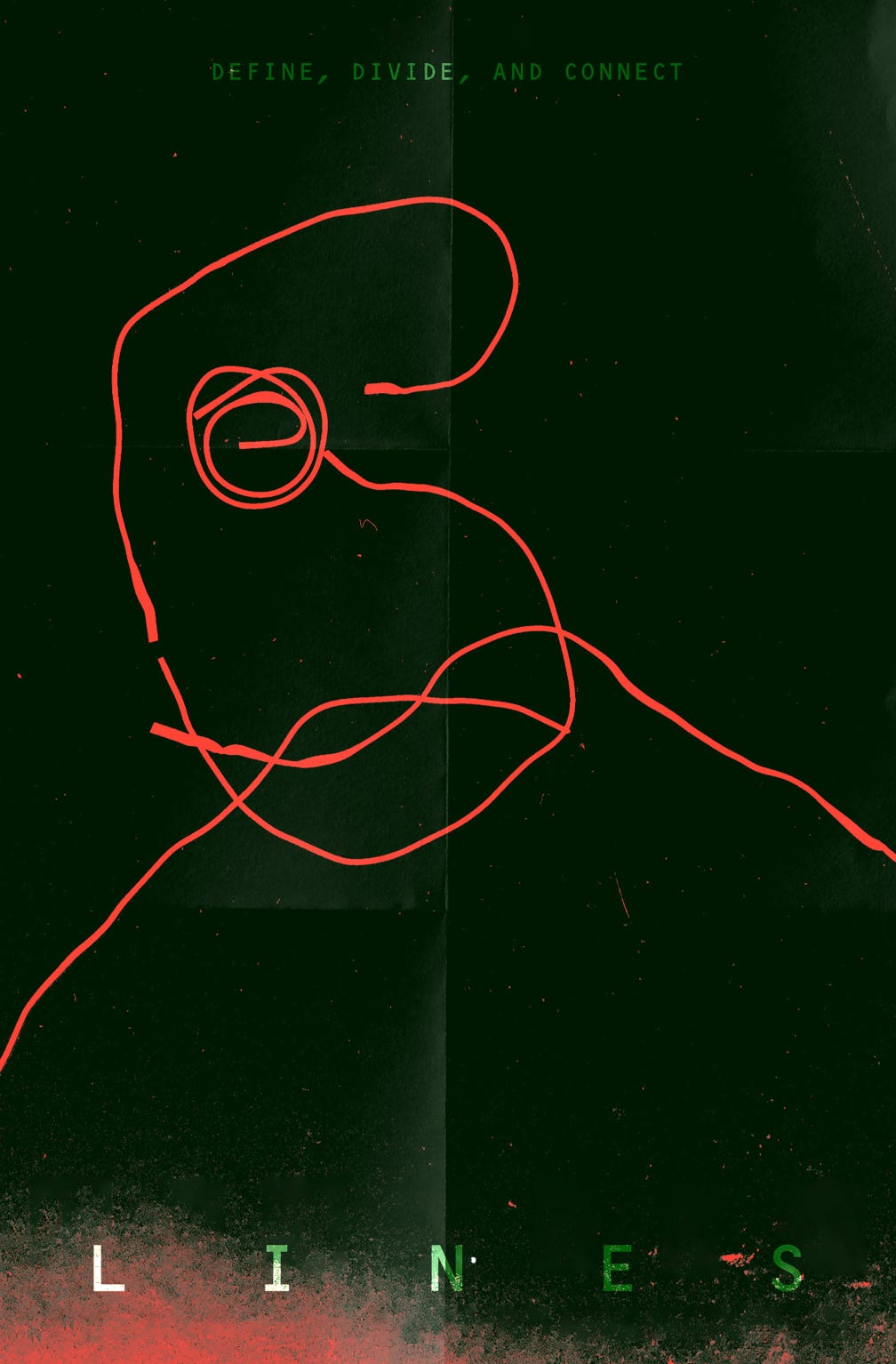
DEFINE, DIVIDE AND CONNECT LINES
Ruud Hendrikx | It’s all about concept
Creative Educator & Visual Designer
Evolving Type | Play Grow Act Fly
Ruud Hendrikx | It’s all about concept
Creative Educator & Visual Designer
TYPE-ANIMATION
Let us re-shape or shape your world |
a Typographic animation
Music: Mirzapur New Bgm, Satyajeet Kant
Ruud Hendrikx | It’s all about concept
Creative Educator & Visual Designer
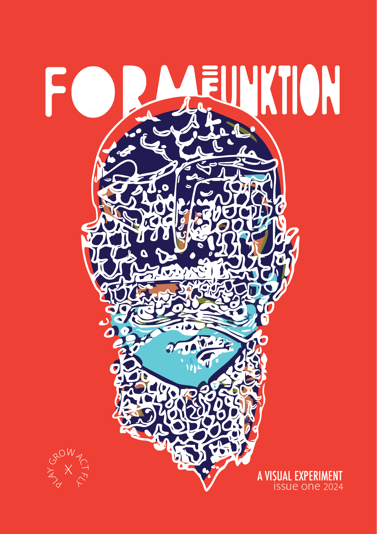
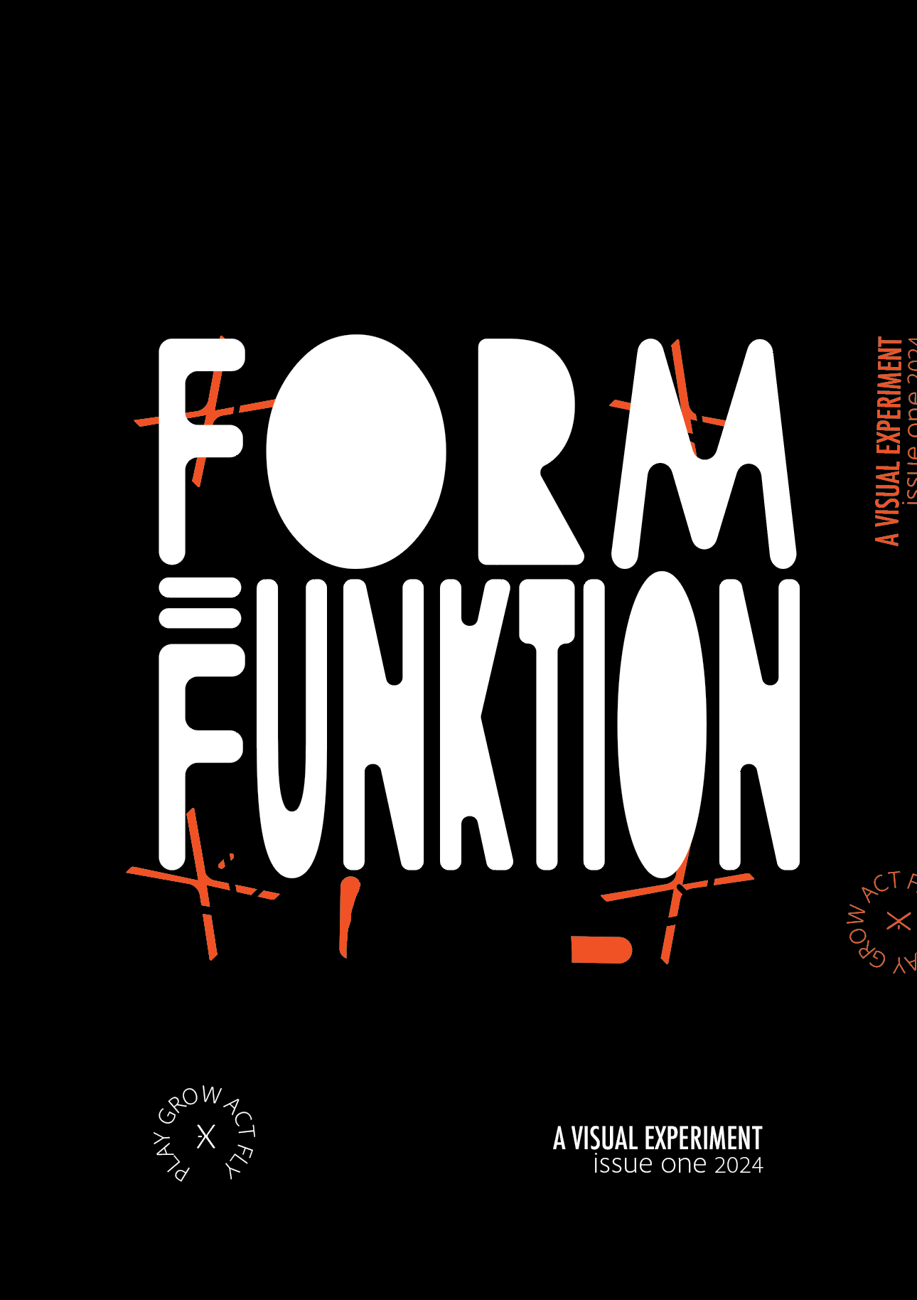
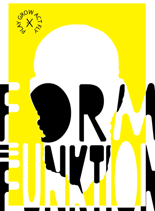
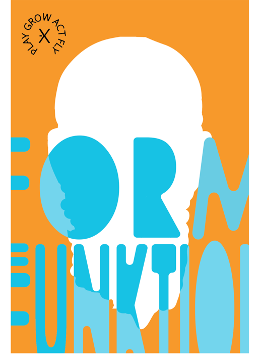
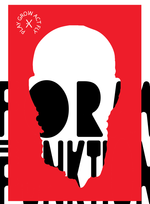
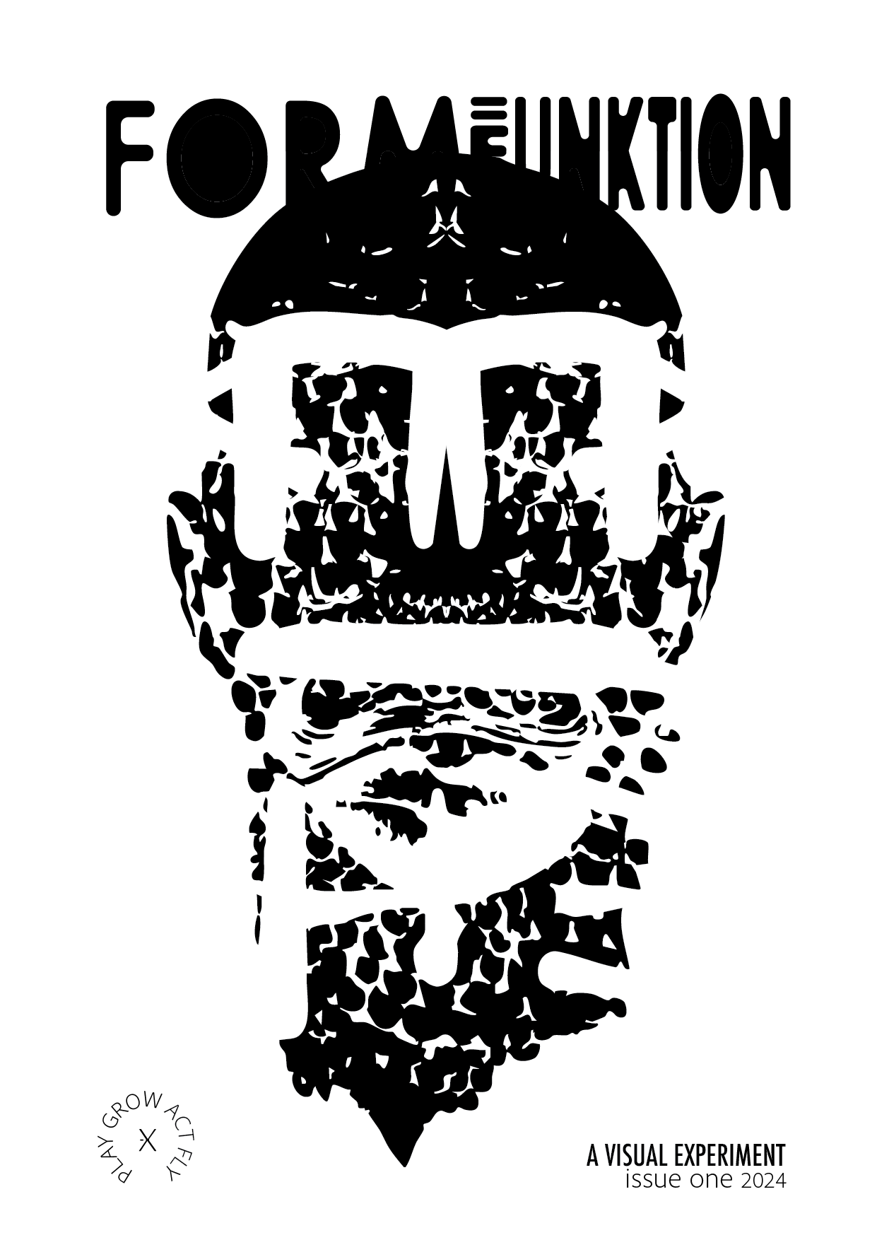
FORM=FUNKTION - Play, Grow, Act, Fly
Ruud Hendrikx | It’s all about concept
Creative Educator & Visual Designer
Book 151
Applying the Play, Grow, Act, Fly principle involves a flexible yet structured approach to design, focused on innovation, exploration, and reflection. Each phase brings its own set of mindsets and activities, leading from playful discovery to impactful release. Click button for more information in how it guides the design process:
Ruud Hendrikx | It’s all about concept
Creative Educator & Visual Designer
Showreel T.I.M.
Ruud Hendrikx | It’s all about concept
Creative Educator & Visual Designer
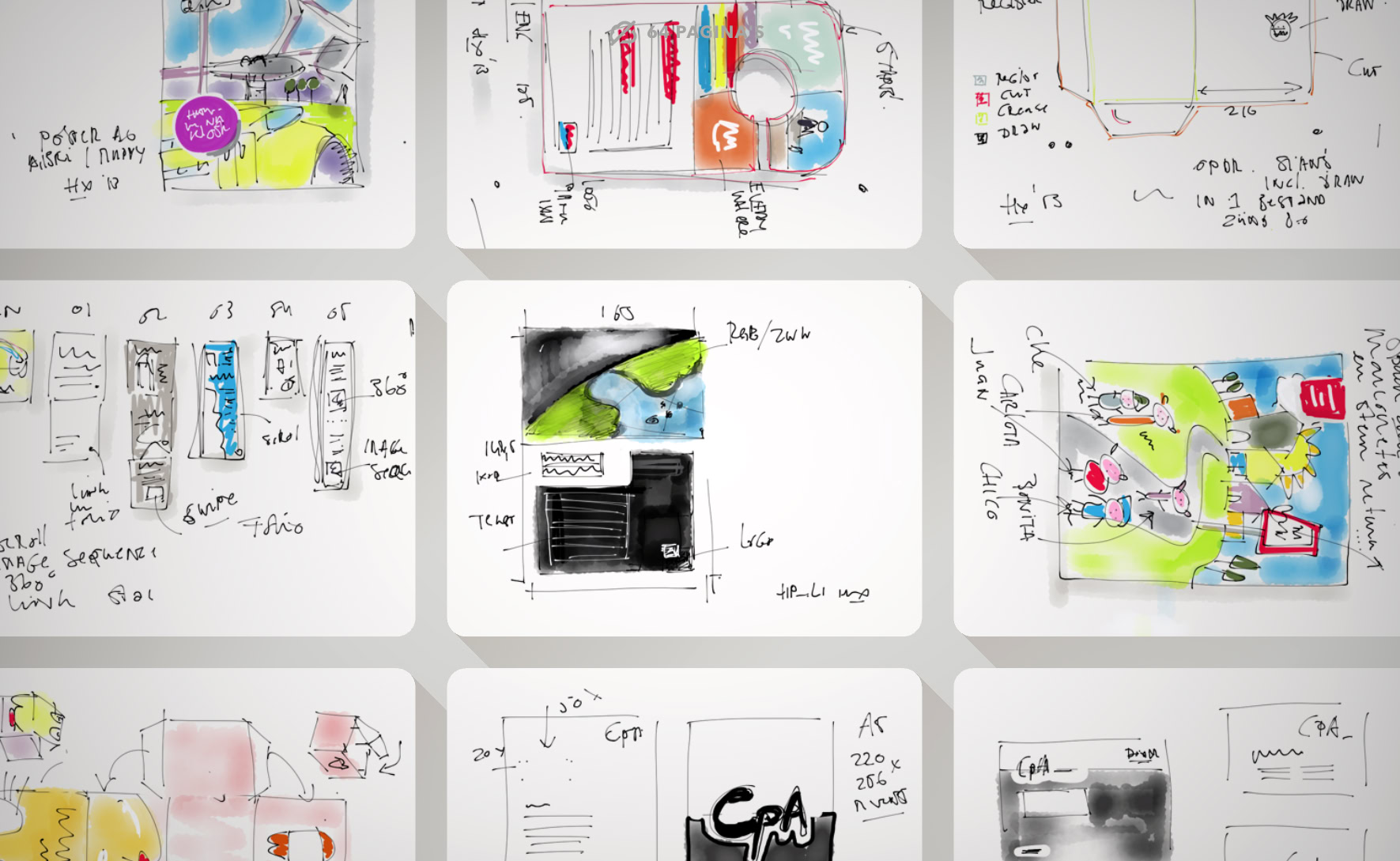
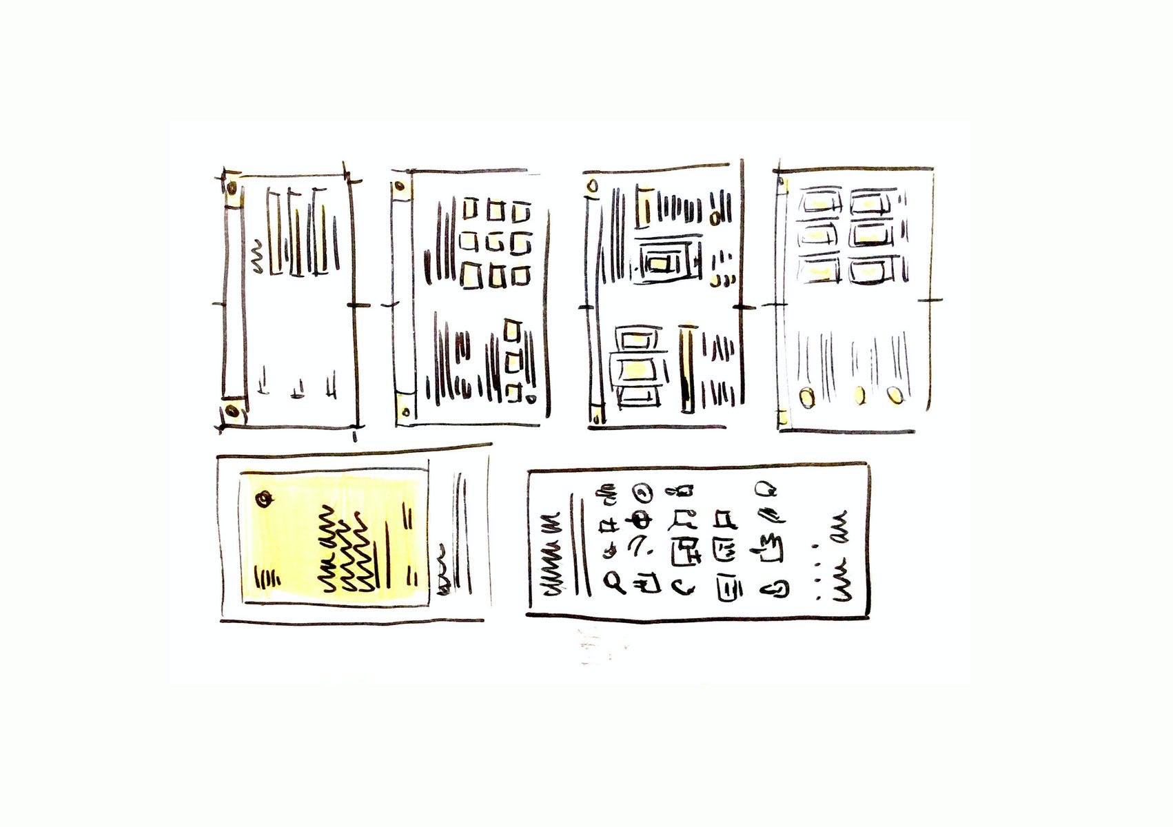
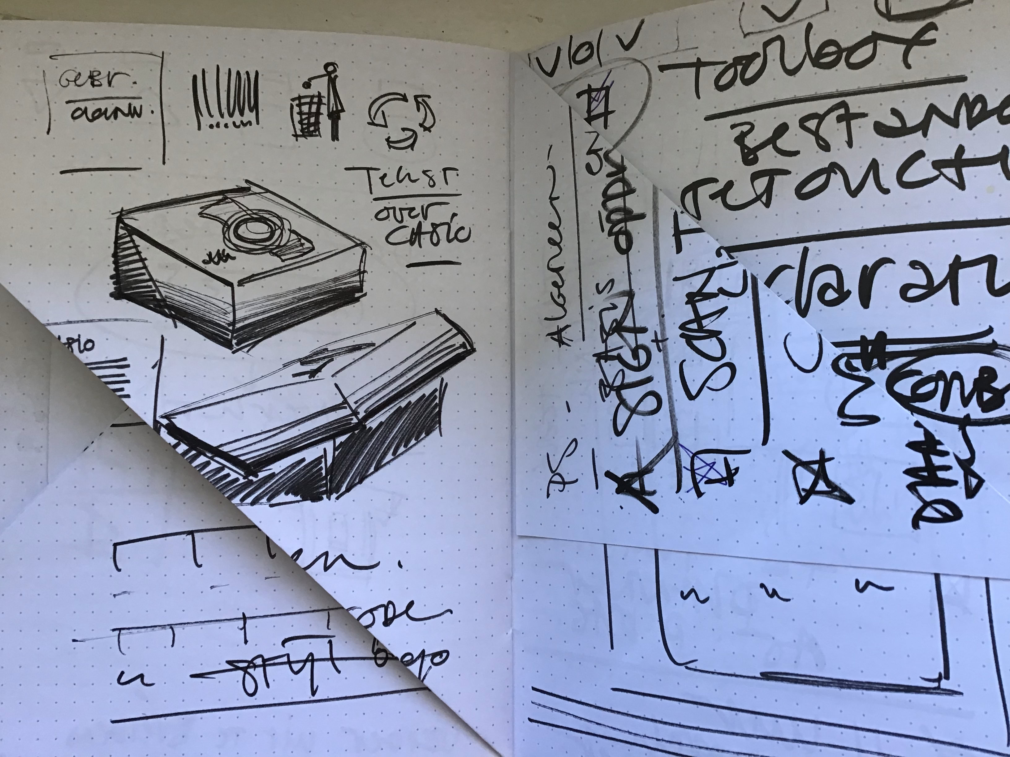
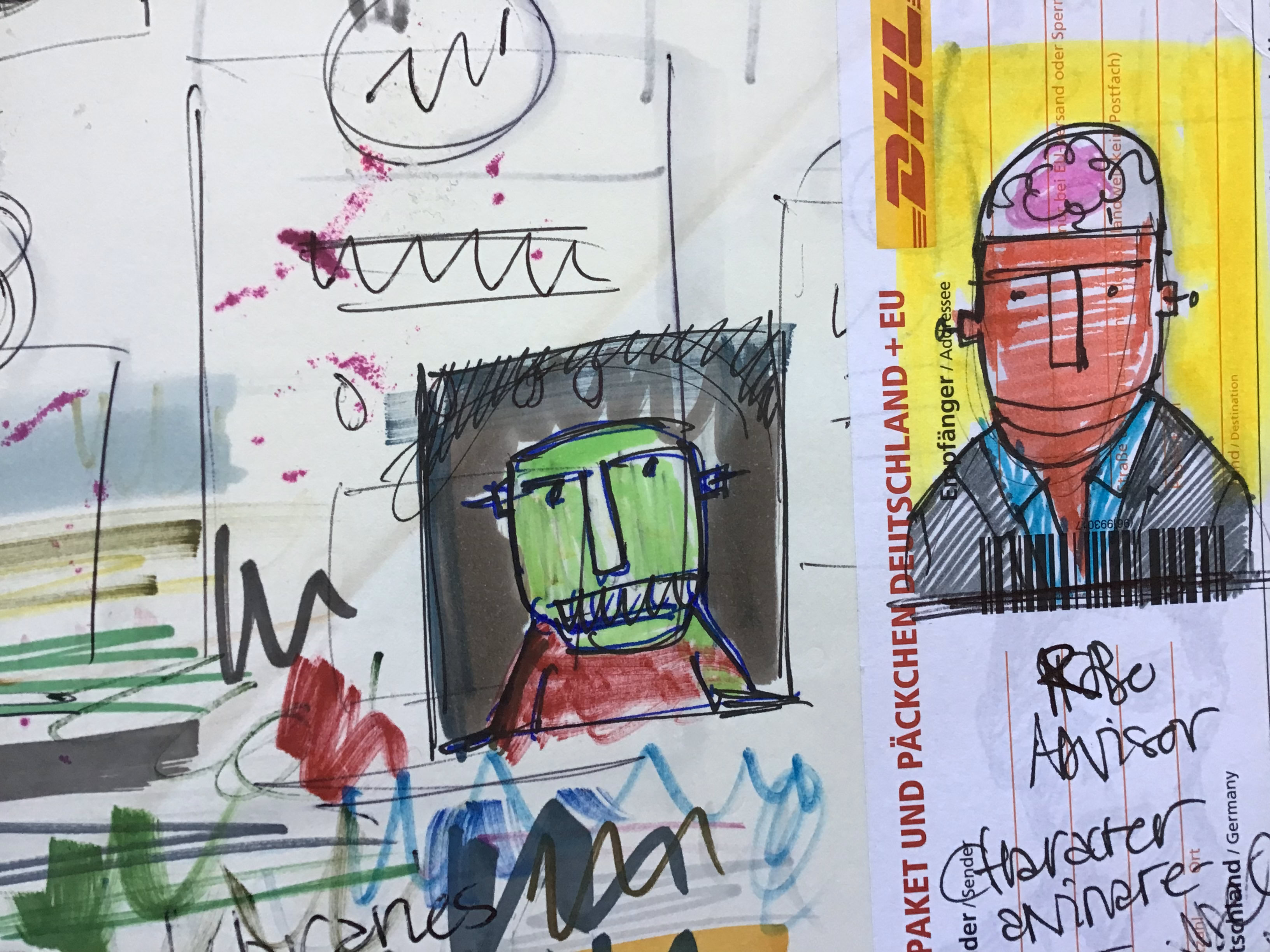
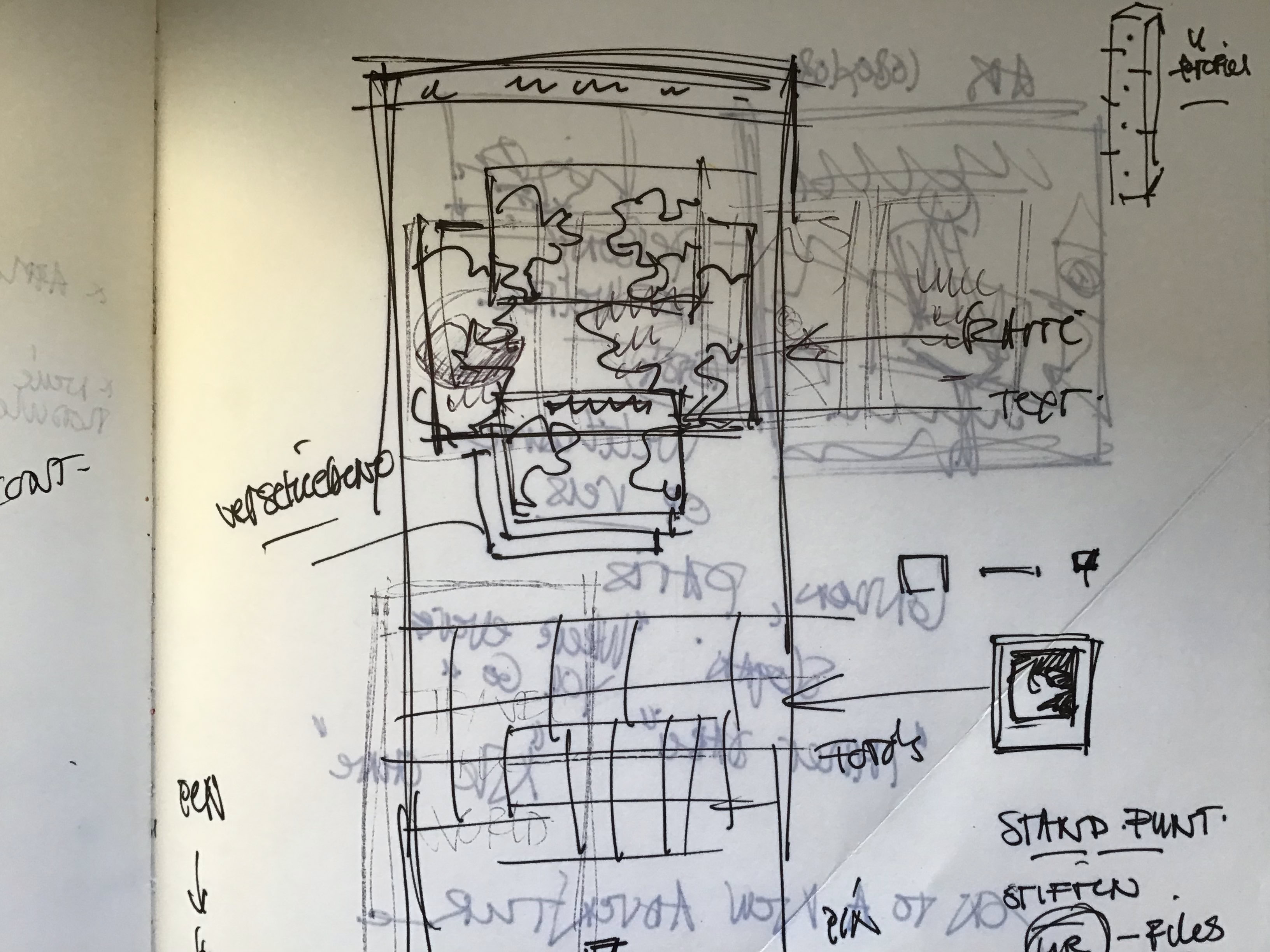
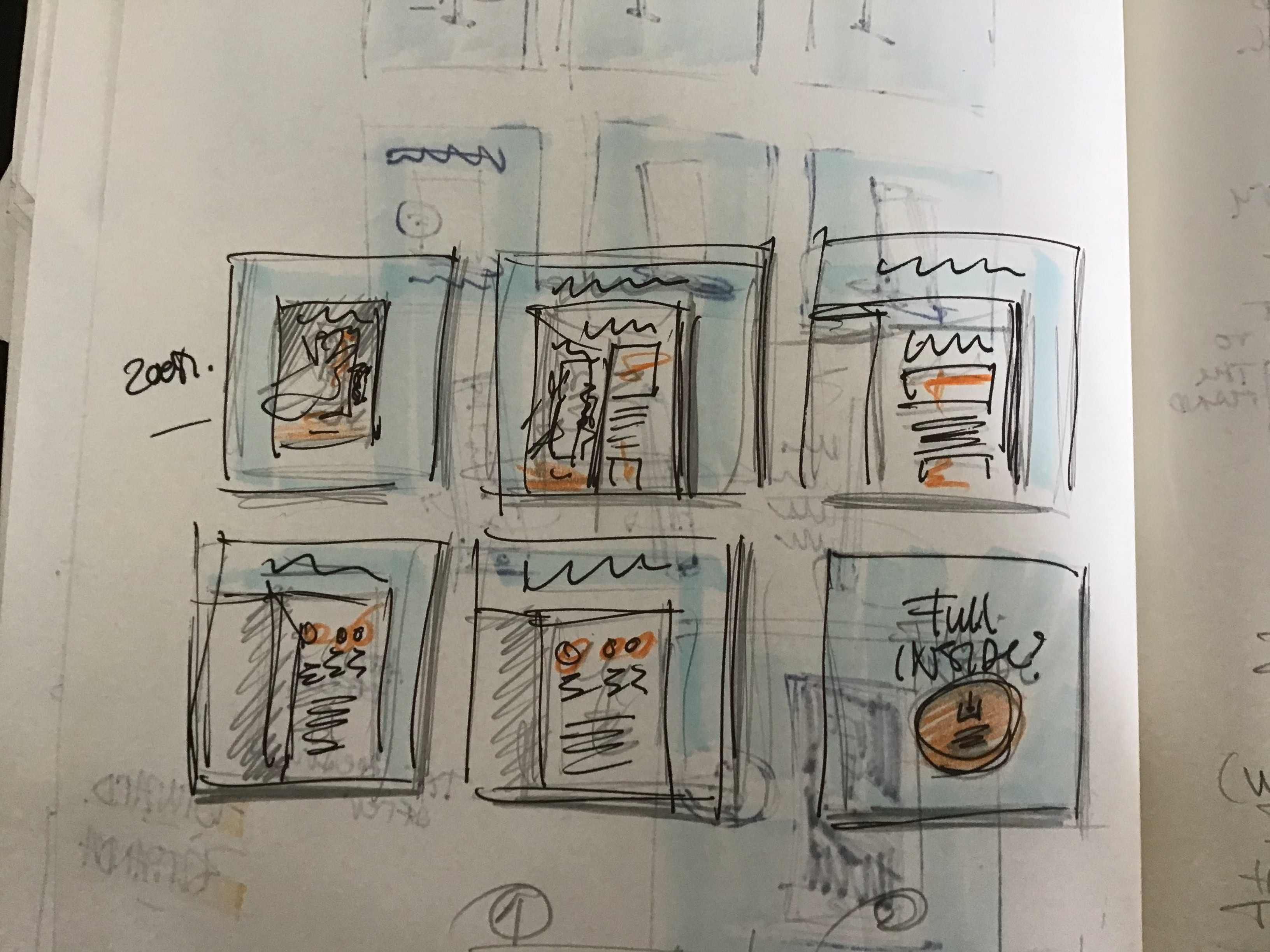
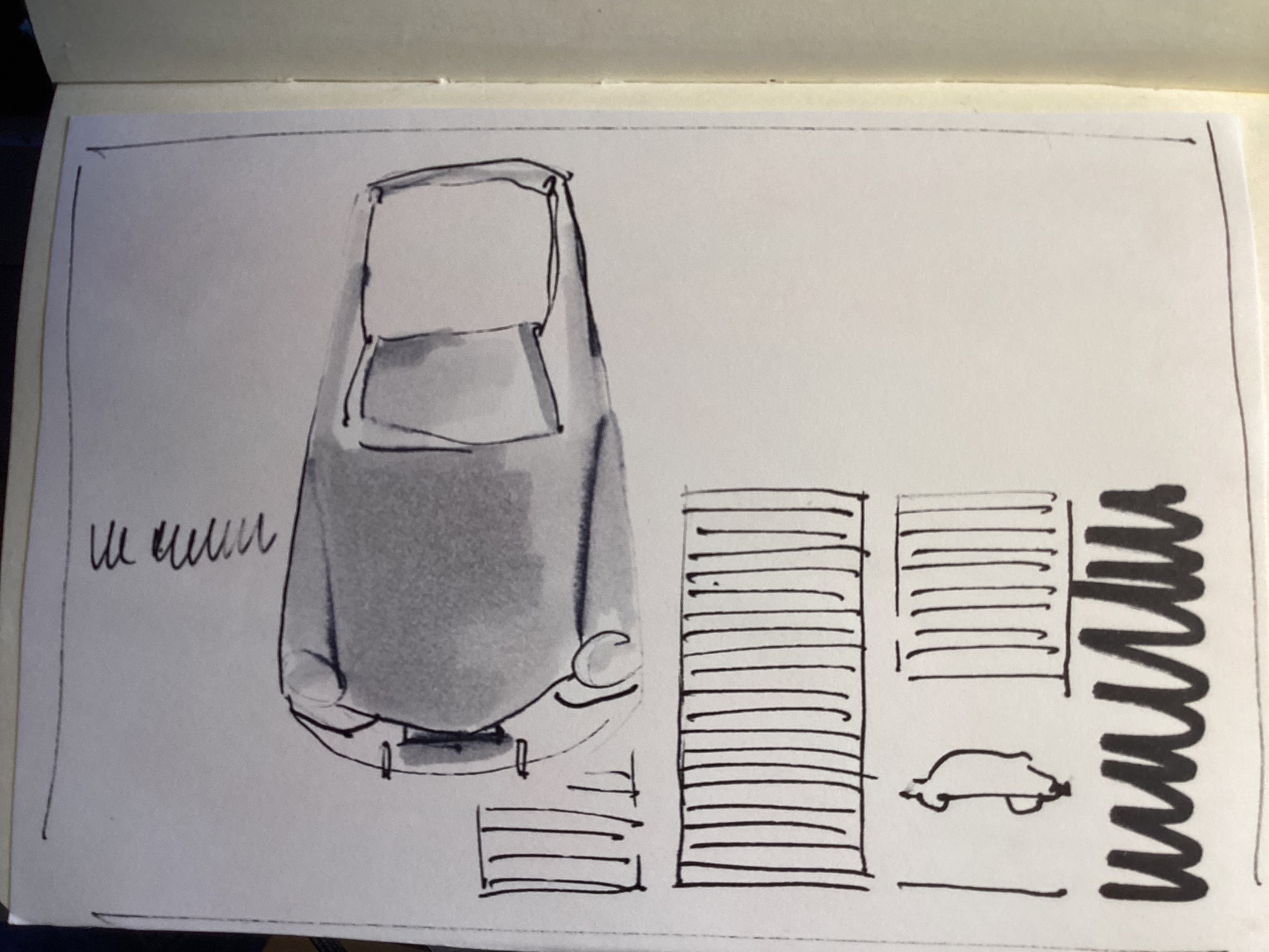
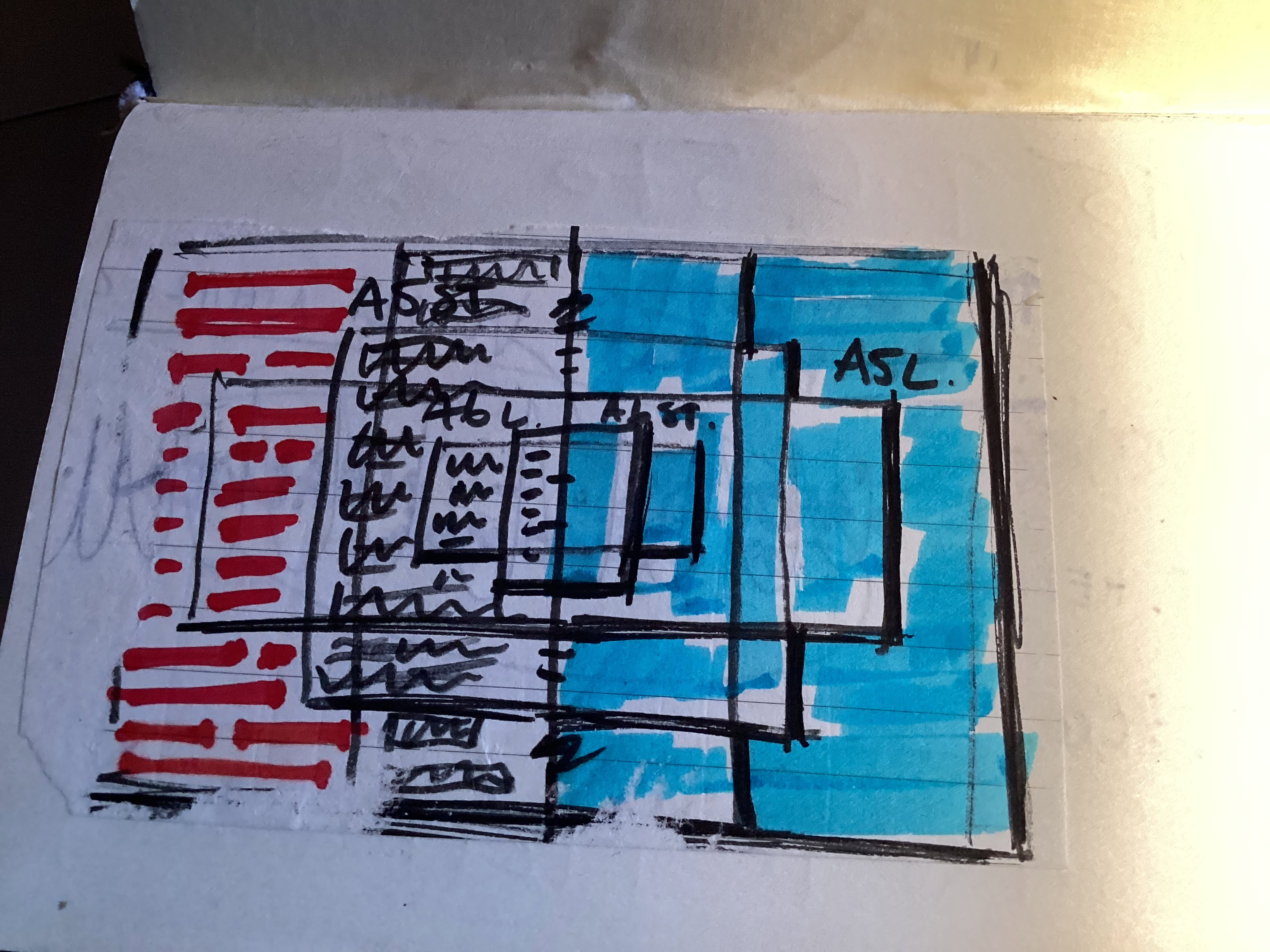
The pivotal role of Sketching
Ruud Hendrikx | It’s all about concept
Creative Educator & Visual Designer
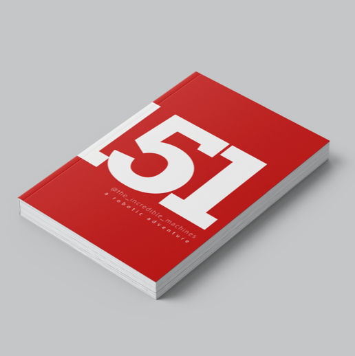
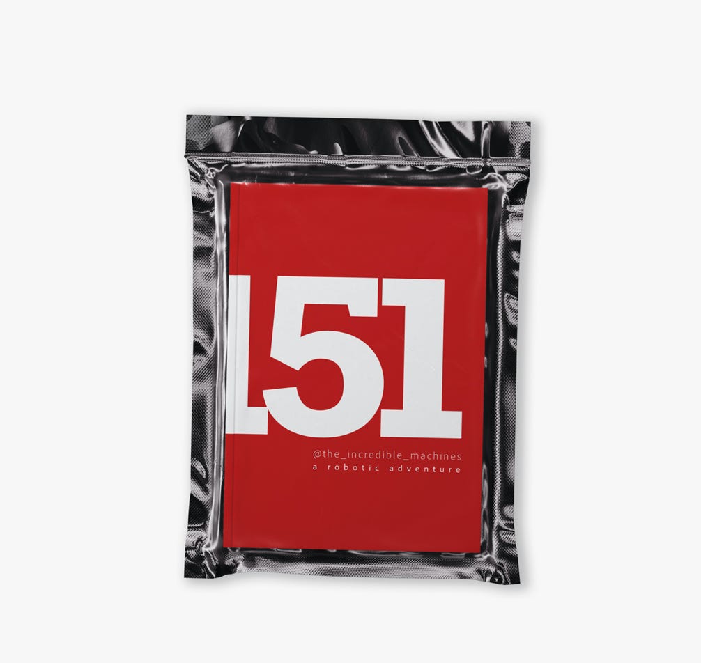
Book 151
Book 151 - signed and sealed ;-)
a robotic adventure
The pivotal role of Sketching in design :
Exploration and Ideation: Sketching allows designers to quickly explore a multitude of ideas and concepts in a low-fidelity format. It's a rapid and efficient way to brainstorm and generate a wide range of design solutions.
Communication: Sketches serve as a universal language for communication within design teams and with clients. They convey ideas and concepts visually, helping to bridge gaps in understanding and facilitating collaboration.
Visualization: Sketching helps designers visualize their ideas in a tangible form early in the design process. It allows them to see how different elements come together and how the design might look and function in reality.
Problem Solving: Sketching enables designers to identify potential issues and challenges early on and brainstorm possible solutions. It provides a platform for problem-solving and iteration, allowing designers to refine and improve their designs iteratively.
Flexibility and Speed: Sketching offers a flexible and quick way to experiment with different design approaches and variations. Unlike more polished design tools, sketching doesn't require extensive technical knowledge or software proficiency, allowing designers to focus on creativity and exploration.
In essence, sketching is a fundamental tool in the designer's toolkit, facilitating creativity, communication, problem-solving, and iteration throughout the design process. It serves as a versatile and indispensable method for turning abstract ideas into concrete designs.
Ruud Hendrikx | It’s all about concept
Creative Educator & Visual Designer
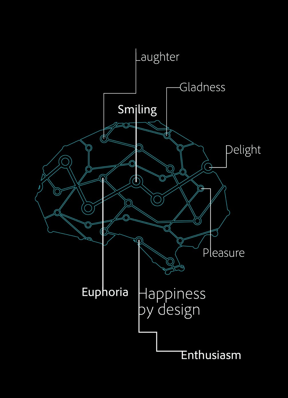
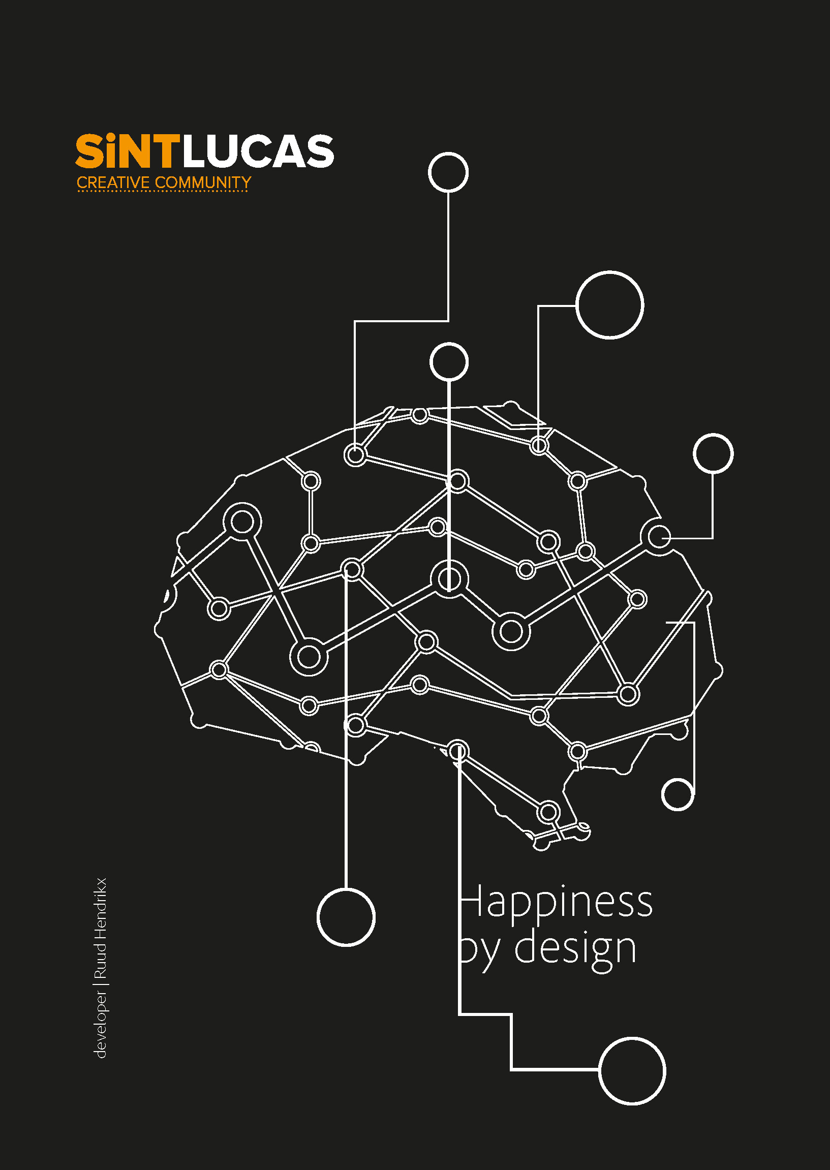
HAPPINESS BY DESIGN
Happiness by Design
Design assignment for the Public Domain
Ruud Hendrikx | It’s all about concept
Creative Educator & Visual Designer
The Future Creatives
Scenic assignment for the campaign The Future Creatives | SintLucas | Digital Publishing | CMD
Ruud Hendrikx | It’s all about concept
Creative Educator & Visual Designer
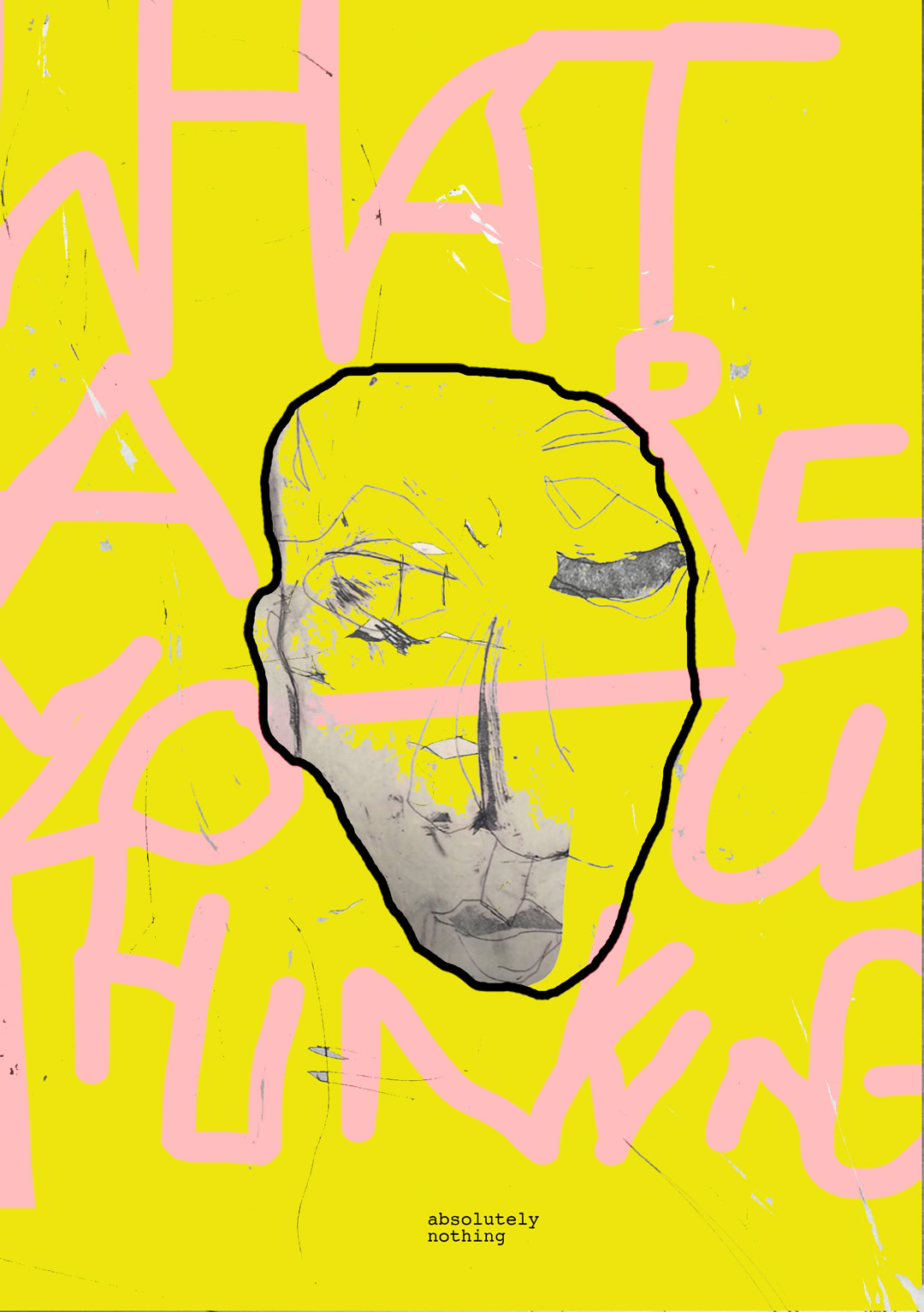
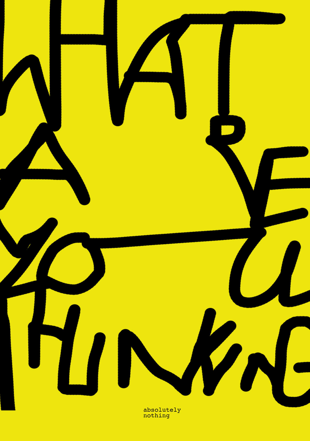
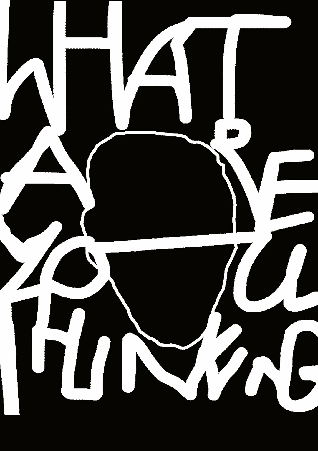
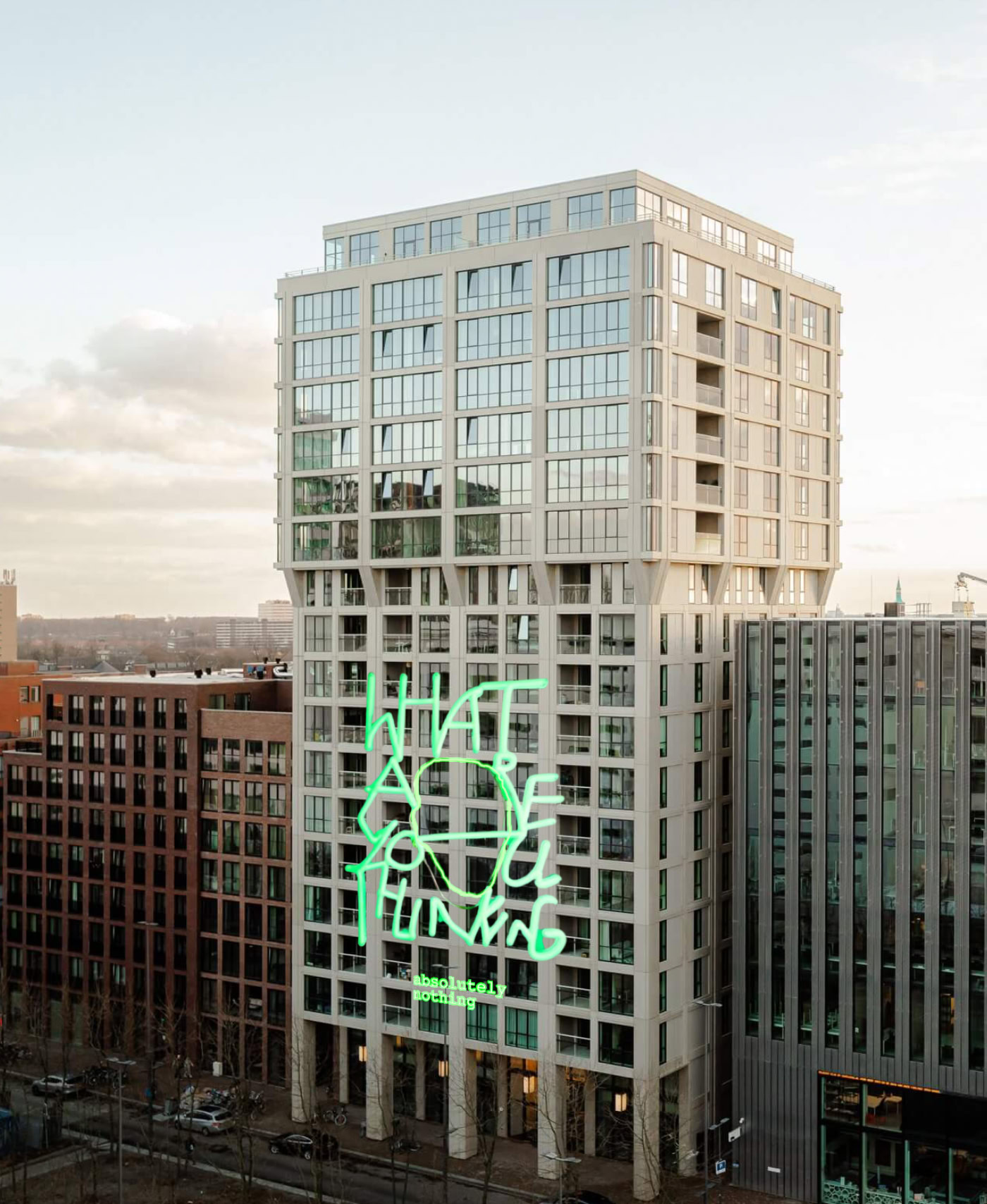
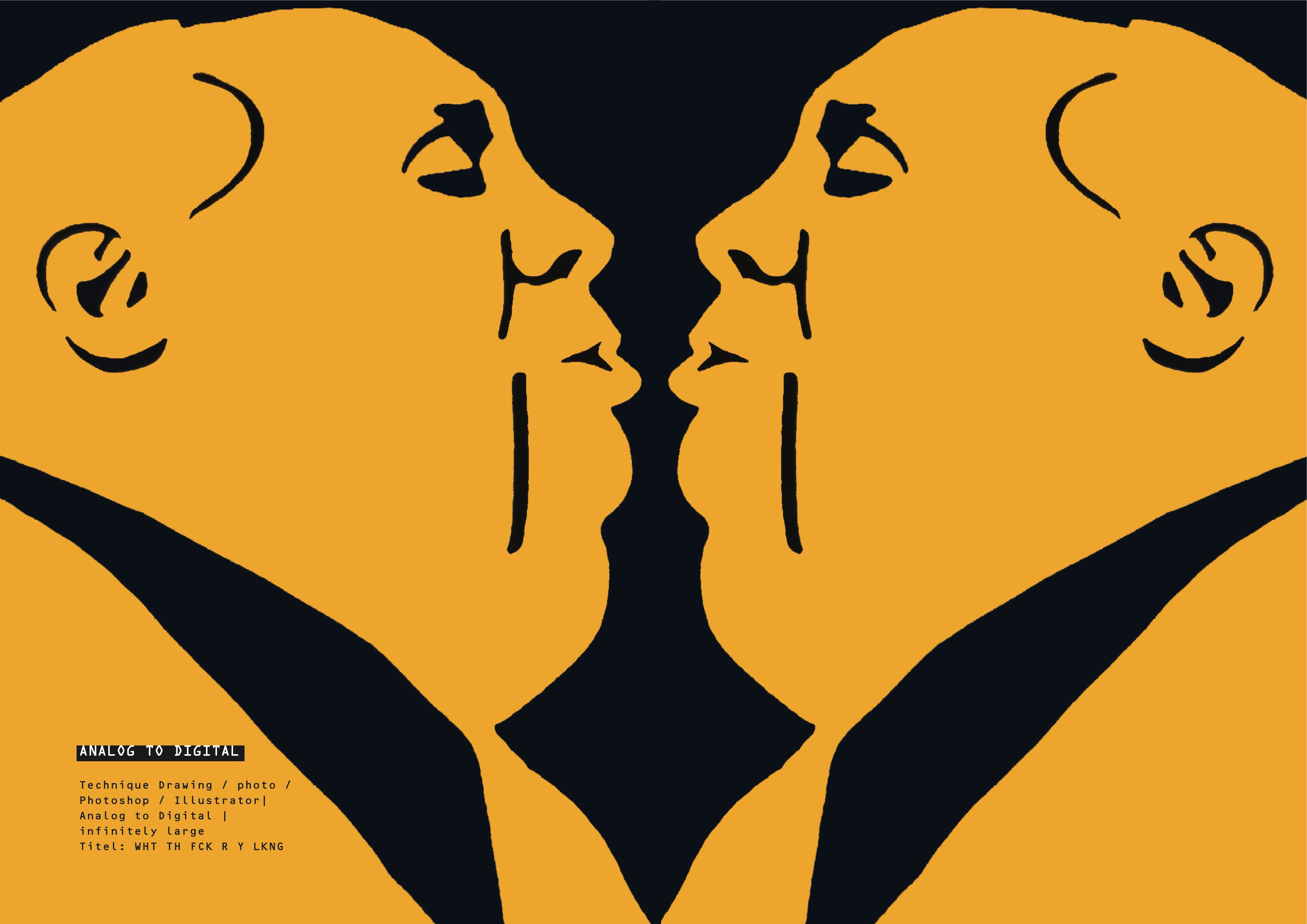
What are you Thinking, Absoluty Nothing
Concept design - Neon installation Strijp-s
The interplay between "What are you thinking?" and "Absolutely nothing" invites introspection and adds a touch of humor or irony, depending on the viewer's interpretation.
Ruud Hendrikx | It’s all about concept
Creative Educator & Visual Designer
The Future Creatives | Poster Campaign
Ruud Hendrikx | It’s all about concept
Creative Educator & Visual Designer
ISSUE ONE - EDUCATION
Issue One - for education
„a brief introduction to typography“
Ruud Hendrikx | It’s all about concept
Creative Educator & Visual Designer
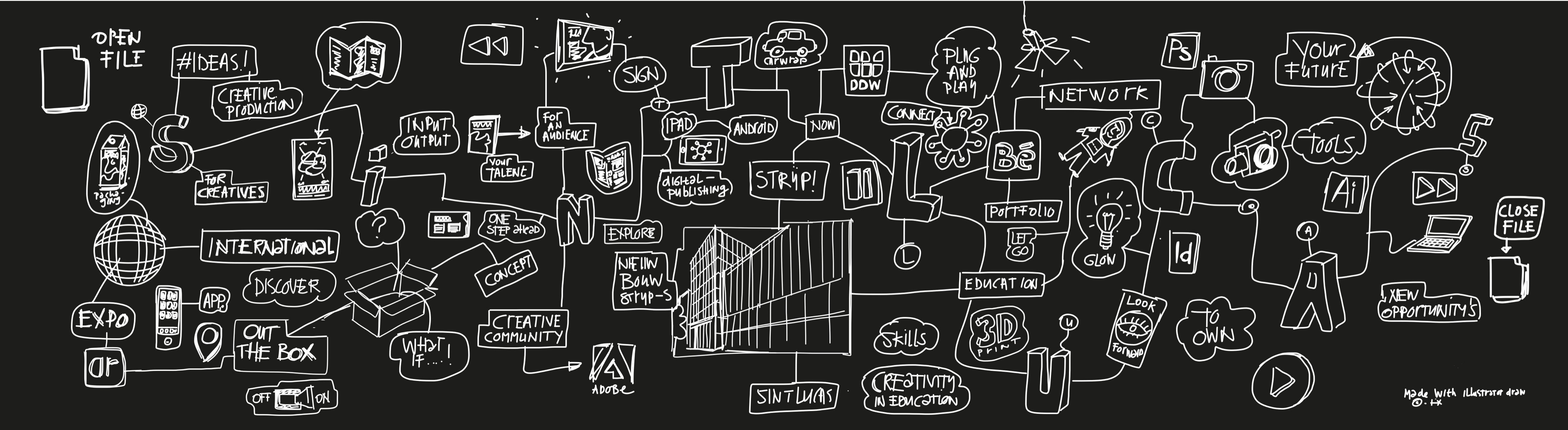
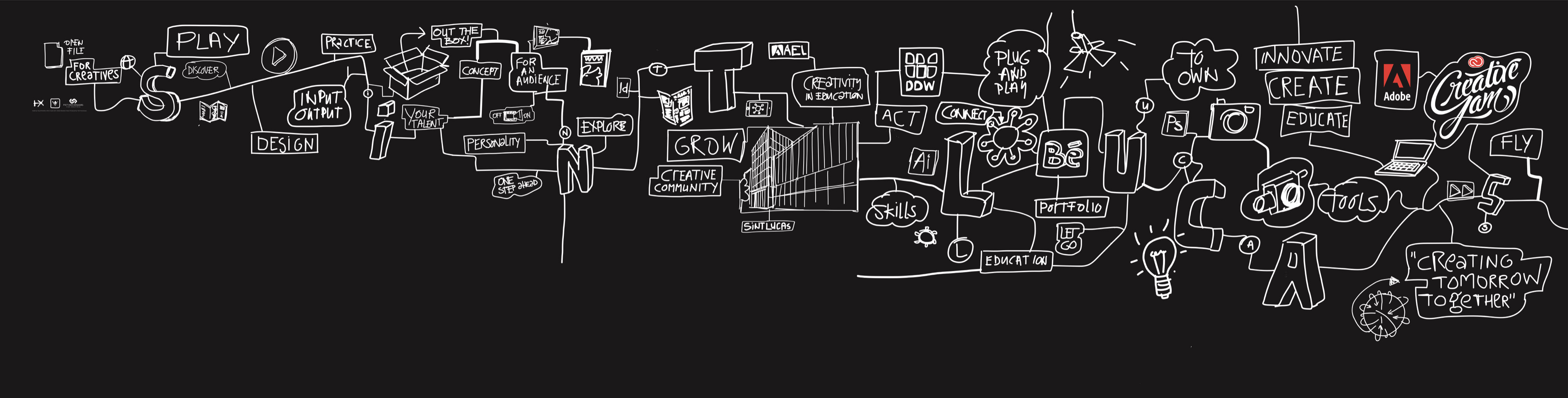
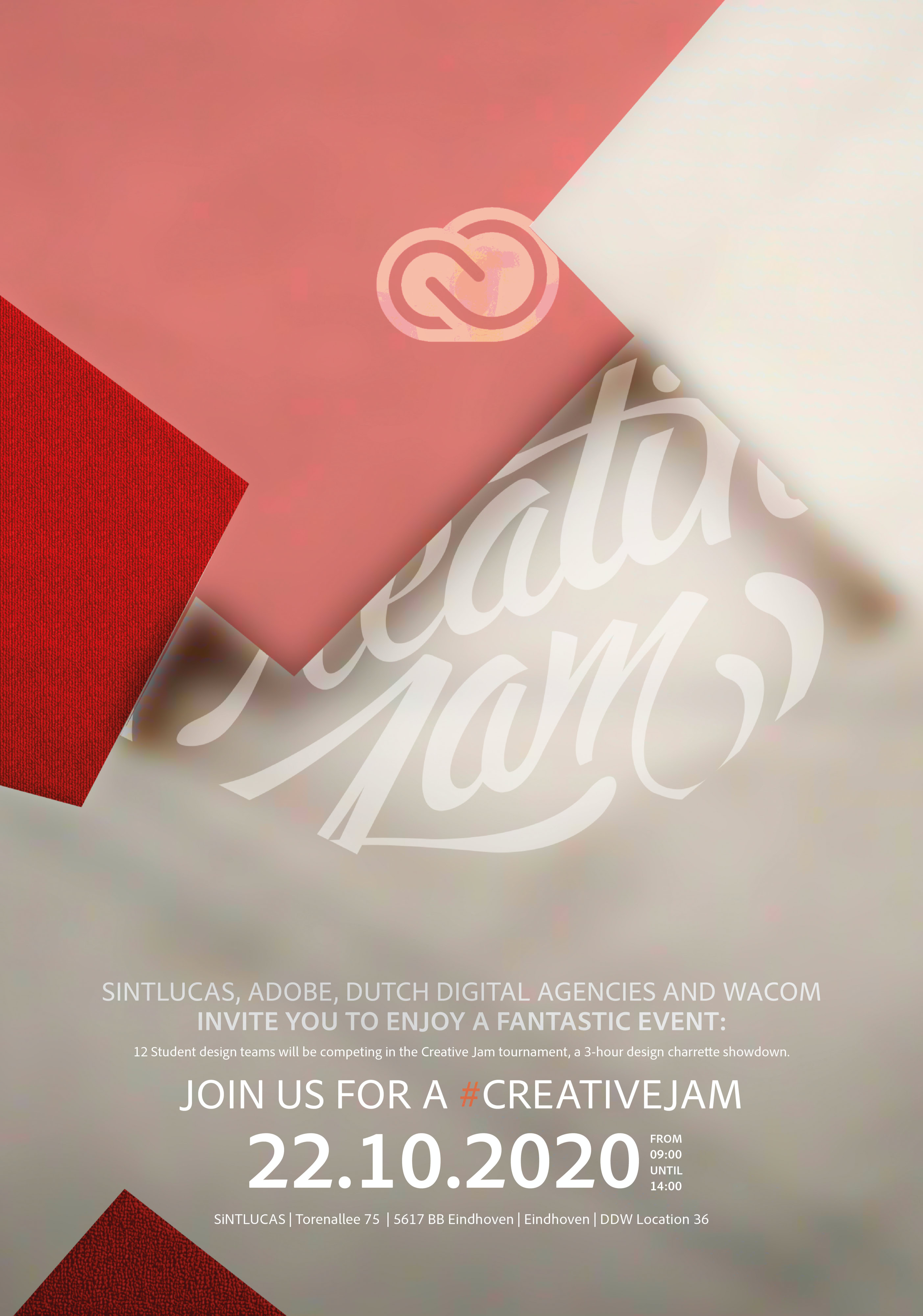
Event Design - Adobe Creative Jam
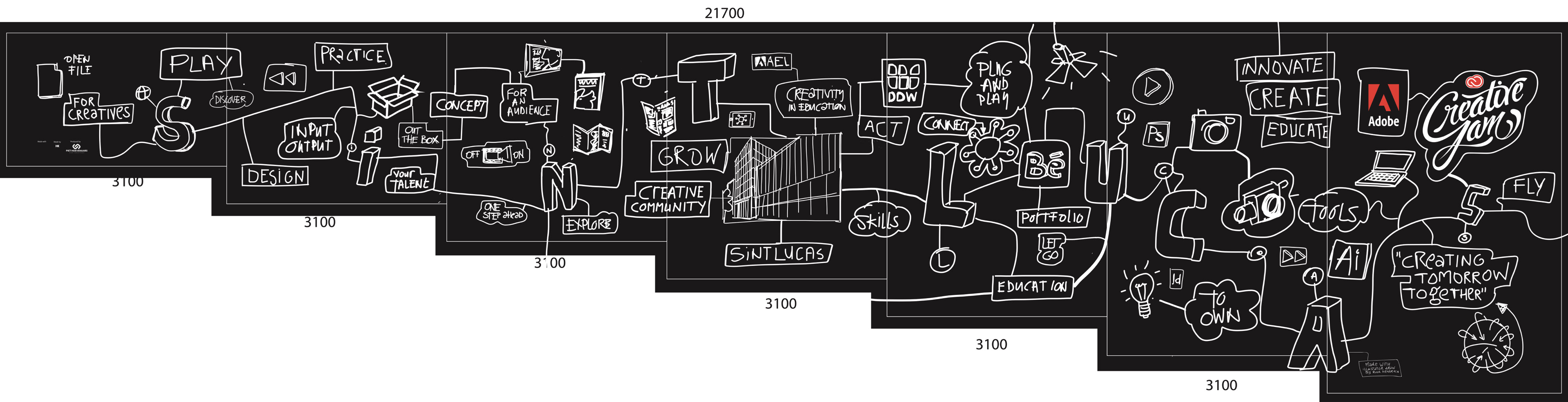
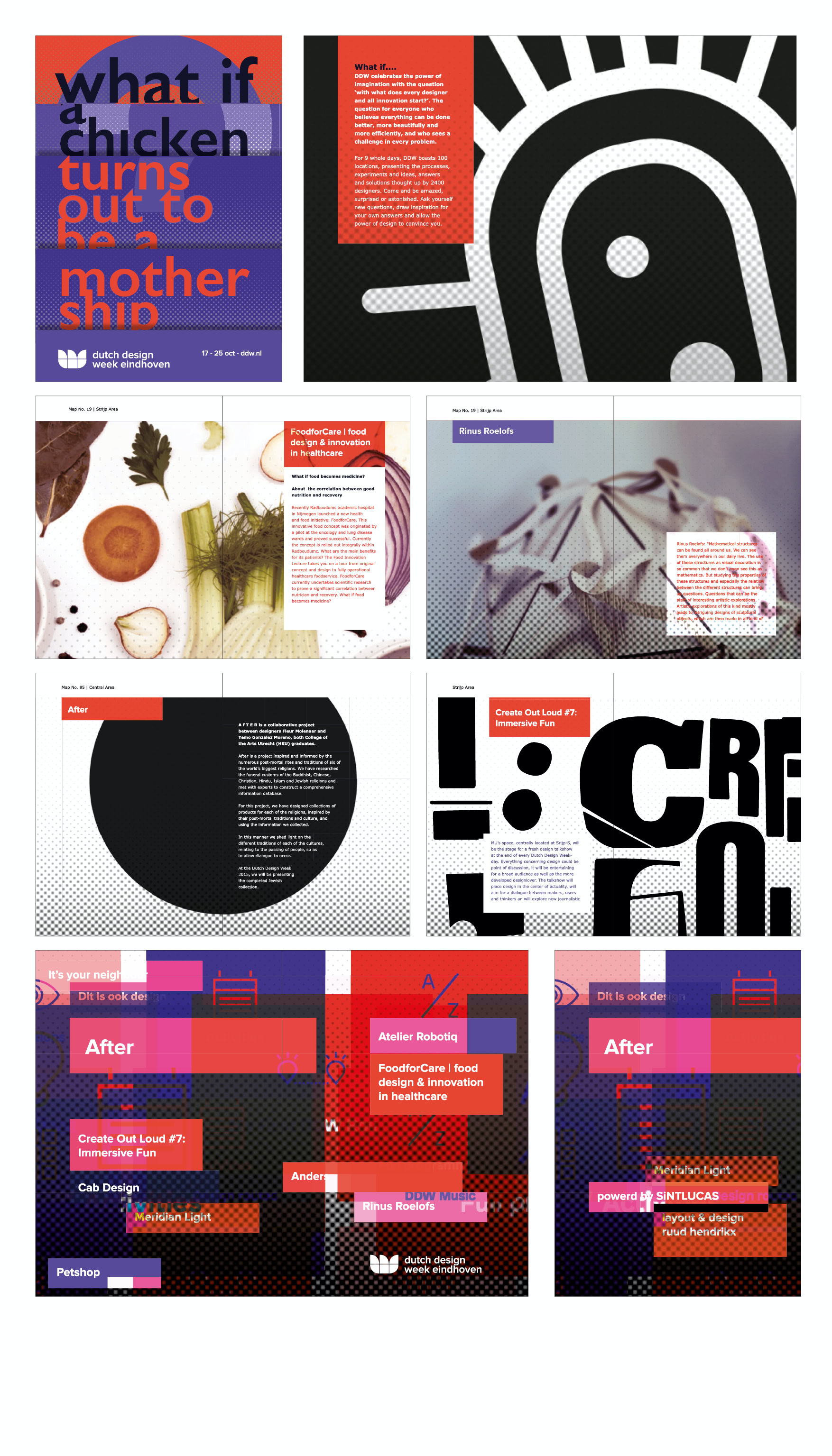
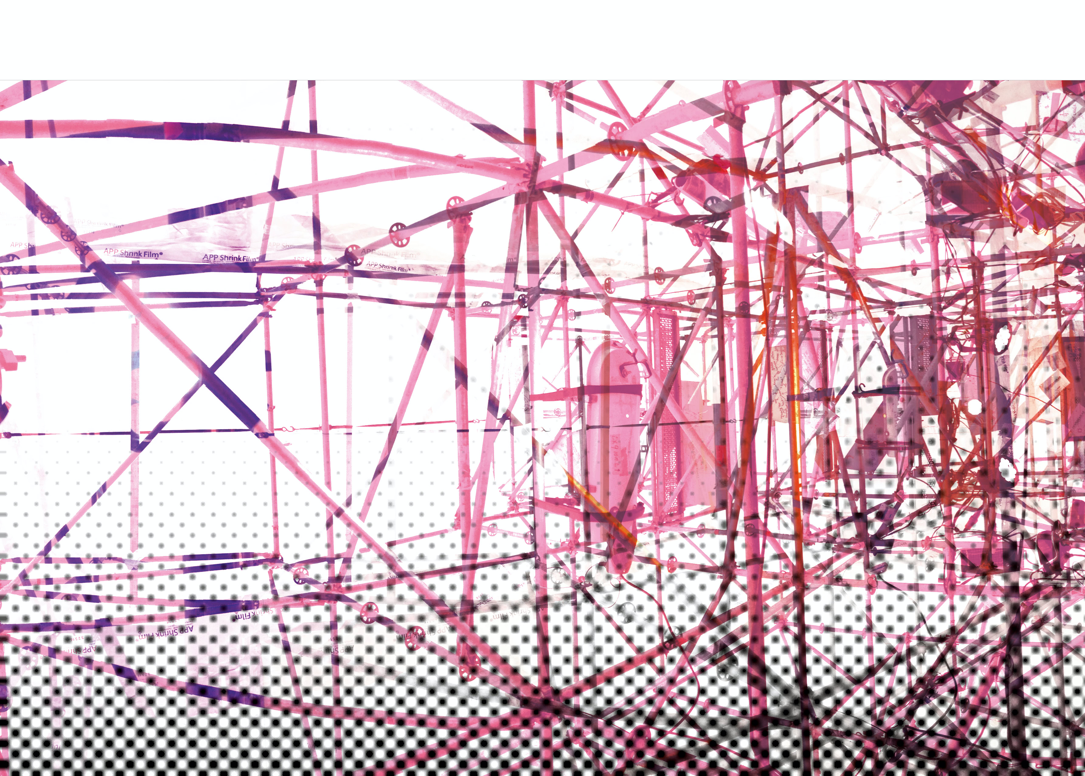
Production Process banner 22 m x 7 m for the Adobe Creative Jam Sintlucas/DDW
Ruud Hendrikx | It’s all about concept
Creative Educator & Visual Designer
Adobe Creative Jam | DDW
Ruud Hendrikx | It’s all about concept
Creative Educator & Visual Designer
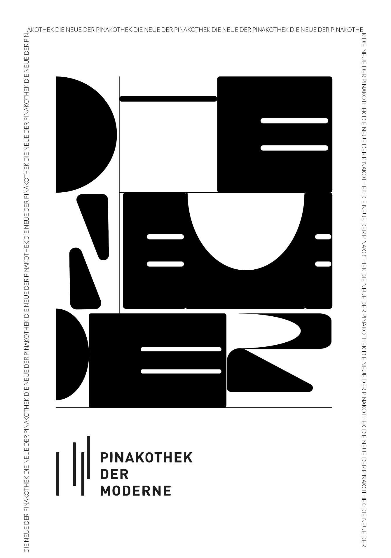
7 Fragments
I had the opportunity to accompany a
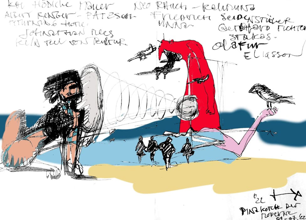
group of pupils from the art class of the Dominicus von Linprun Gymnasium (Viechtach) to the Pinakothek-der-moderne (Munich), as a facilitator, and it became clear once again how important it is for pupils (and teachers -;) to have the opportunity to develop creatively, and where better to do so, than in a place that inspires, amazes, fascinates and immerses them/us in the world of creation.
Workshop : Fragments
Location: Pinakothek der Moderne
Assignment:: collect 7 fragments selected from 7 different artworks and form a new artwork with these 7 fragments.
Ruud Hendrikx | It’s all about concept
Creative Educator & Visual Designer
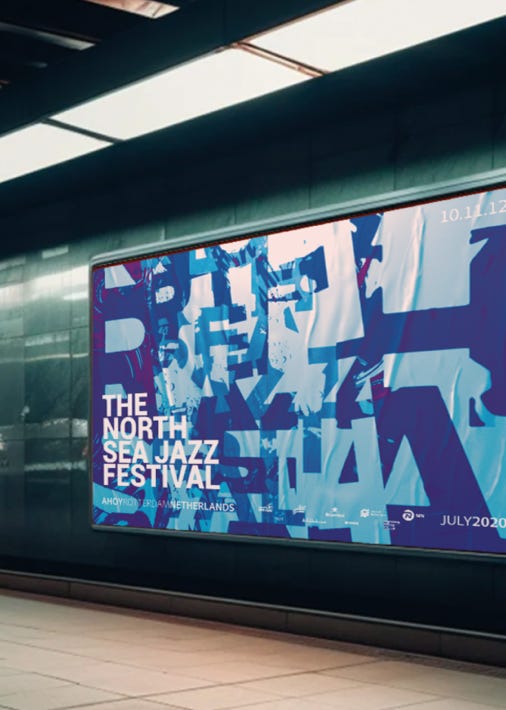
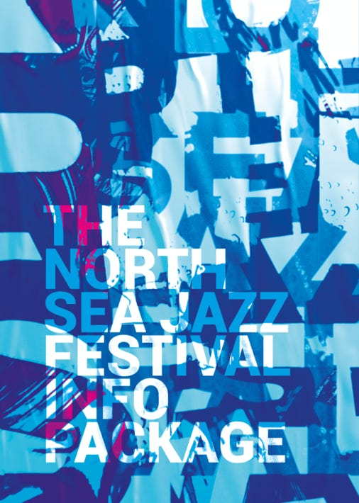
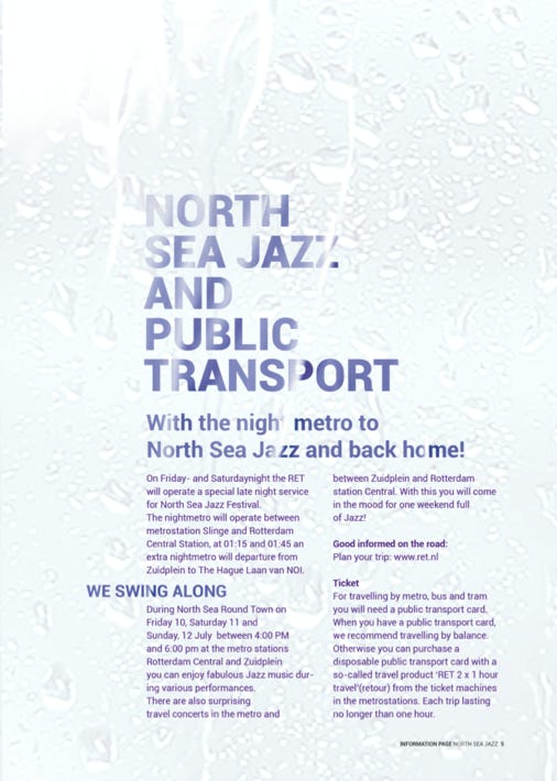
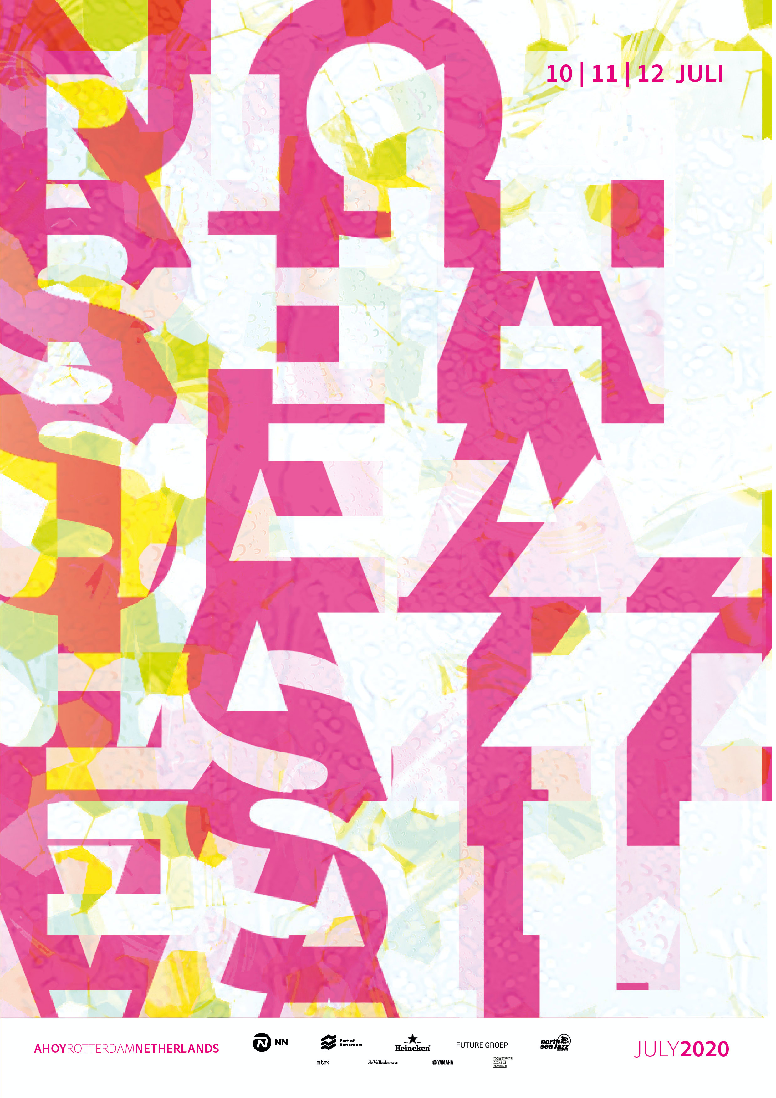
North Sea Jazz
North Sea Jazz Festival
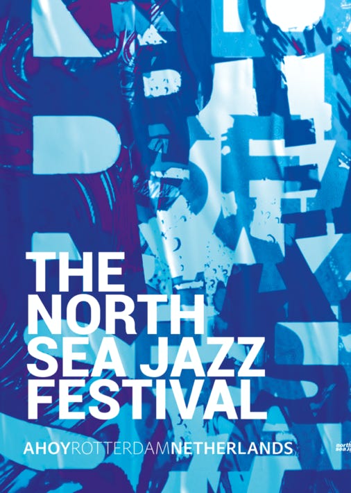
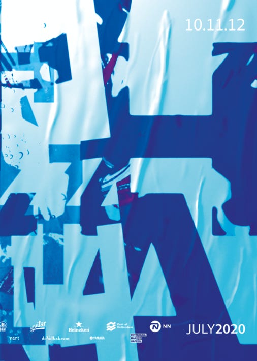
Poster & Info Package
Ruud Hendrikx | It’s all about concept
Creative Educator & Visual Designer
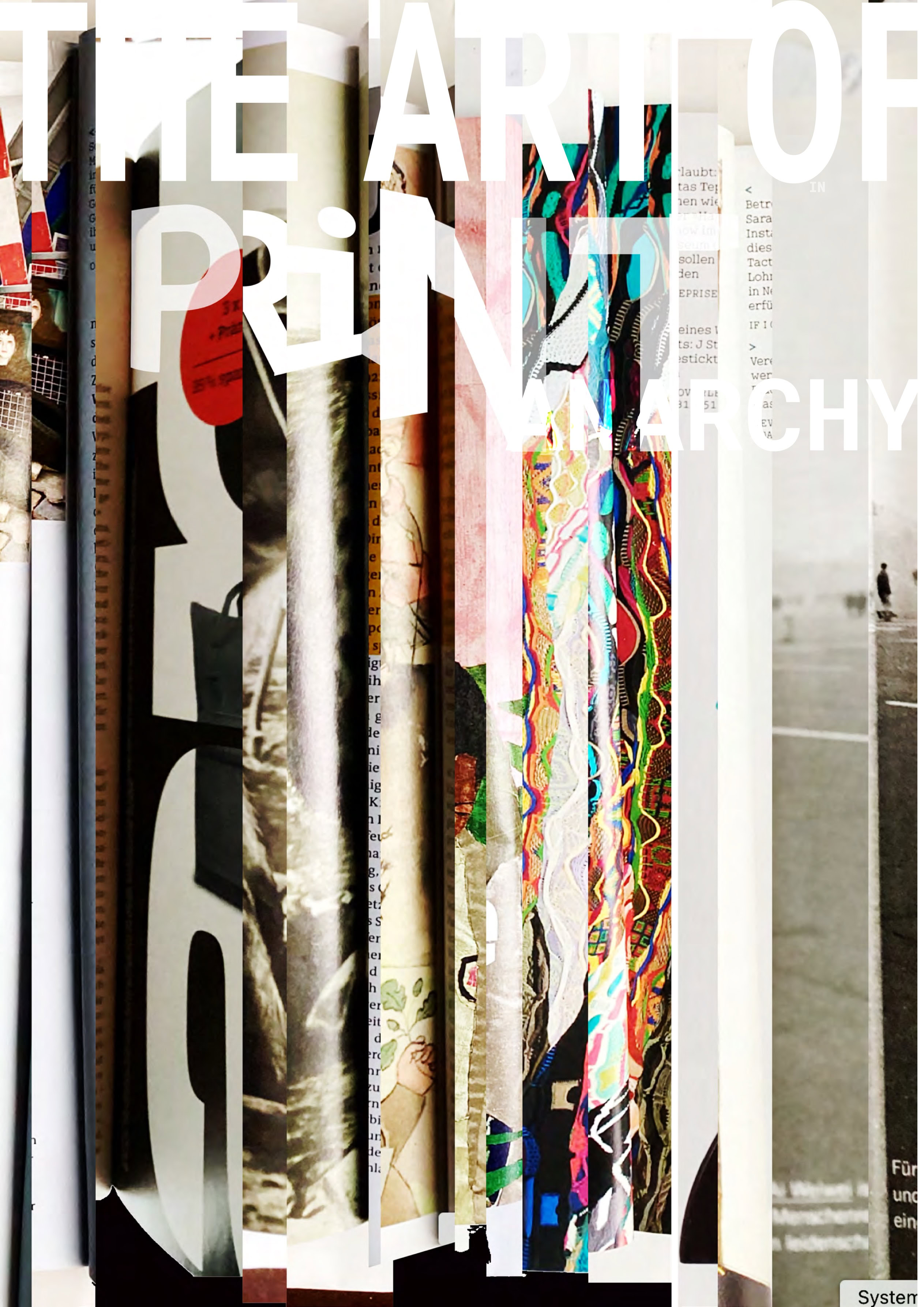
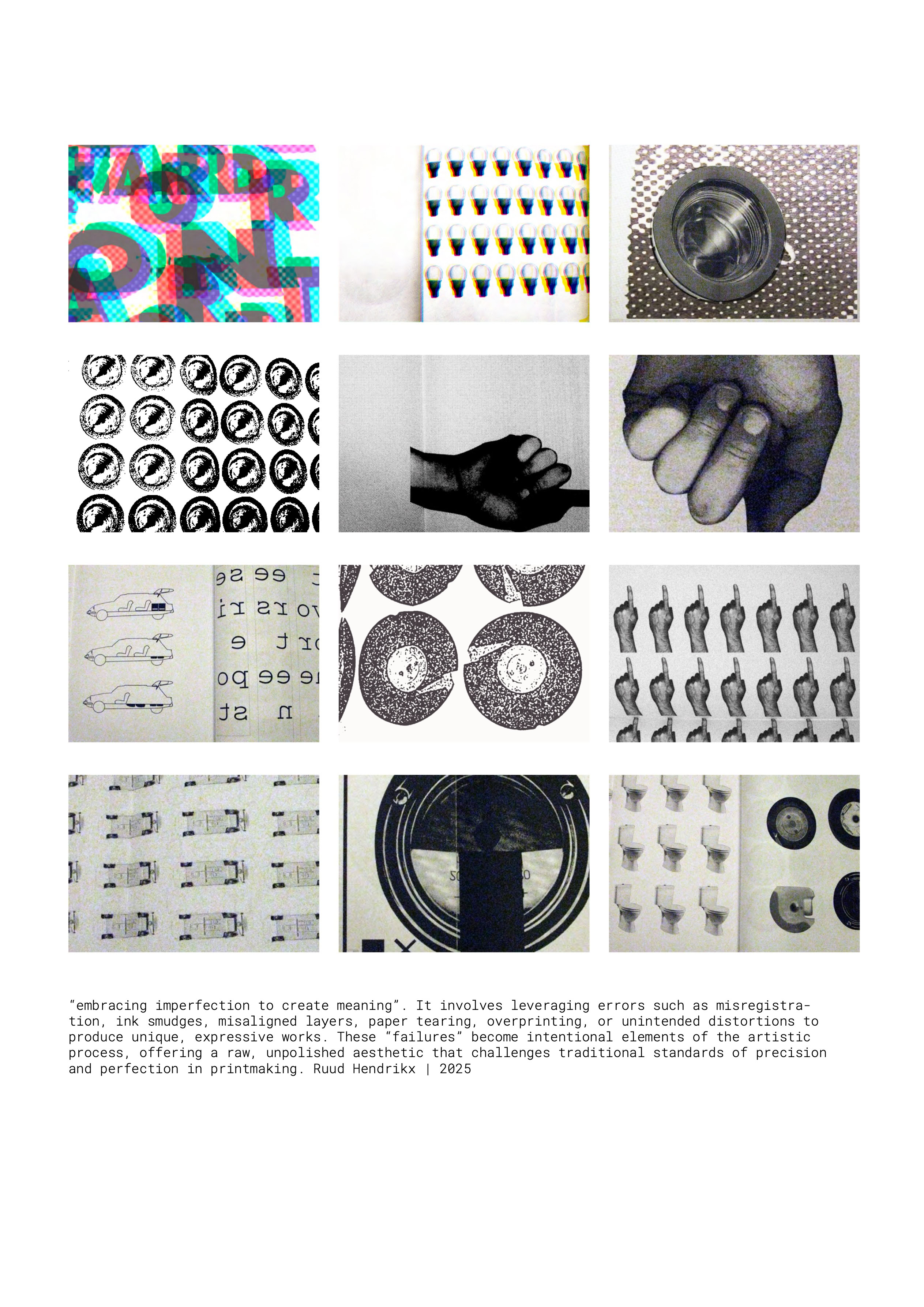
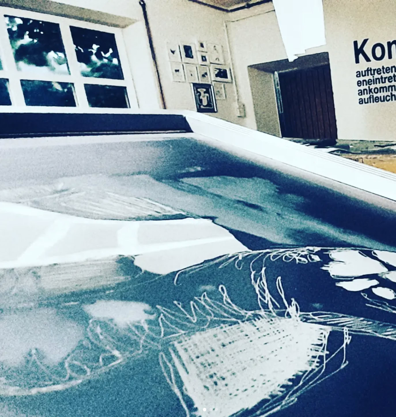
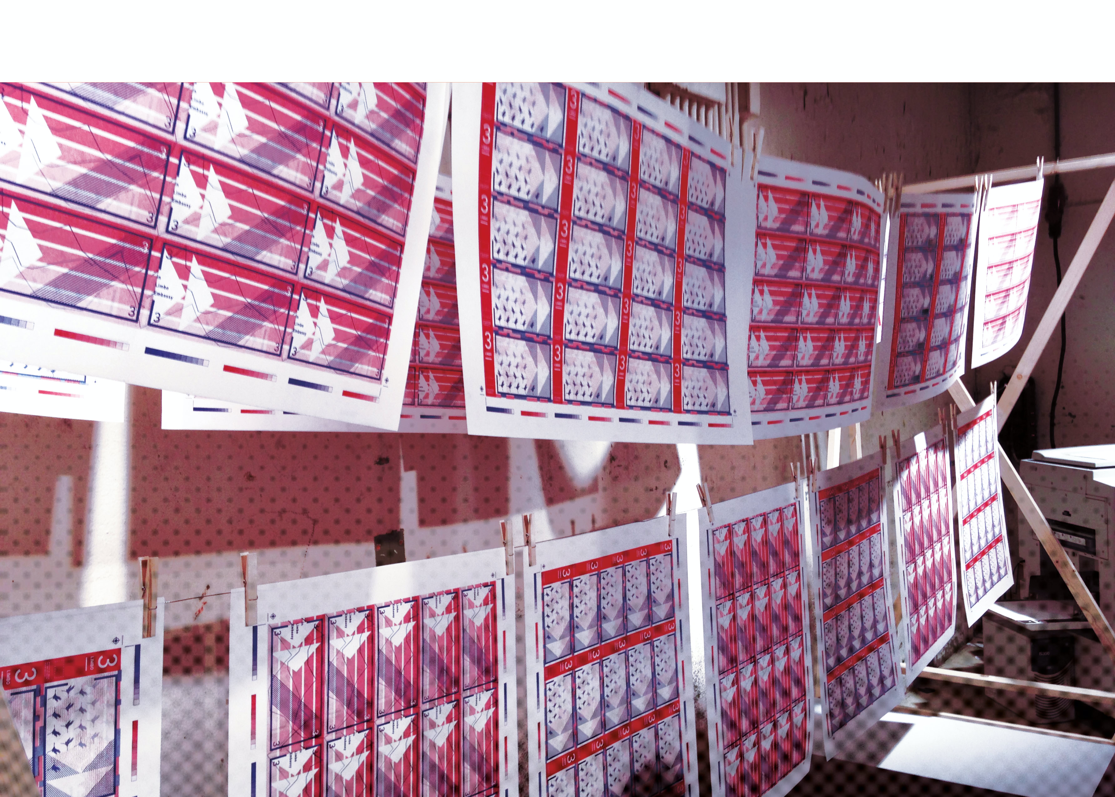
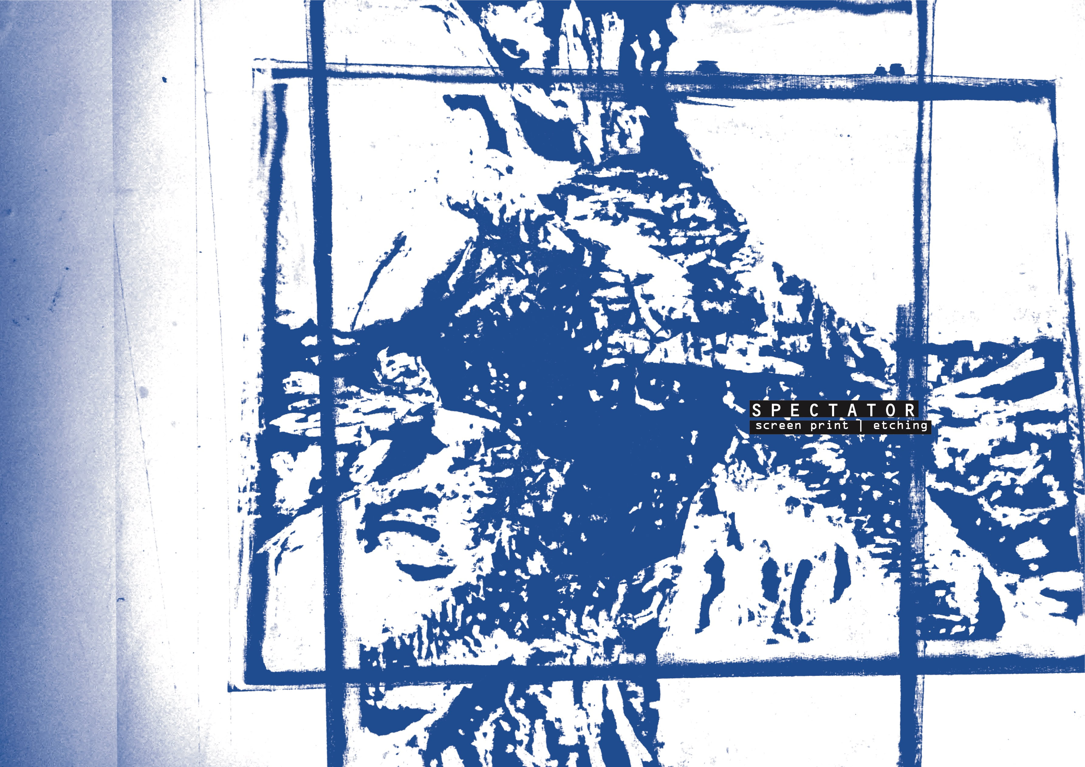
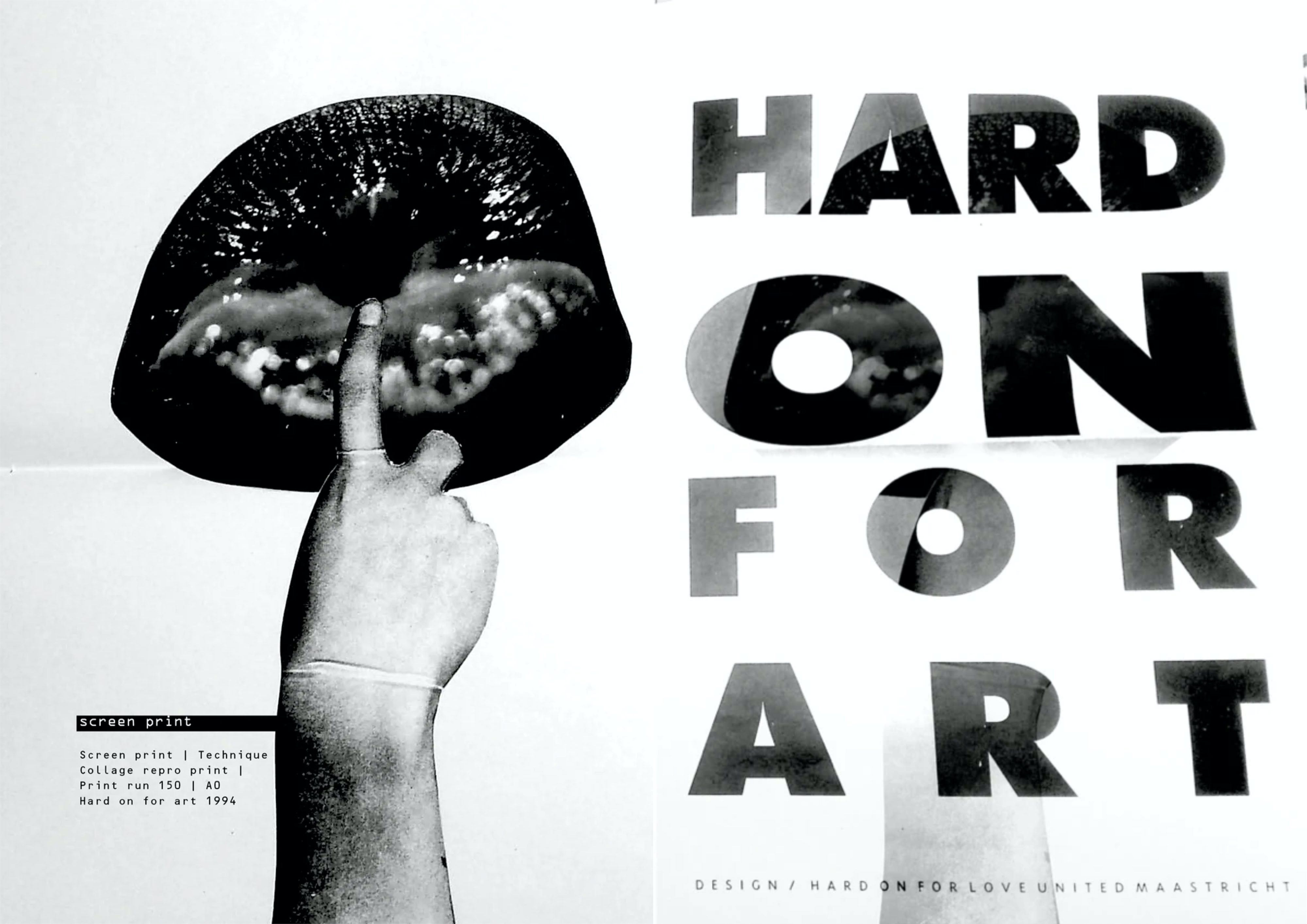
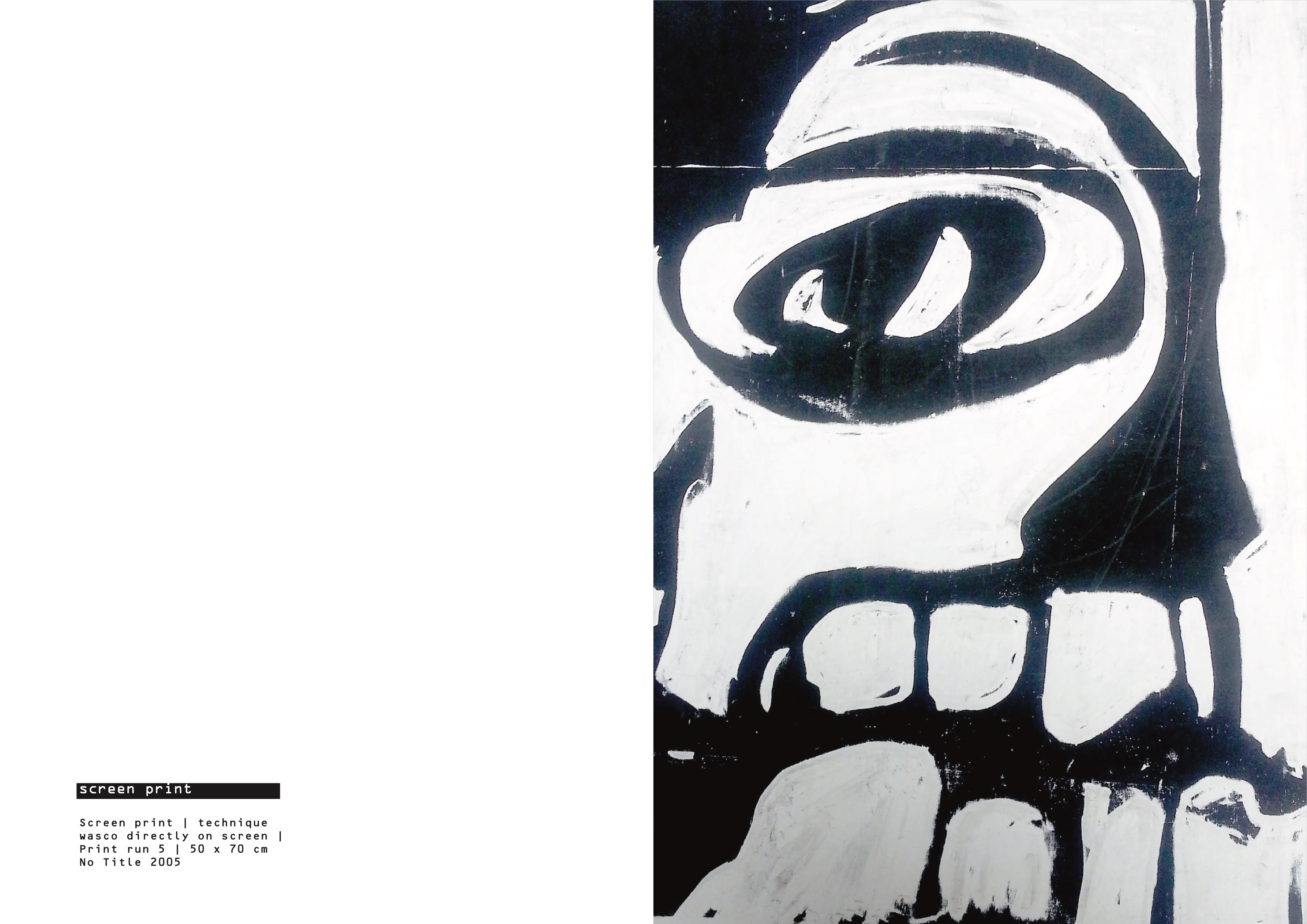
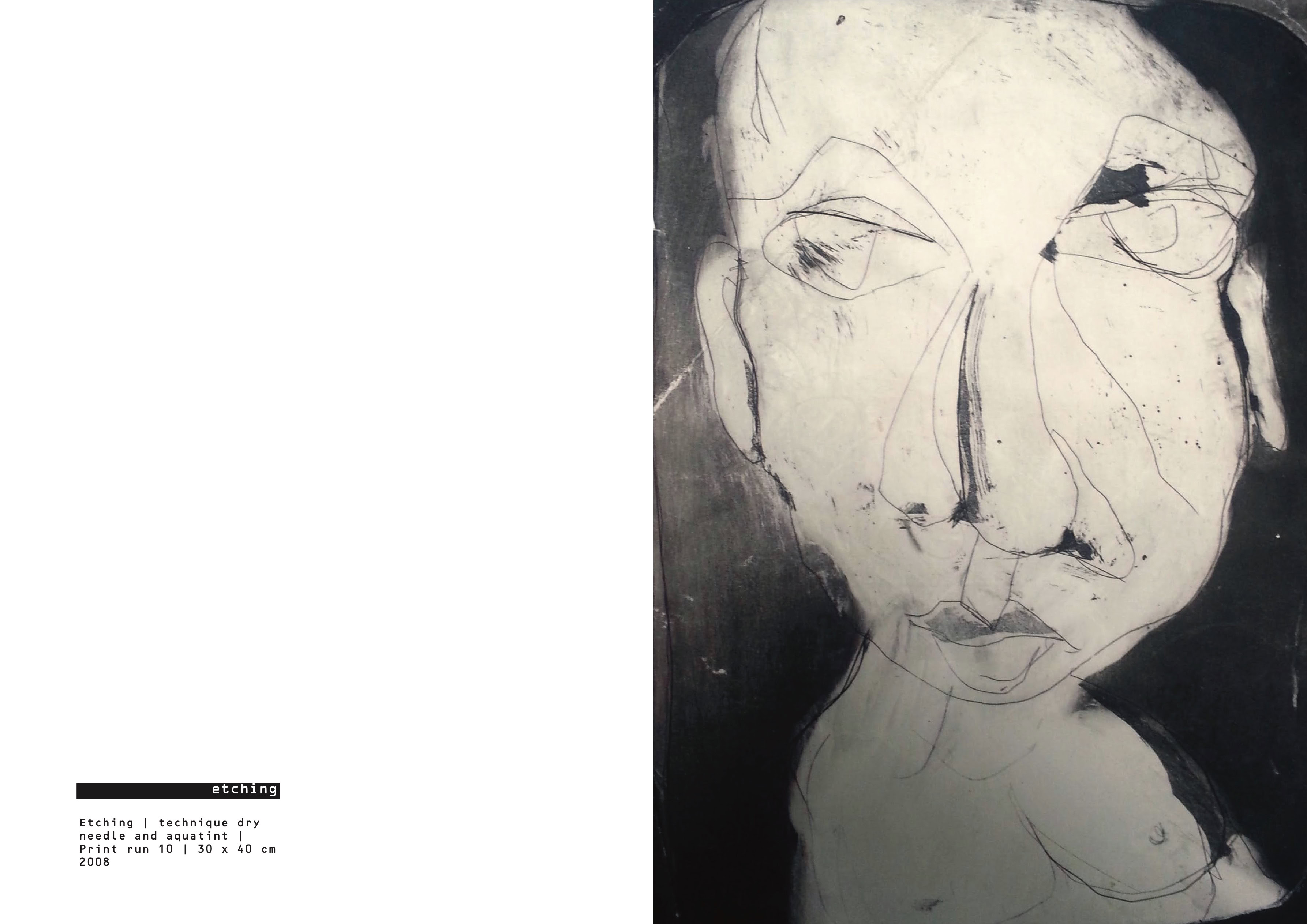
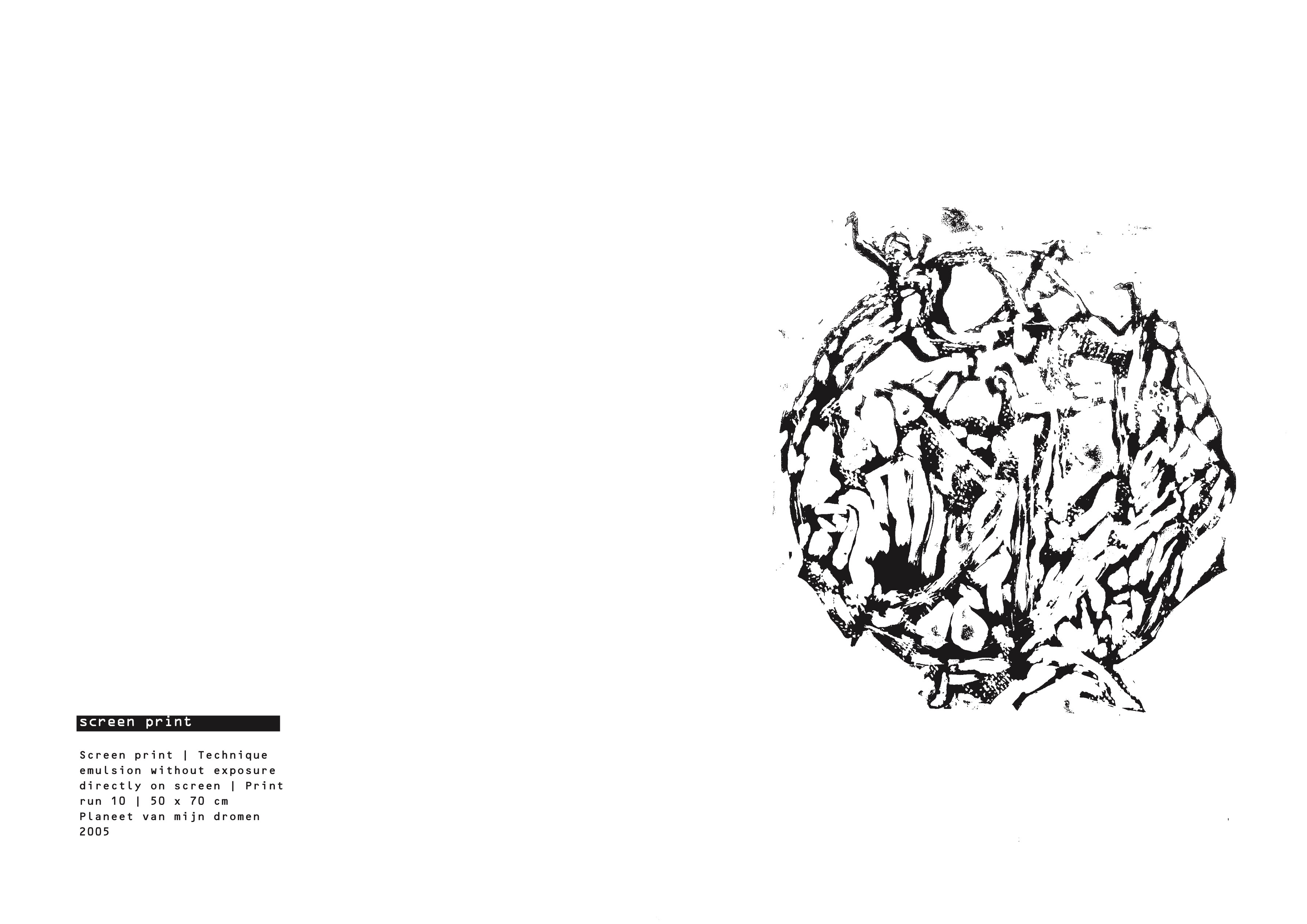
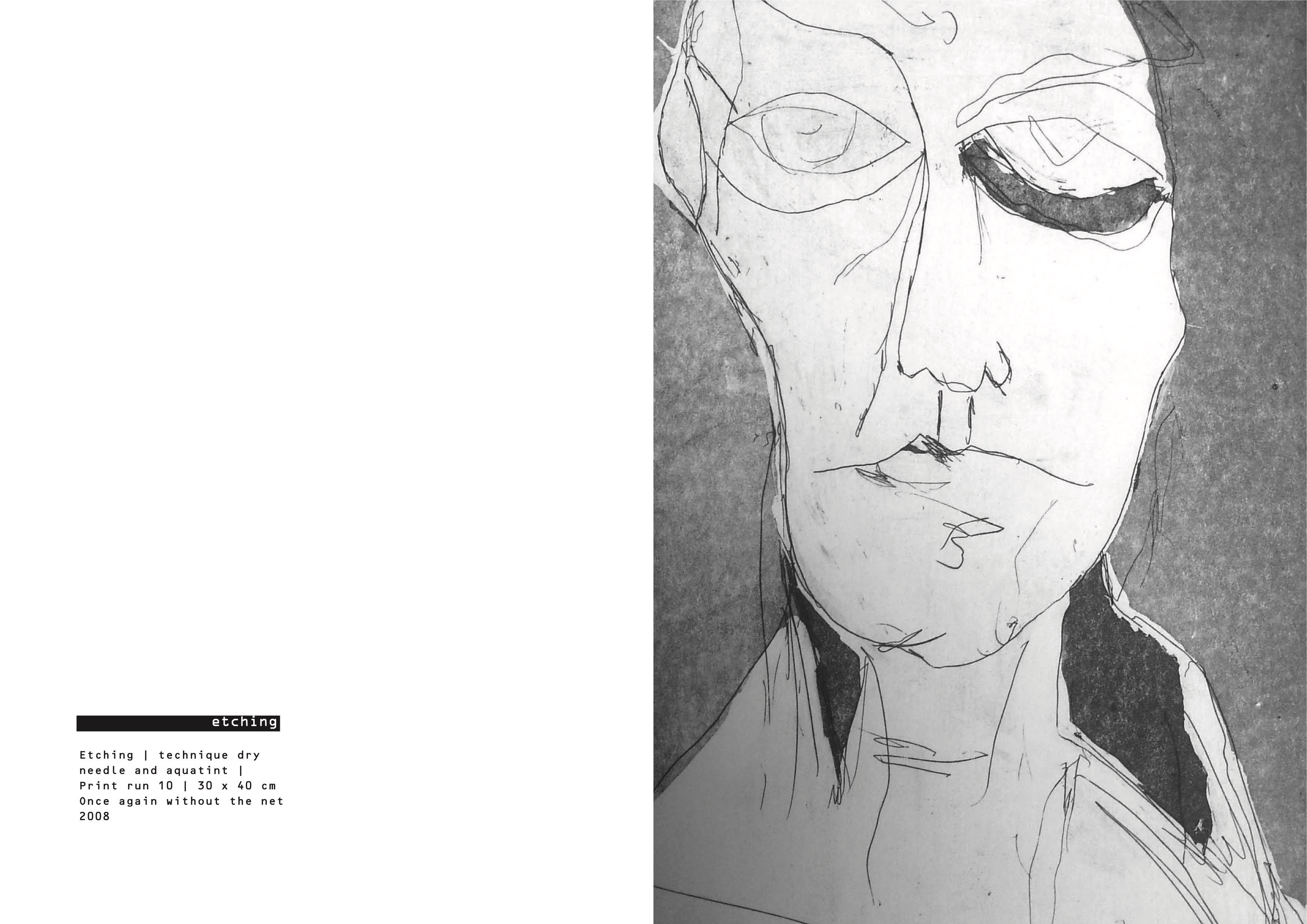
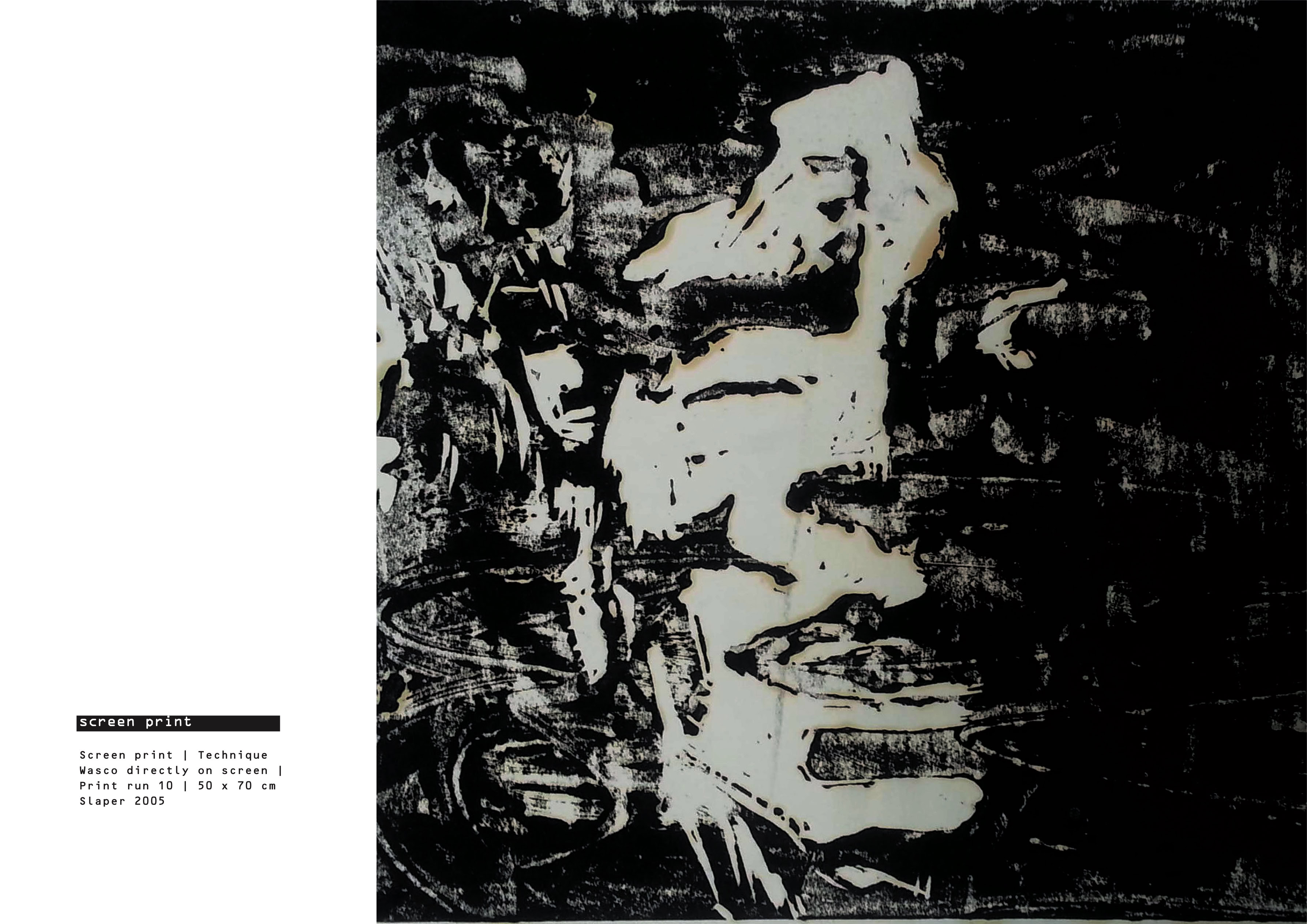
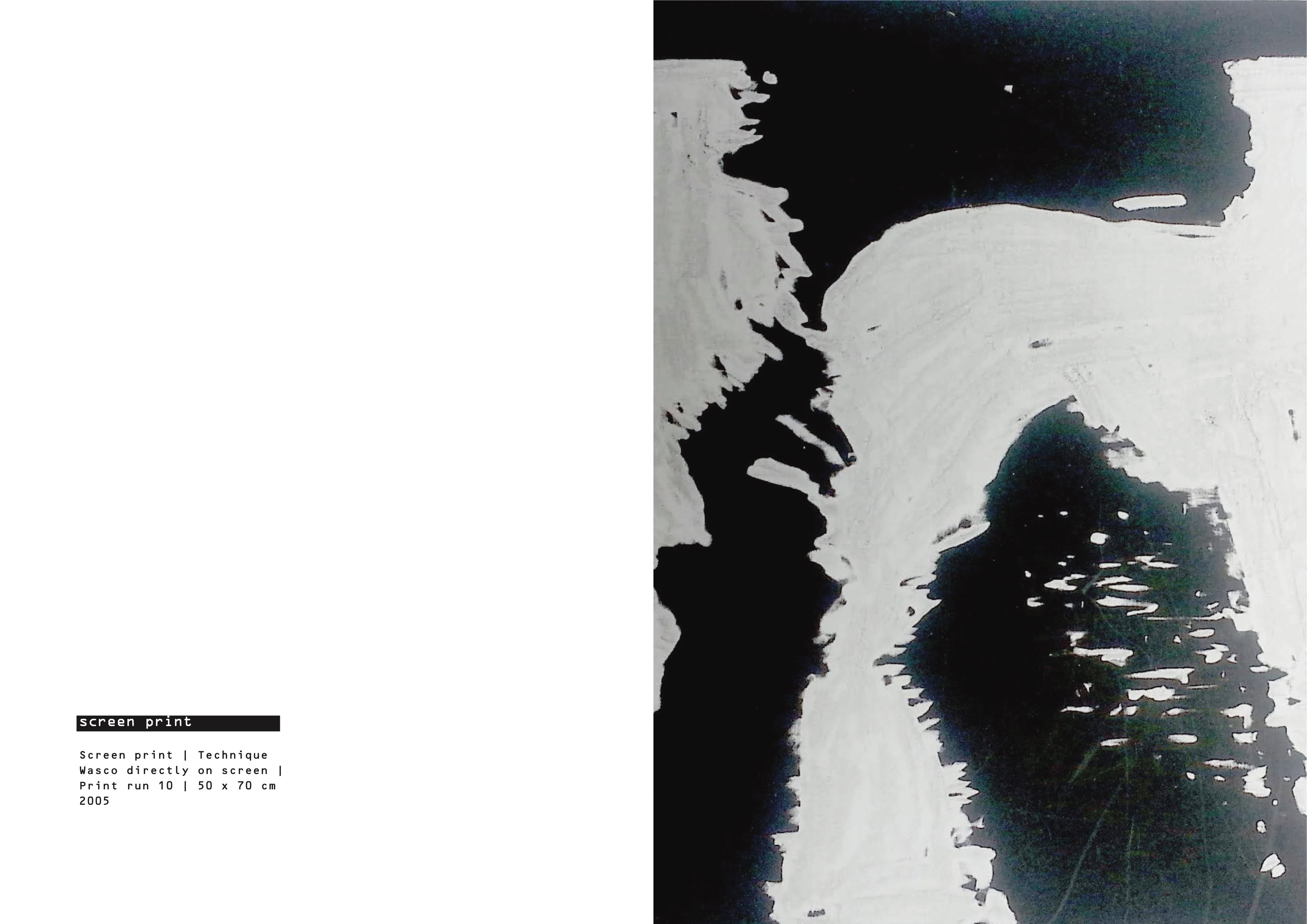
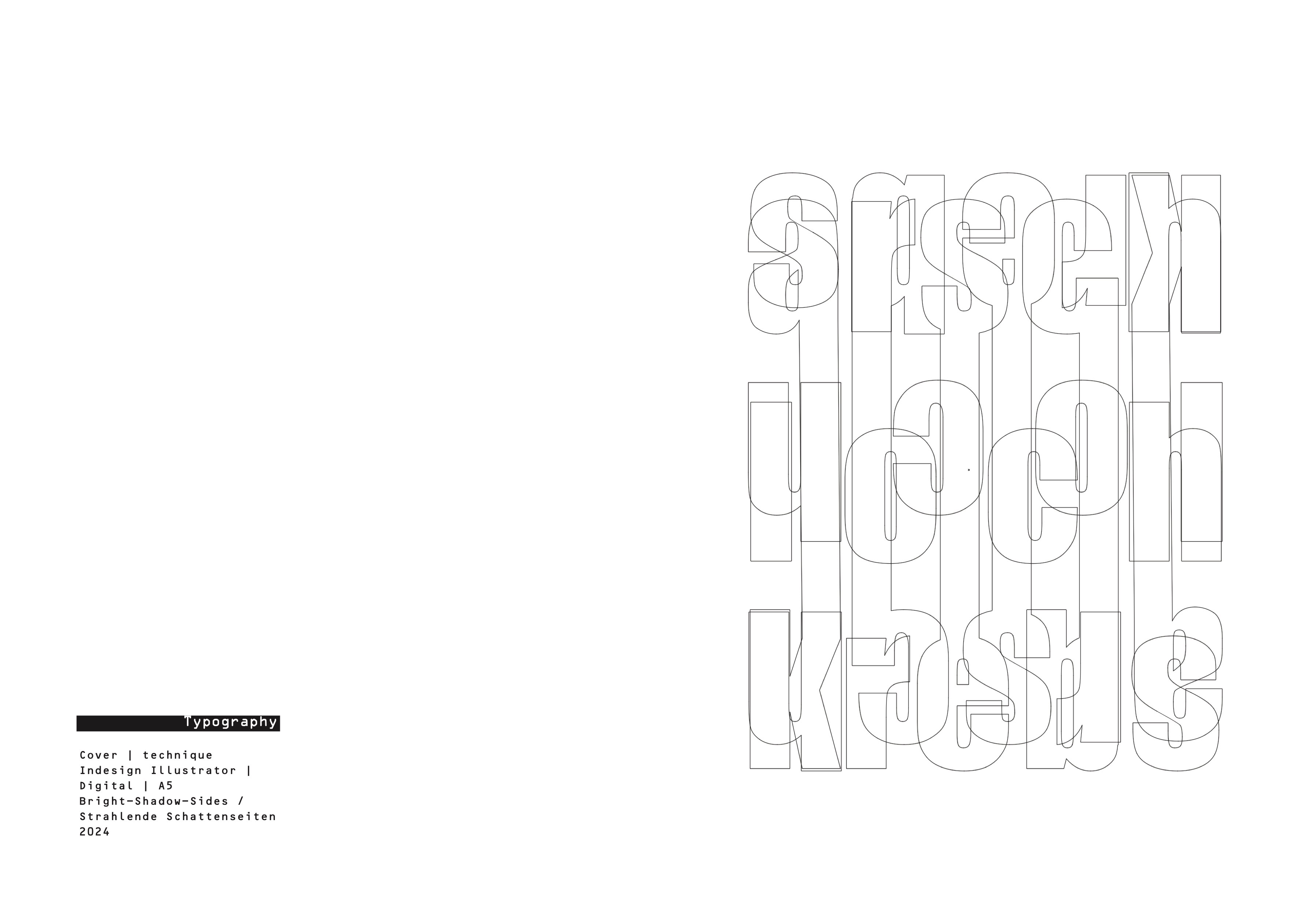
THE ART OF PRINT ANARCHY | Catalogue
embracing imperfection
to create meaning
It involves leveraging errors such as misregistration, ink smudges, misaligned layers, paper tearing, overprinting, or unintended distortions to produce unique, expressive works. These “failures” become intentional elements of the artistic process, offering a raw, unpolished aesthetic that challenges traditional standards of precision and perfection in printmaking.
Ruud Hendrikx | It’s all about concept
Creative Educator & Visual Designer
Truly Rewarding ( K001-56ST-MP )
I find great joy in challenging talent, pushing them beyond what they think is possible. It's in those moments of struggle and discovery that true growth happens. Guiding them through each step, watching them navigate challenges with determination, is where I see their strength unfold. The perseverance they show, the resilience in their journey, all culminates in an outcome that is more than just a finished product—it's a testament to their dedication and potential. To witness this transformation is truly rewarding.
Ruud Hendrikx | It’s all about concept
Creative Educator & Visual Designer
Adobe Logo Remix, Remix, Remix,…..
Over 90 students enthusiastically engaged in the Creative Jam, a collaborative effort between Dutch Digital Design, Dutch Digital Agencies, and SintLucas, held during Dutch Design Week. It was an exhilarating day filled with creativity and innovation! These aspiring talents delved into a case for Philips Lighting, guided by esteemed professionals from GRRR, Dept Agency, Hike One, IN10 Design & Innovation Agency, Greenberry, Redkiwi, gracious - building awesome brands, Resoluut, Burst, Triple, MediaMonks, Intracto, and FCB Amsterdam.
(Organisation & Event Visuals: Ronald den Bekker, Ruud Hendrikx)
Ruud Hendrikx | It’s all about concept
Creative Educator & Visual Designer
An introduction to cross media campaigns | Preview
Ruud Hendrikx | It’s all about concept
Creative Educator & Visual Designer
self-portrait Remix Mashup
Ruud Hendrikx | It’s all about concept
Creative Educator & Visual Designer
COKExADOBExYOU
#COKExADOBExYOU | Storyboard/ Animated gif
Ruud Hendrikx | It’s all about concept
Creative Educator & Visual Designer
Recycle everything except great ideas
video collage from the assignment „Adobe Logo Remix“ | Presented during the Dutch Design Week | SintLucas | Digital Publishing | CMD (Id | Ru ) Music: America is waiting, Eno&Byrne
Ruud Hendrikx | It’s all about concept
Creative Educator & Visual Designer
In November 2018, the Toolbox philosophy was presented
at the Adobe Educational Leaders Summit at London’s
Design Museum “Just Click it!”
Ruud Hendrikx | It’s all about concept
Creative Educator & Visual Designer
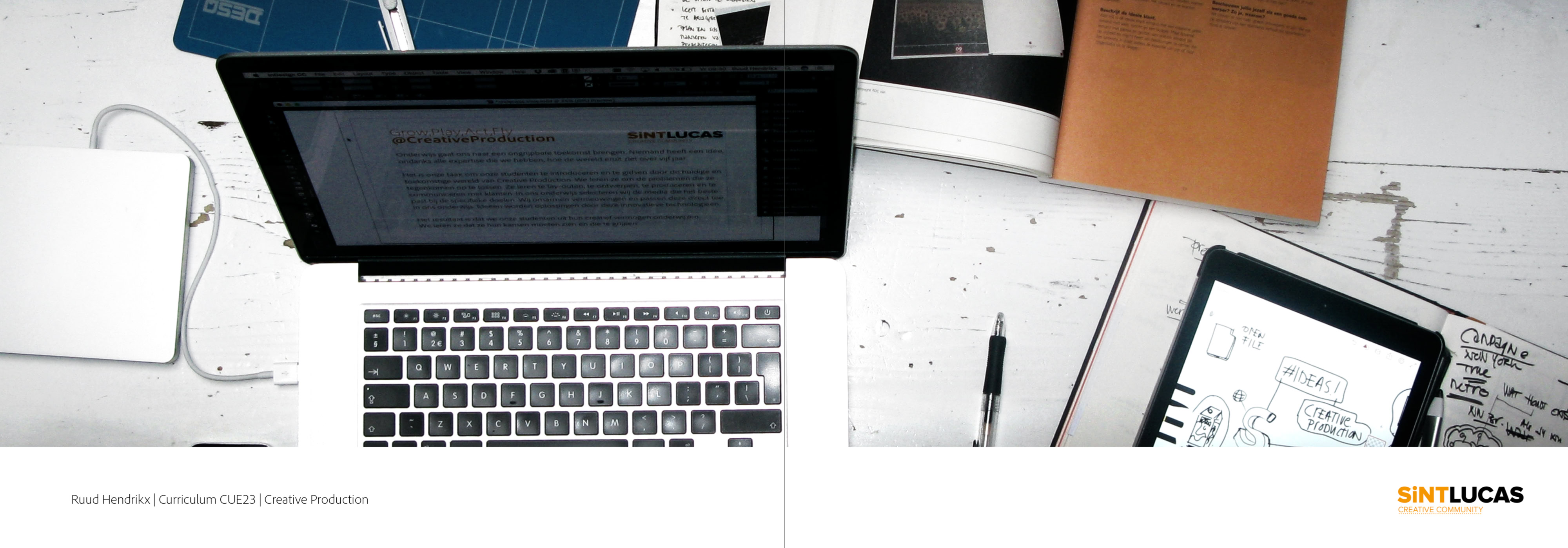
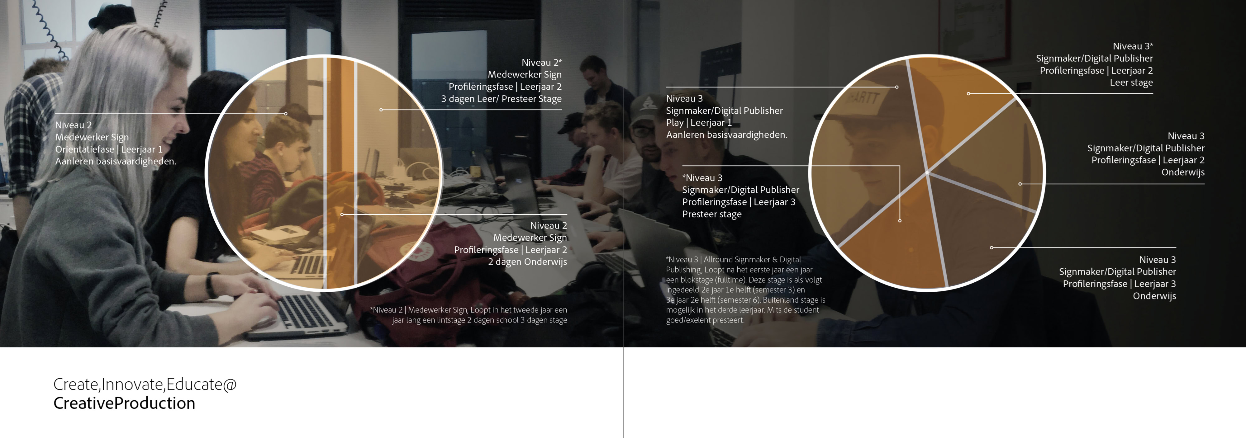
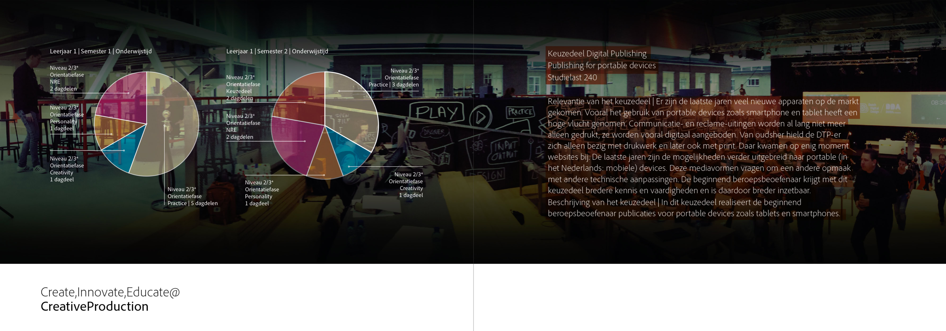
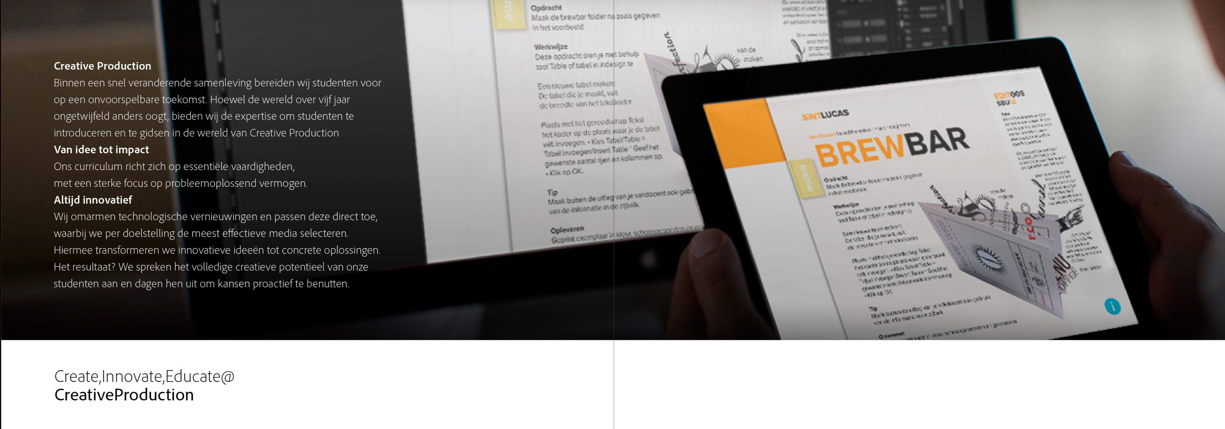
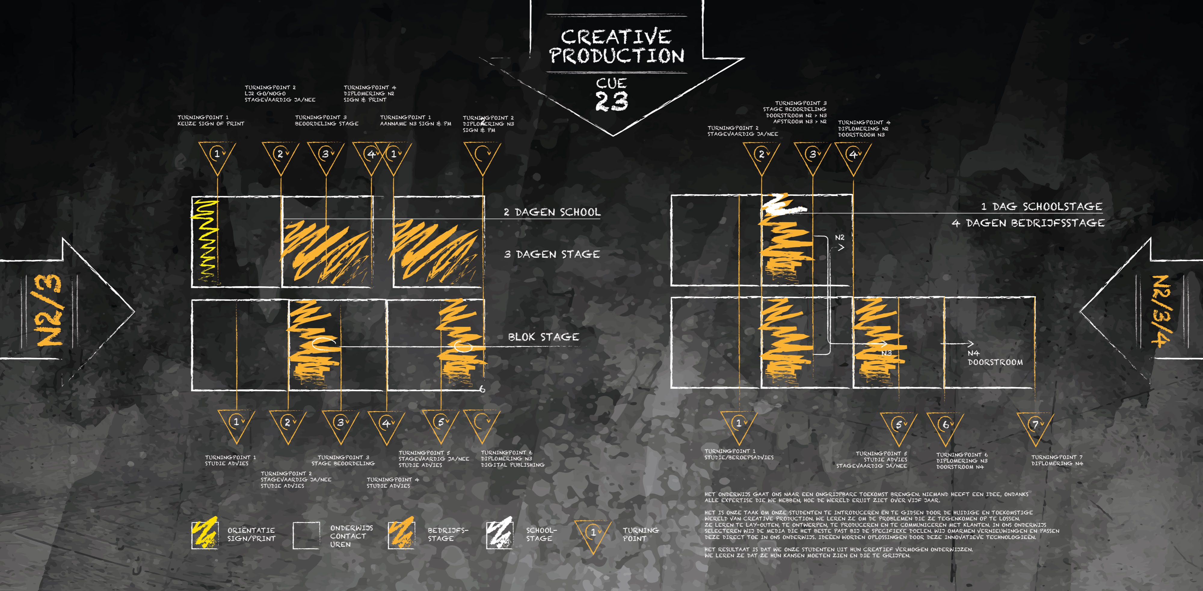
Curriculum | CUE23 | Creative Production
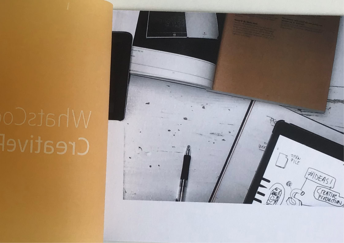
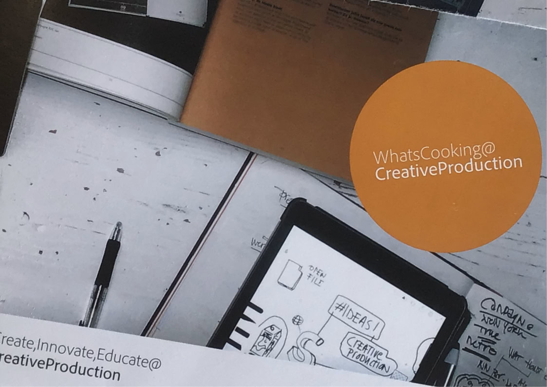
CUE23 Educational Vision Brochure: Shaping the Learning of Tomorrow Together
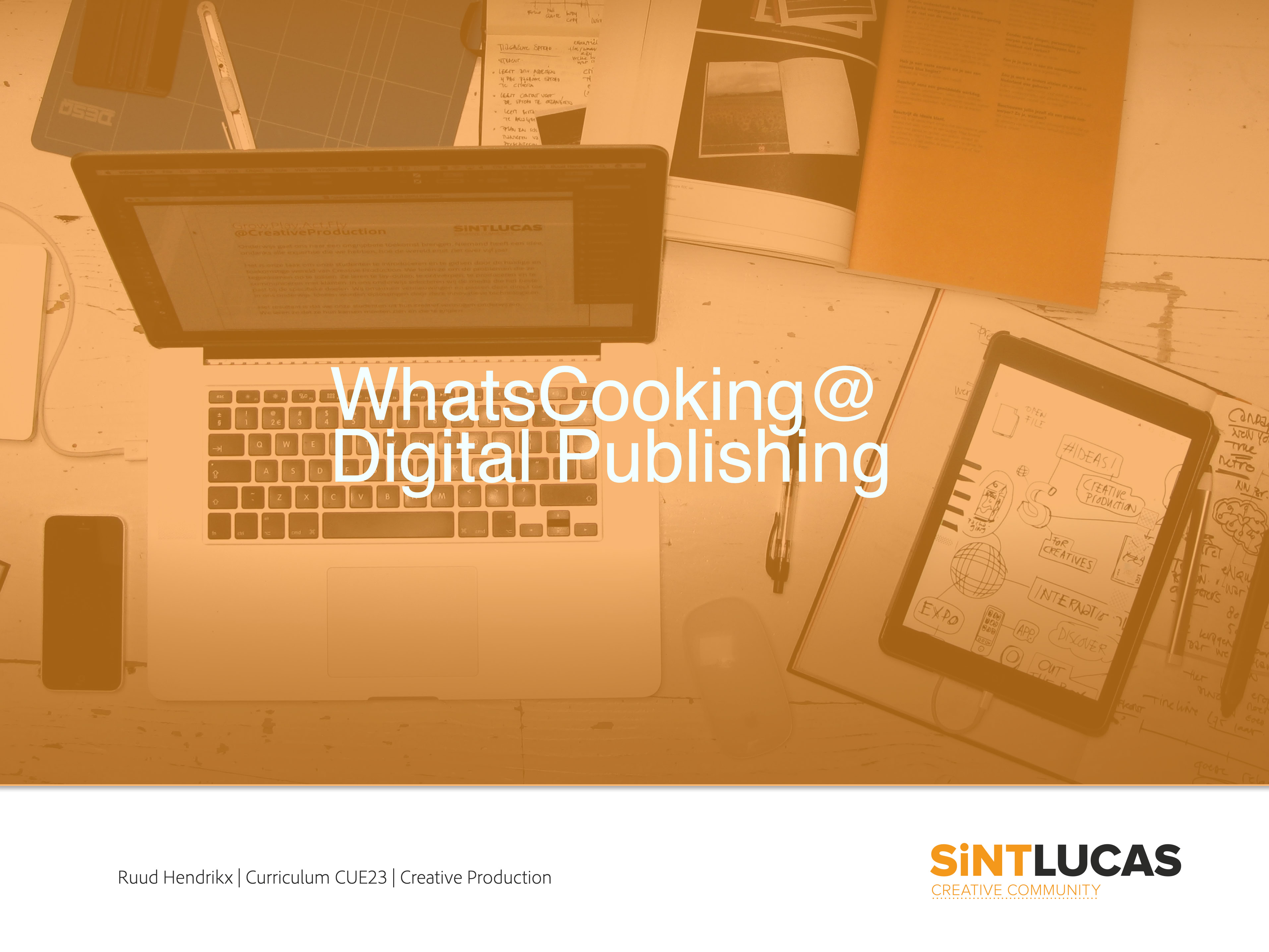
This brochure captures the heart and achievements of our CUE23 educational vision. It accompanies the presentation "What’s Cooking @ Creative Production?", which was delivered to the Education Committee.
It showcases how we are paving new ways with our flexible curriculum for the two- and three-year programmes in Eindhoven, ensuring today's talents
are perfectly prepared for a creative future.
Ruud Hendrikx | It’s all about concept
Creative Educator & Visual Designer
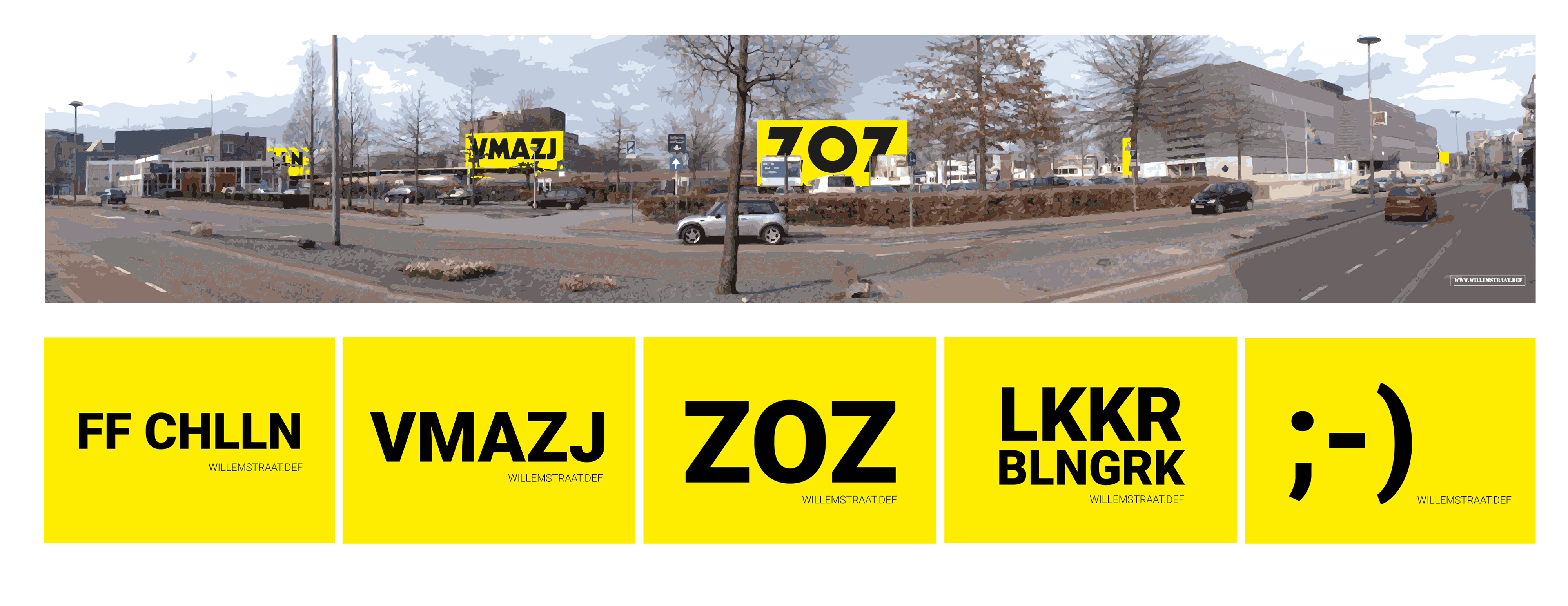
Willemstraat Def
Music: Skin - Fur Coat | Front 242
Toolbox | Just click it
and unlock your creative prowess!
It's crystal clear: sharing and collaborating are the lifeblood of progressive education, whether in the land of creativity or academia at large. Embracing a mindset of openness, heart, and fearlessness, we join forces with students, educators, and institutions to catalyze real change …
The Toolbox isn't just a static resource; it's a living, breathing entity fueled by the insights of students and continually refined through collaborative efforts. Designed to empower, it fast-tracks mastery of essential tools like Indesign, Illustrator, and Photoshop, ensuring students hit the ground running for their inaugural internships.
We thrive on those jaw-dropping "oh wows" as we guide them through the process. Our secret sauce? Concise, punchy instructions that liberate time for personalised attention. With tools segmented into digestible chunks, each accompanied by a spectrum of assignments, we pave the way from simplicity to more complex.
Ruud Hendrikx | It’s all about concept
Creative Educator & Visual Designer
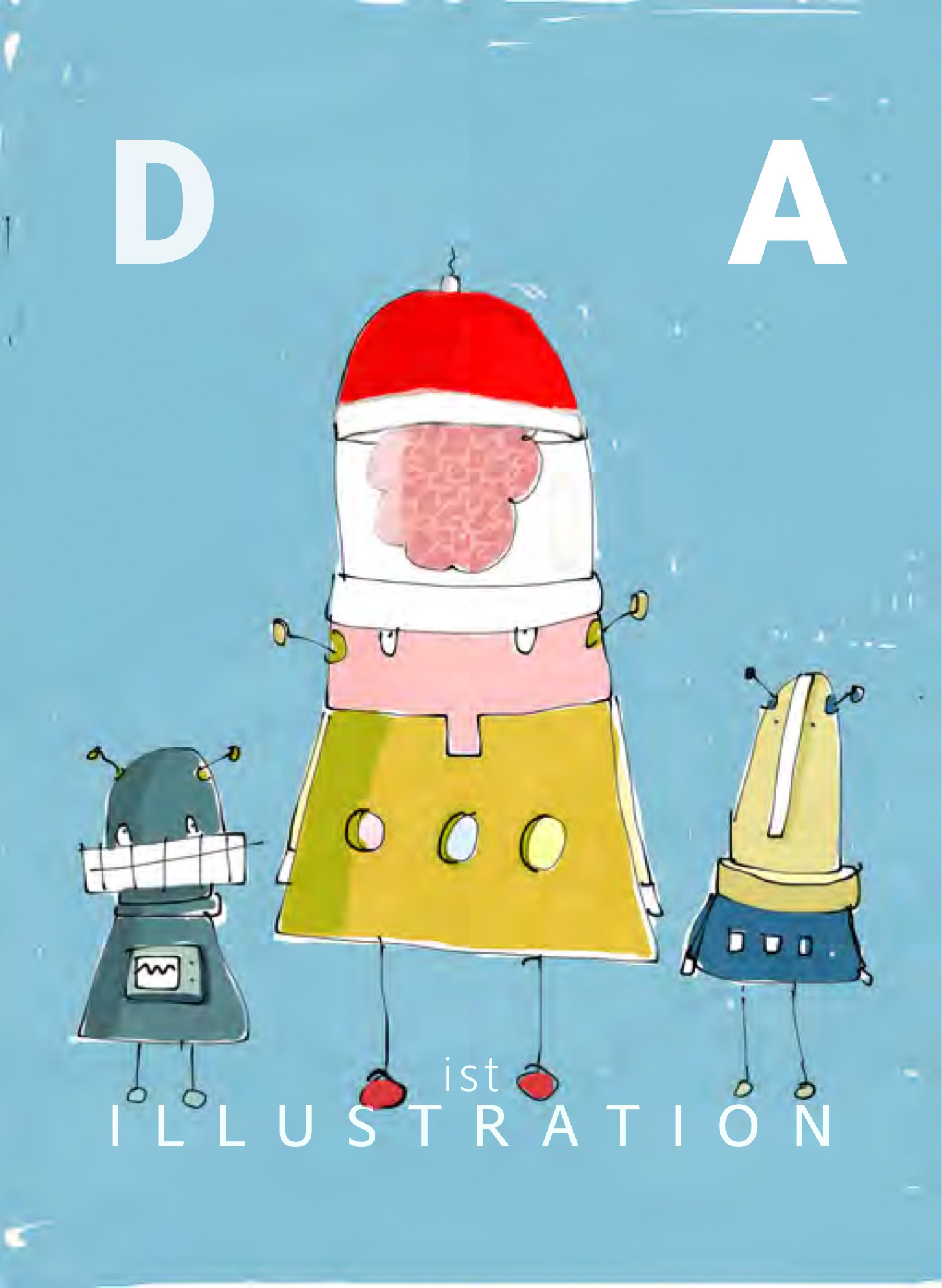
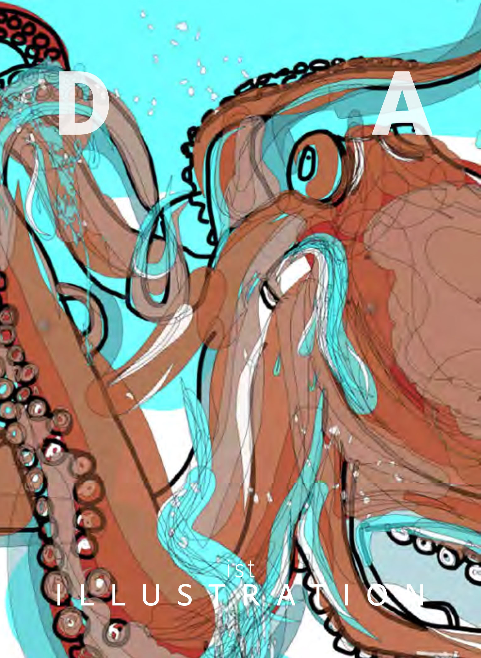
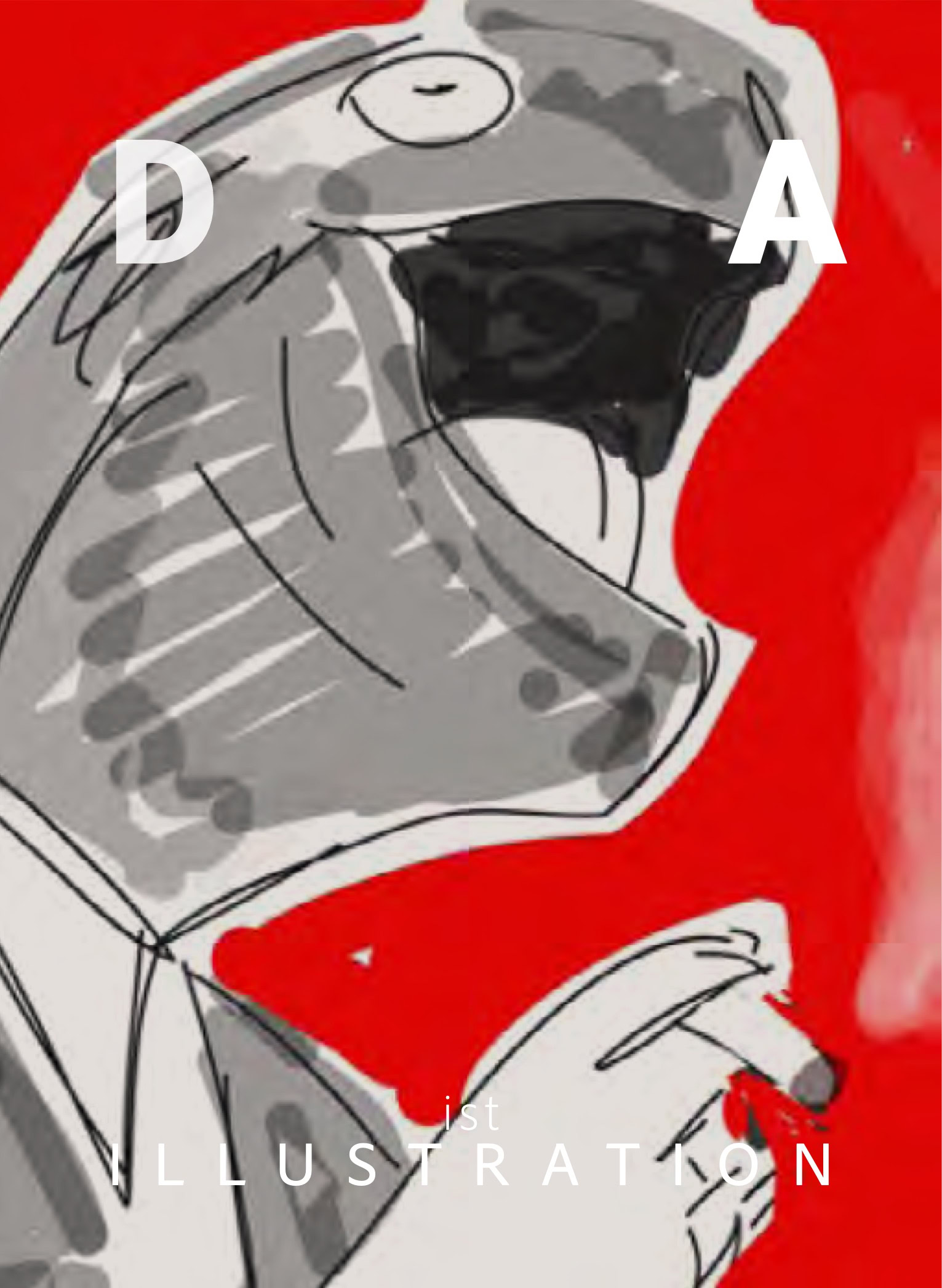
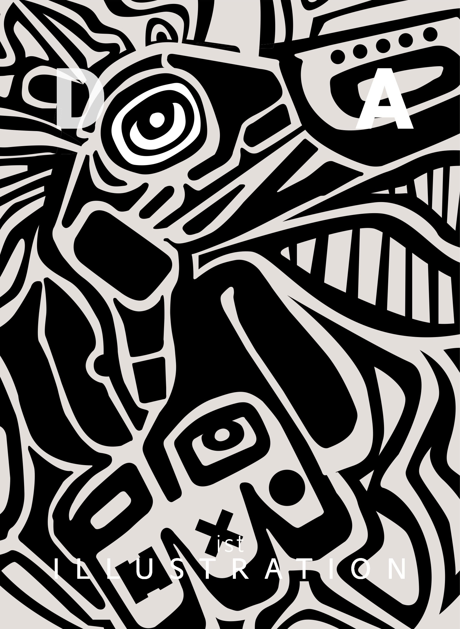
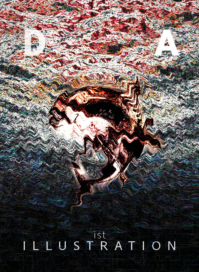
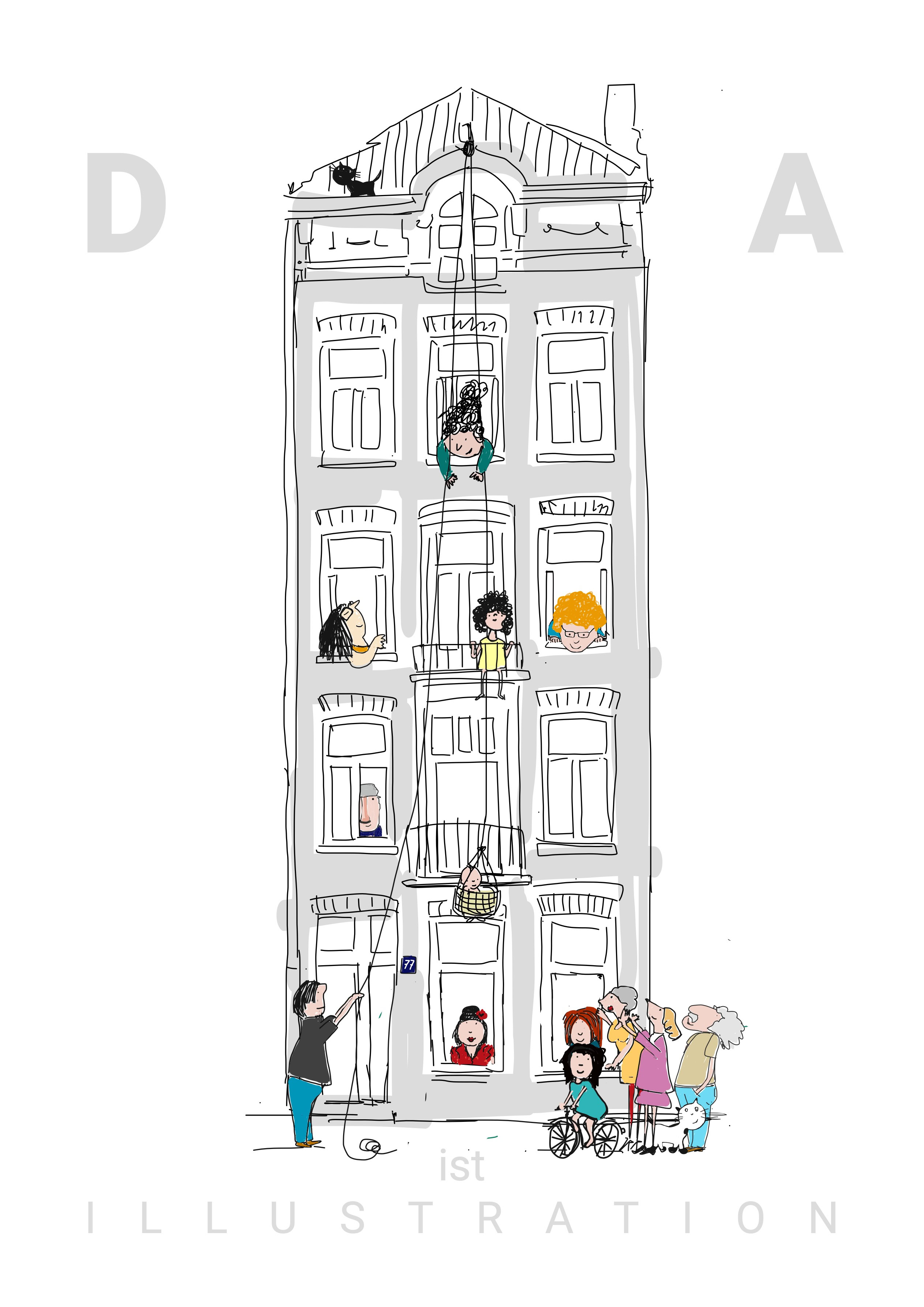
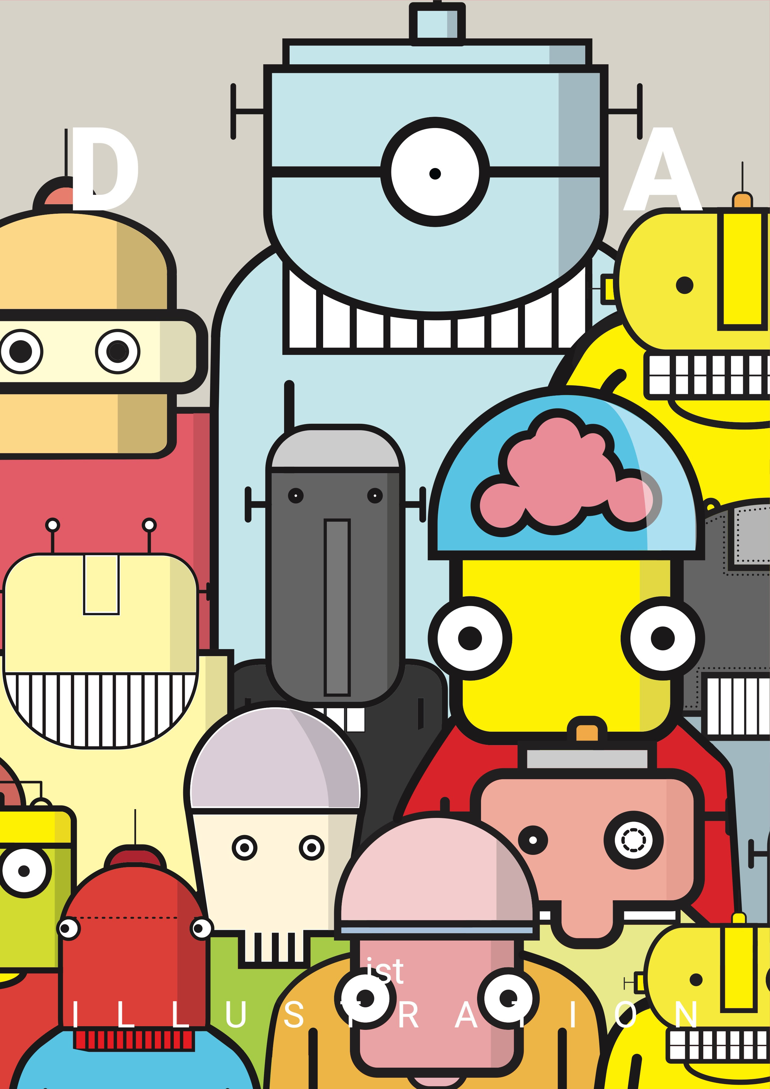
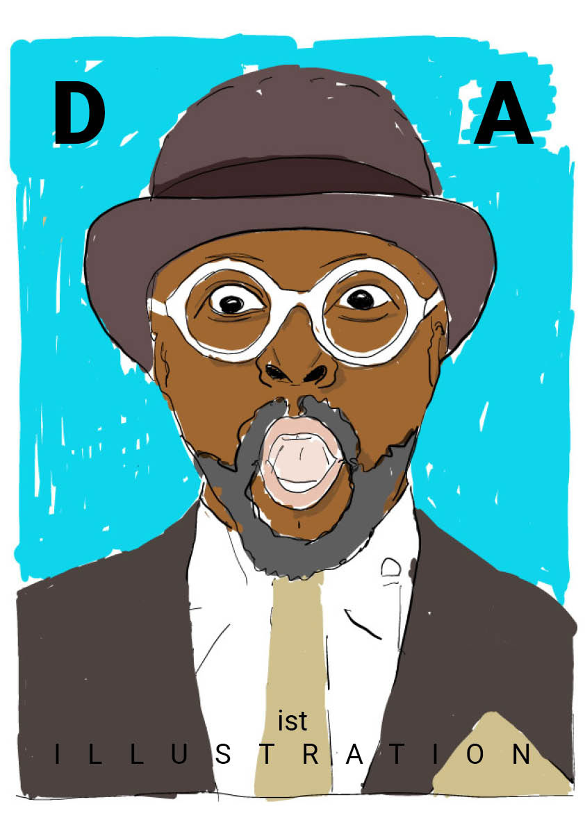
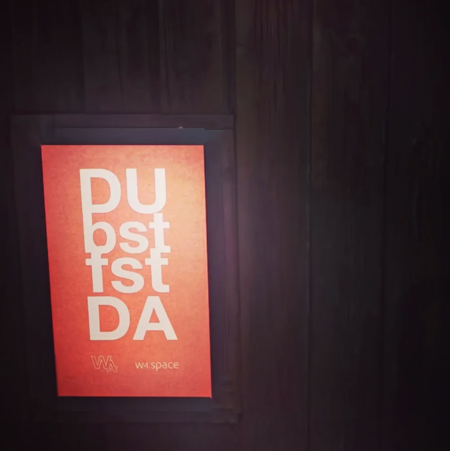
DA ist Illustration
DA ist Illustration
Ruud Hendrikx | It’s all about concept
Creative Educator & Visual Designer
All the news you are waiting for
Ruud Hendrikx | It’s all about concept
Creative Educator & Visual Designer
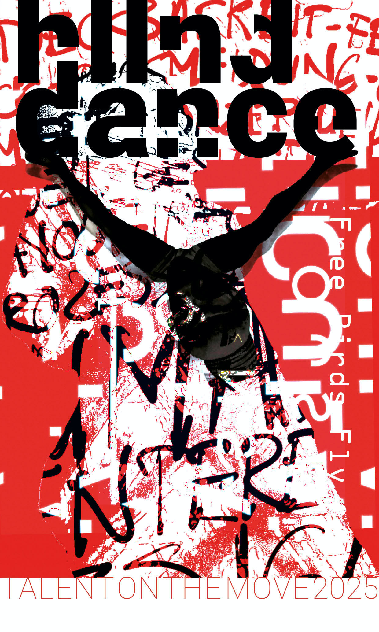
Holland Dance Festival
Ruud Hendrikx | It’s all about concept
Creative Educator & Visual Designer
Project T.I.M.
Click images to enlarge ;-)
Ruud Hendrikx | It’s all about concept
Creative Educator & Visual Designer
That’s ruud@work
Ruud Hendrikx | It’s all about concept
Creative Educator & Visual Designer
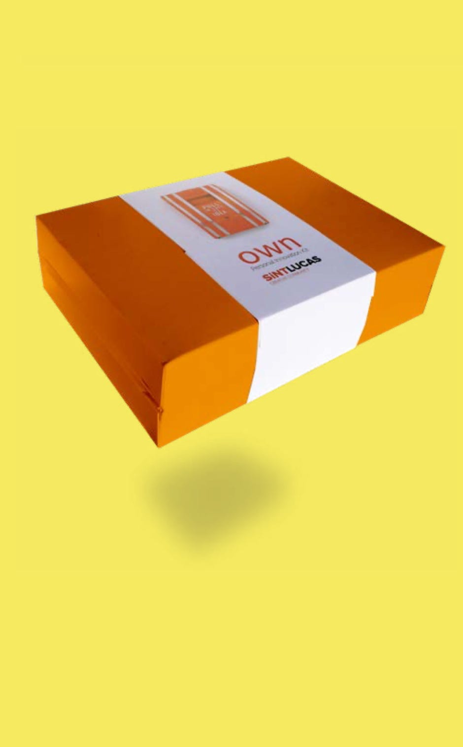
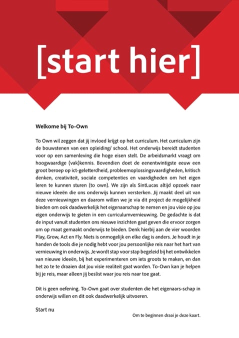
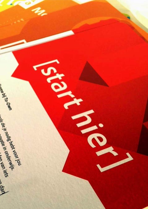
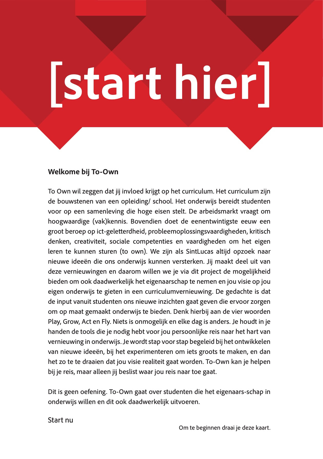
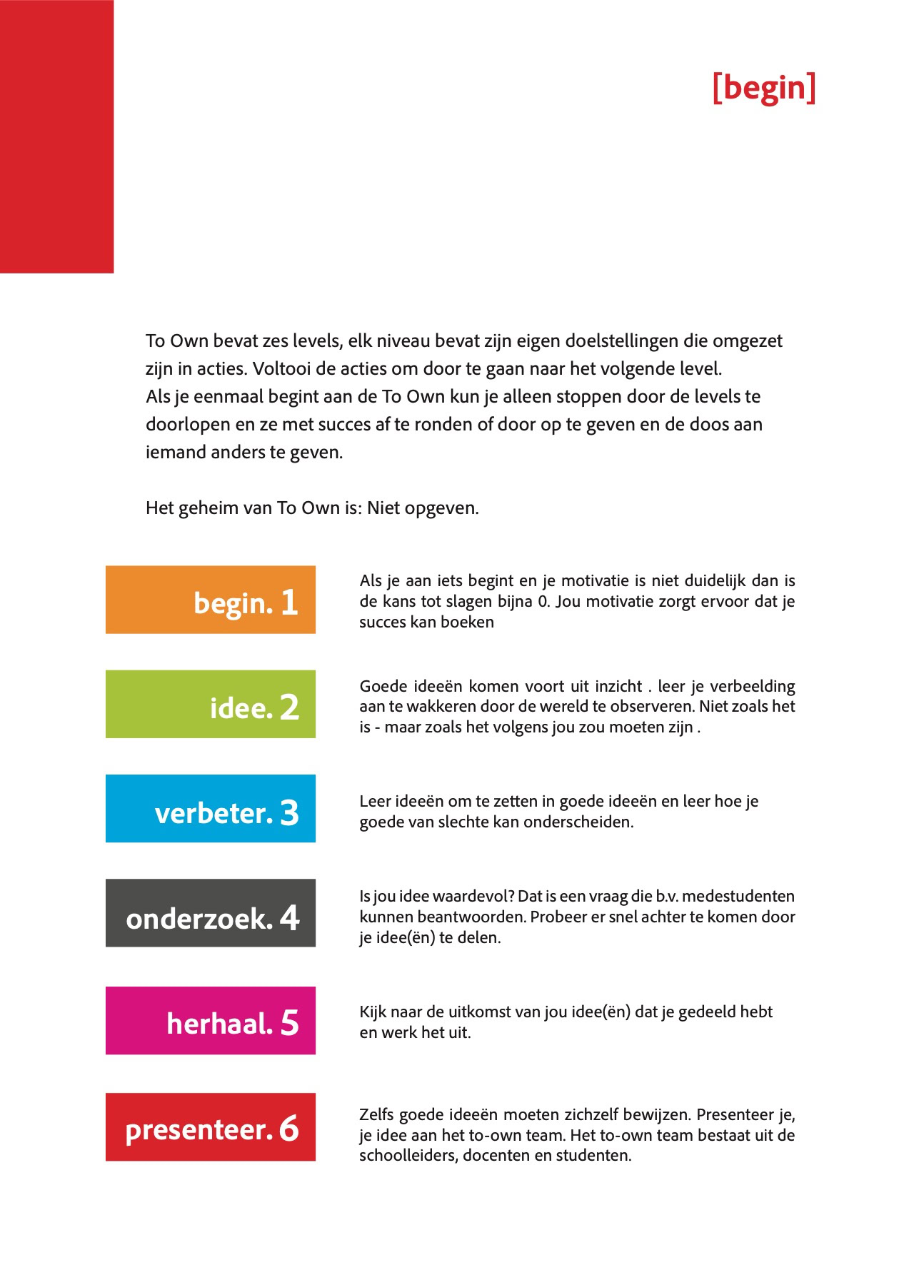
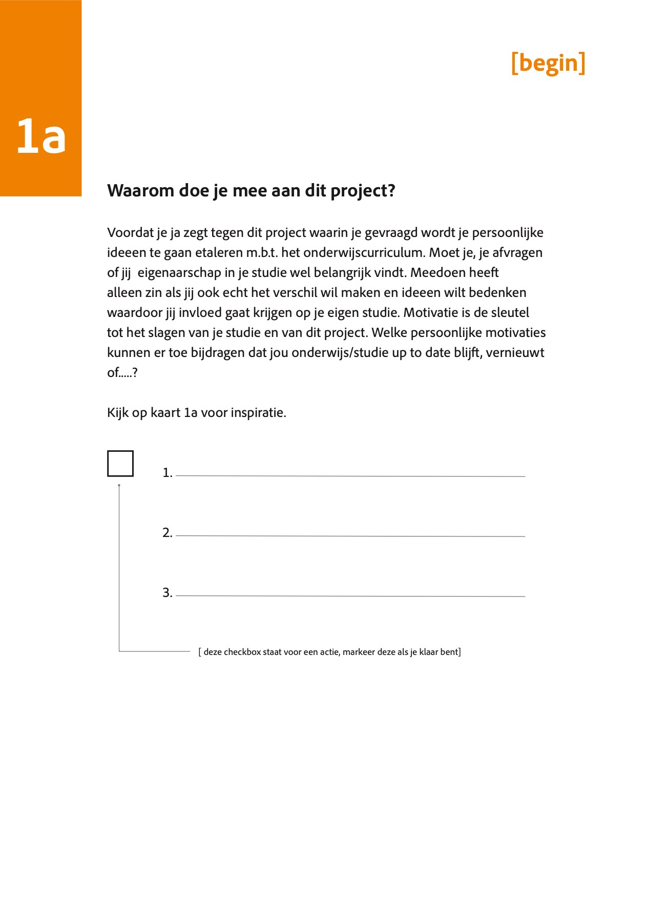
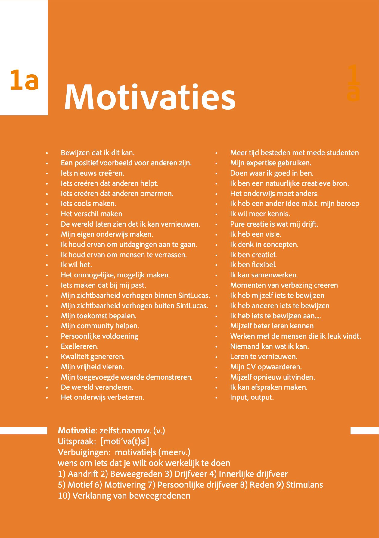
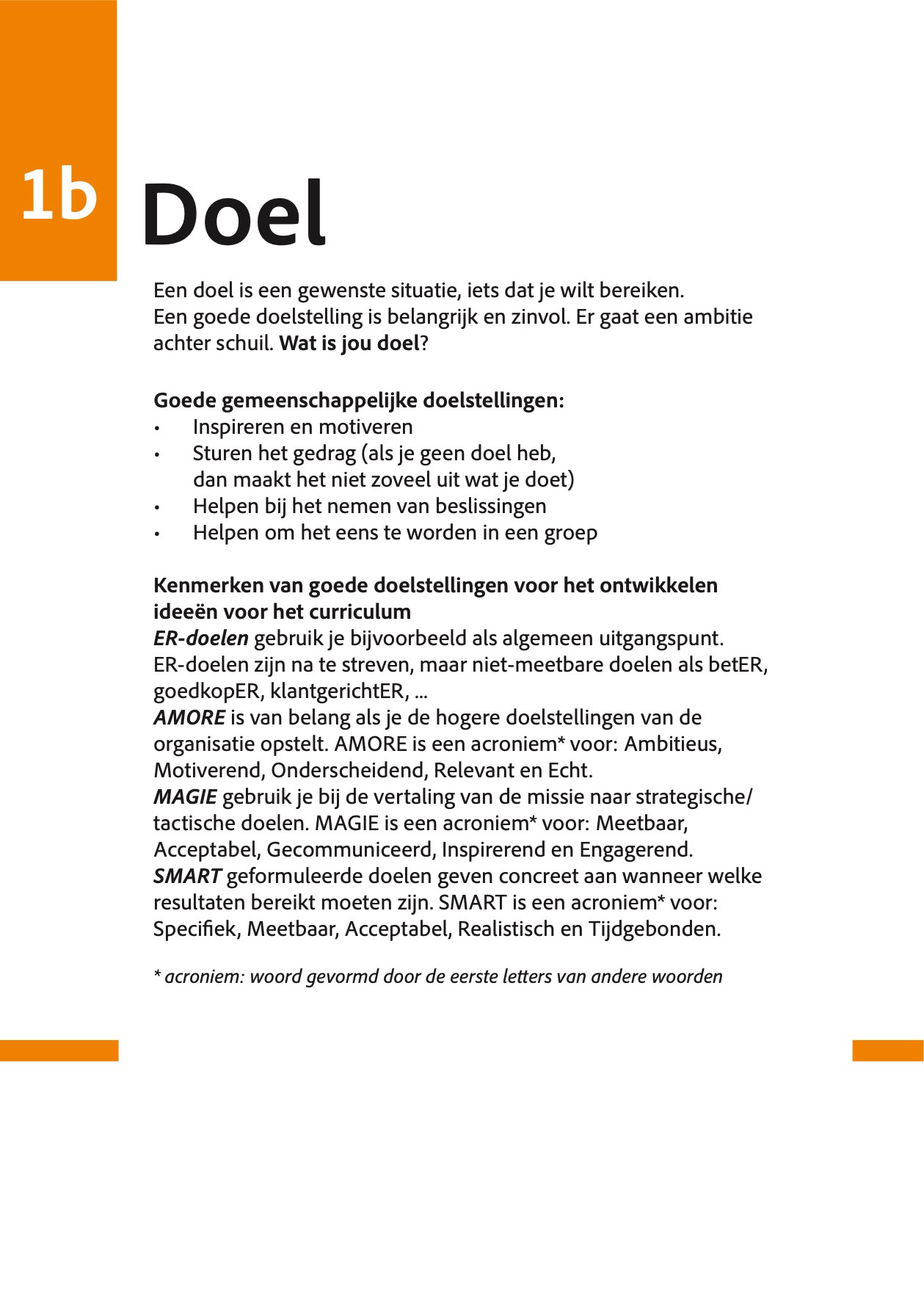
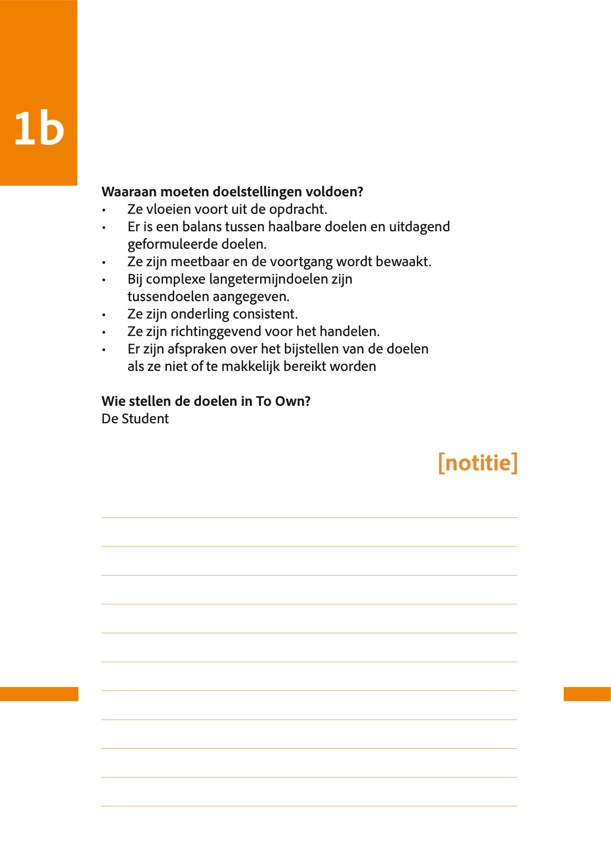
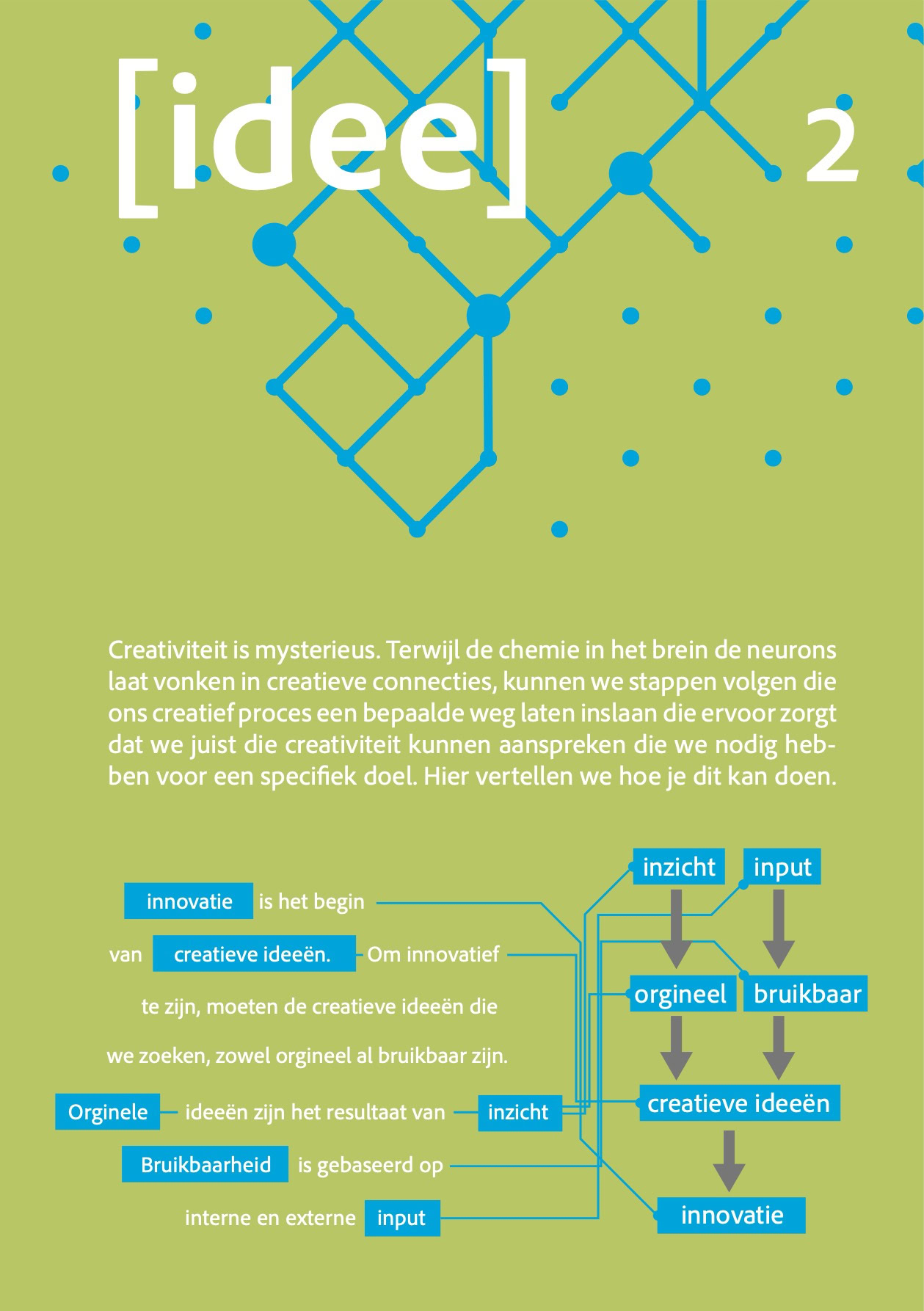
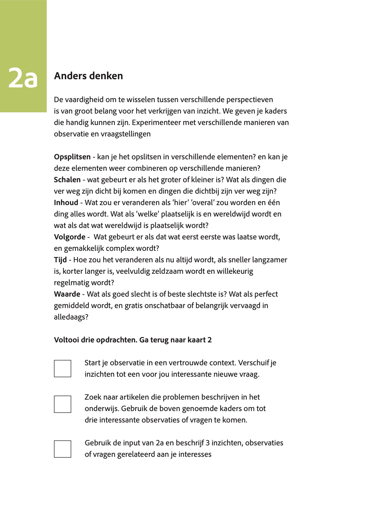
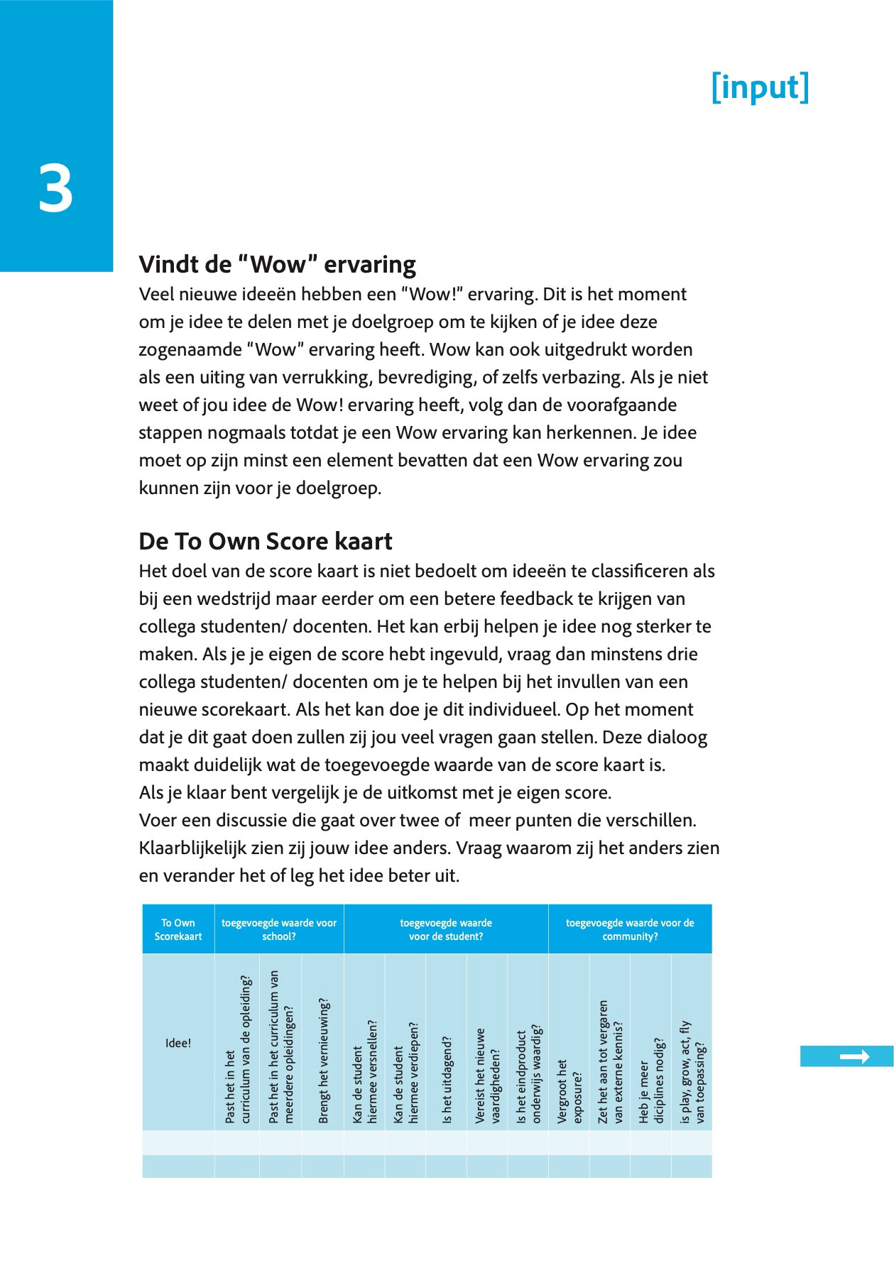
To Own
To Own Project Collaboration designed to
give students ownership in the curriculum
To Own Project Collaboration designed to
give students ownership in the curriculum
Ruud Hendrikx | w4 Space | It’s all about concept
Creative Educator & Visual Designer
Poster design
Ruud Hendrikx | It’s all about concept
Creative Educator & Visual Designer
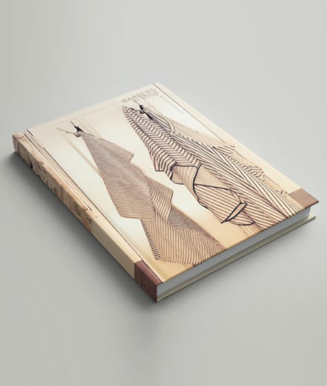
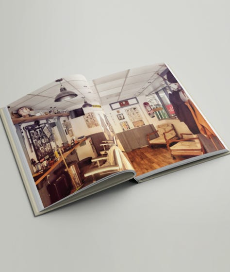
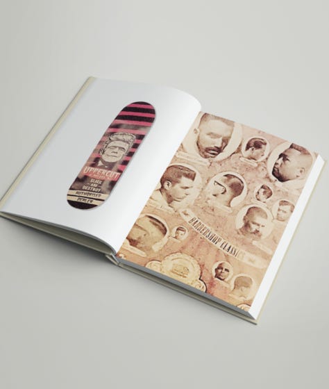
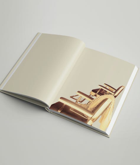
Barbers in shop
"Barber in Shop - Where Tradition meets Trend"
is more than just a glimpse into a barbershop. This visual experiment doesn't just capture moments; it seizes them, stripping away the mundane backdrop to reveal the raw essence. Here, tradition intertwines with trend in a provocative dance of design and composition. Each element, meticulously extracted from its surroundings, takes center stage, demanding attention
and appreciation.
Ruud Hendrikx | It’s all about concept
Creative Educator & Visual Designer
Untitled Covers
“covers as visual poems, reducing the writer’s world to one iconic abstraction — almost like a logo for their storytelling essence.”
Ruud Hendrikx | It’s all about concept
Creative Educator & Visual Designer
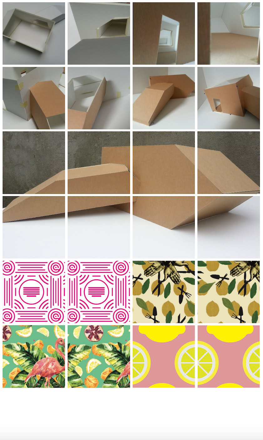
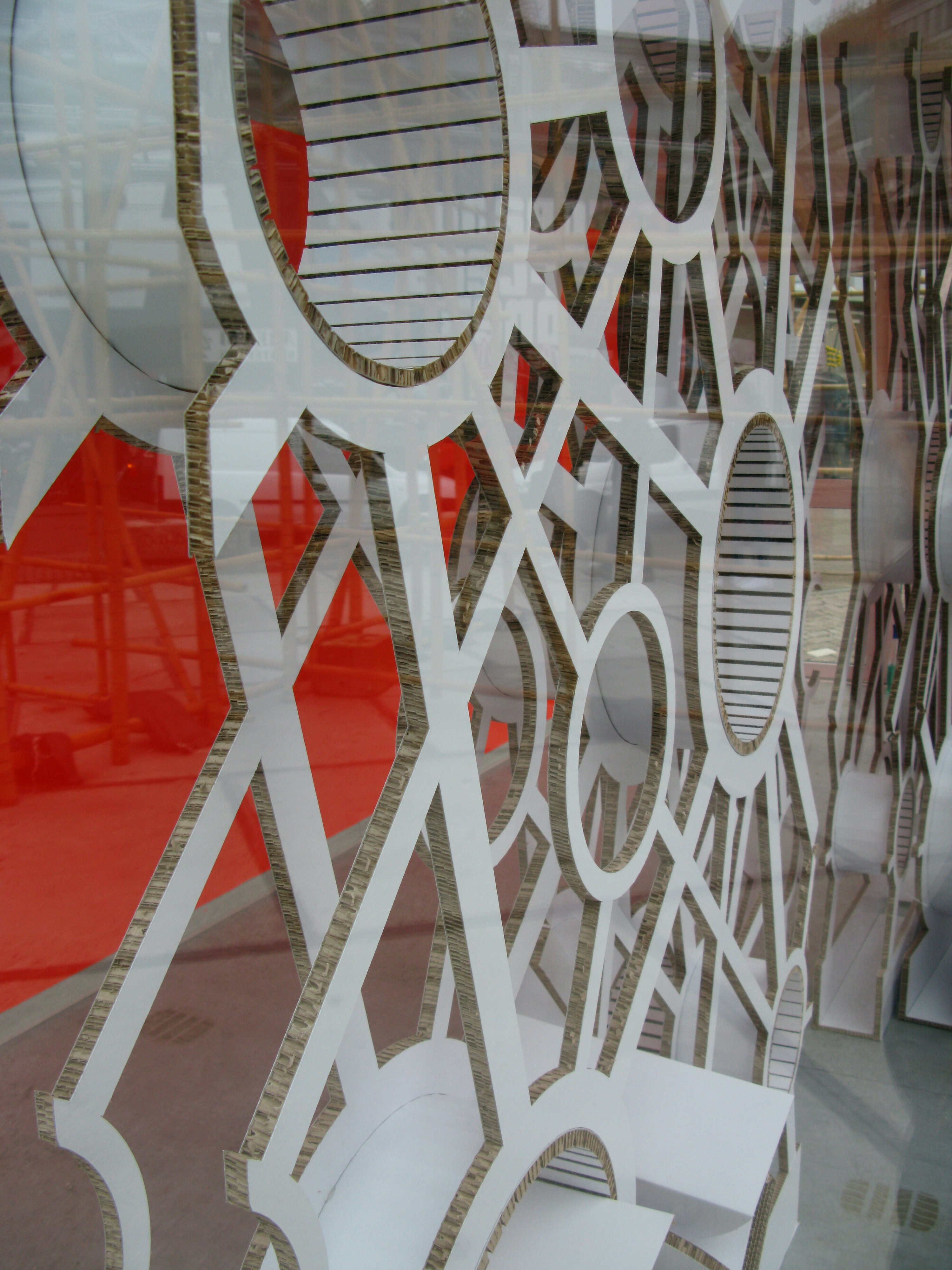
Project Kitch Hotel DDW.
Kitsch Hotel — A playful exploration of pattern, space and excess
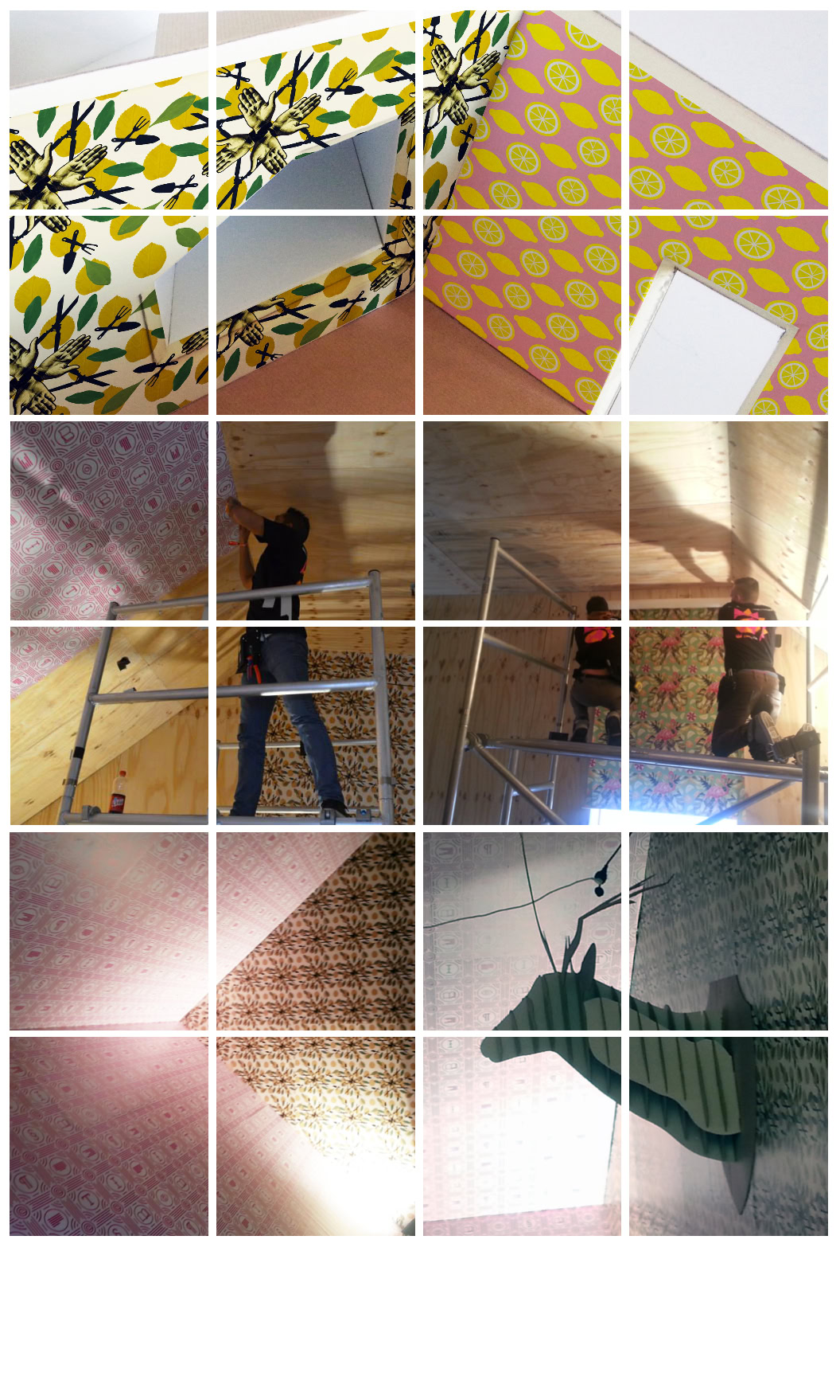
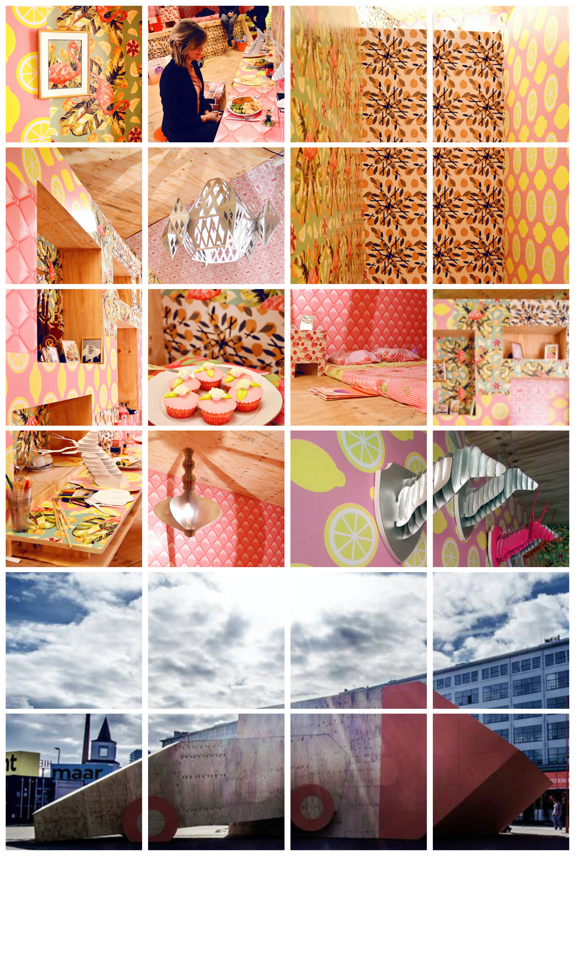
During the Dutch Design Week in Eindhoven, students from the Sign, Printmedia and Digital Publishing programmes explored the theme of kitsch through pattern and spatial design. They created bold, colourful patterns and used scale models to experiment with their application throughout the hotel. From walls and ceilings to floors and architectural elements, graphic design became part of the space. The result is an exuberant, playful environment where colour, pattern and excess come together.
The Space to Experiment
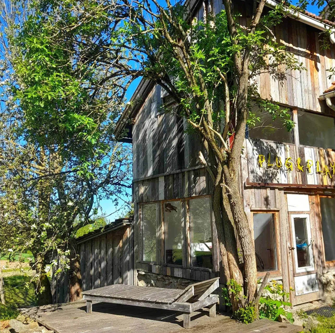
Wherever our two creative minds meet, W4 opens its doors. It has become a mental playground where art, visual design, and education intersect with connection, curiosity, and experimentation.
We simply love giving ideas the space to breathe. To think, to play, to make, to look, to learn, to try, and sometimes to just see where it takes us. Free from the boundaries of a fixed studio, but with the freedom of the whole world as our workplace.
by Birgitta Wahlers & Ruud Hendrikx
Creative Education & Art
W4 Space Art Projects: Play. Grow. Act. Pop Up.
Ruud Hendrikx | It’s all about concept
Creative Educator & Visual Designer
Projects/Assignments DDW @SintLucas
Ruud Hendrikx | It’s all about concept
Creative Educator & Visual Designer
Selection Studentwork/Assignments
2007 - 2020 @SintLucas
Ruud Hendrikx | It’s all about concept
Creative Educator & Visual Designer
Predloader
Preloader
Before everything became instant, there was waiting.
Inspired by the Flash era, this preloader turns waiting into part of the experience. Instead of simply indicating that something is loading, it creates a moment of anticipation — a brief pause between what you see now and what is waiting behind it.
Because sometimes, the experience is not only about what is behind the screen, but also about the moment before you get there.
by Birgitta Wahlers & Ruud Hendrikx
Creative Education & Art
W4 Space Art Projects: Play. Grow. Act. Pop Up.
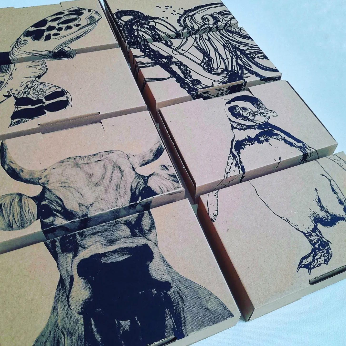
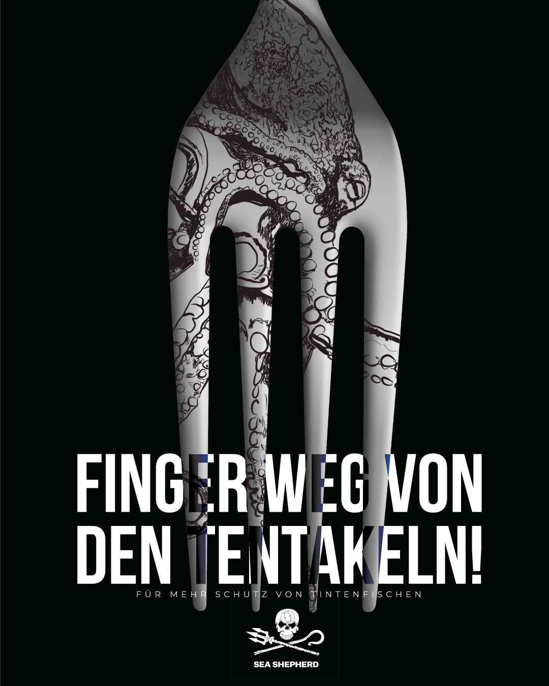
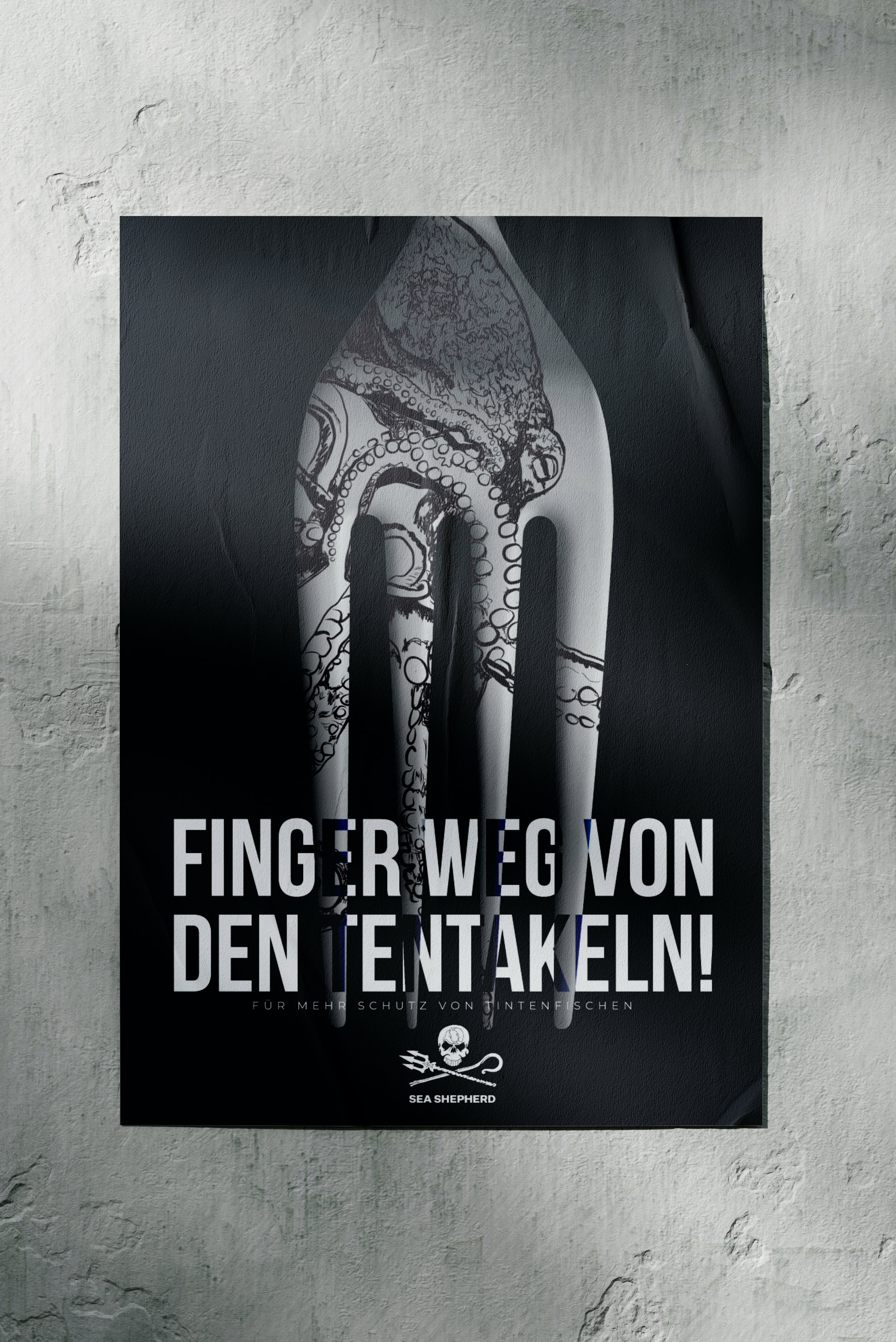
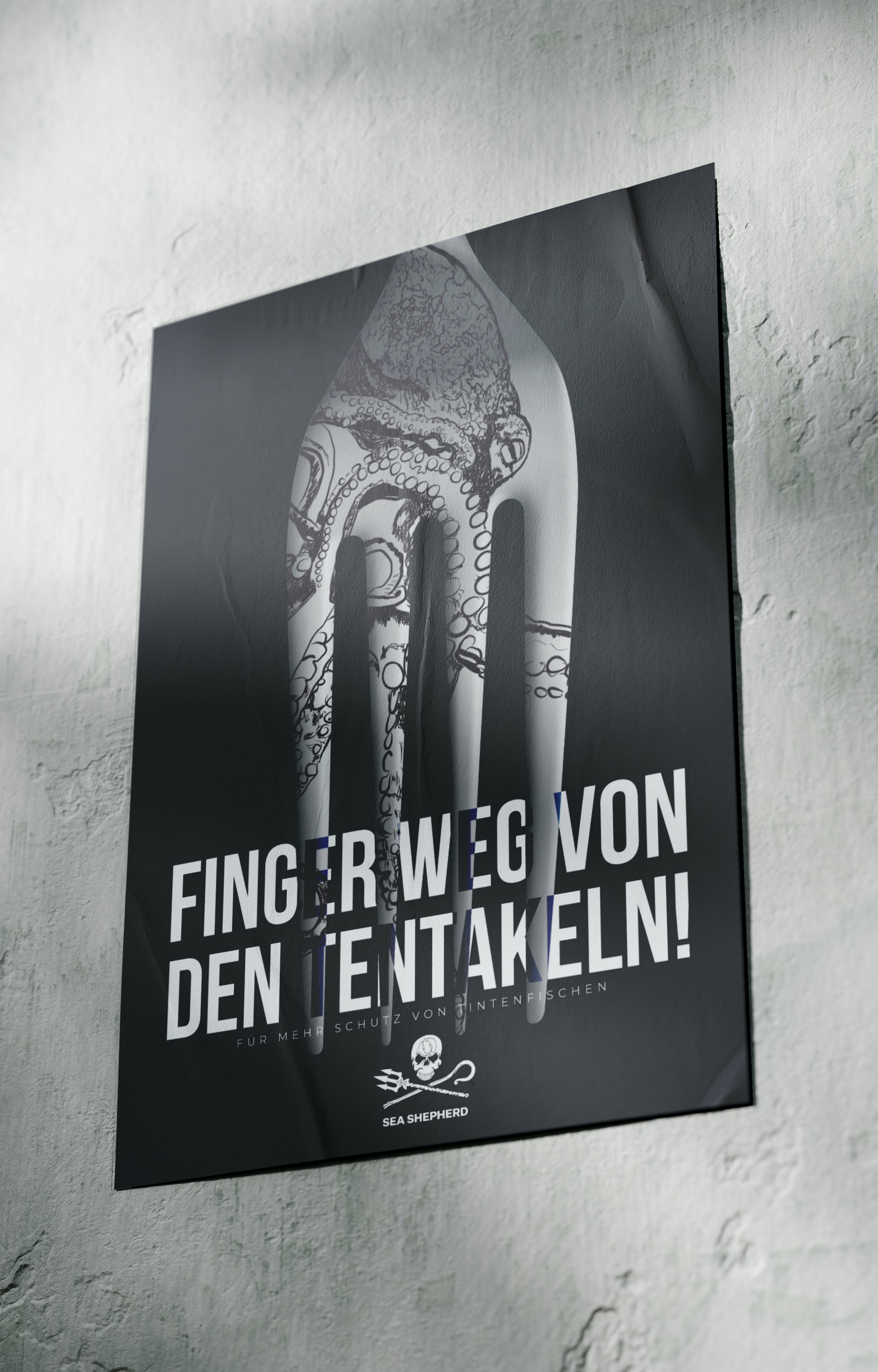
“Finger weg von den Tentakeln!”
A provocative Sea Shepherd campaign concept where typography and image collide to make marine protection impossible to ignore. W4 Space.
Flyeralarm Design Awards — Sea Shepherd ‘26
Ruud Hendrikx | It’s all about concept
Creative Educator & Visual Designer
Mess & Press
Ruud Hendrikx | It’s all about concept
Creative Educator & Visual Designer
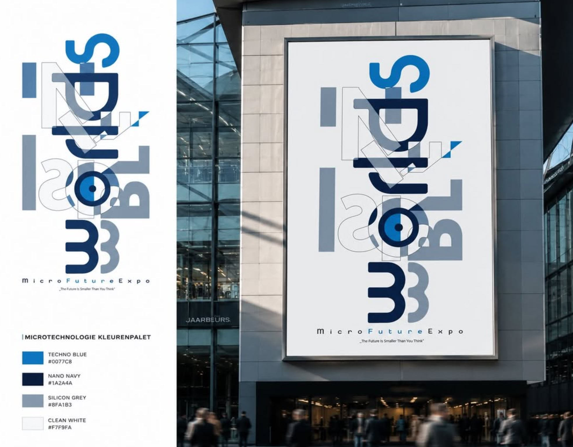
MicroFutureExpo — The Future is Smaller
Than You Think. “Invisible Worlds”
Here’s how it guides the design process:
scroll down
Play: Begin by experimenting freely. In this phase,
no ideas are off-limits; it’s all about exploring possibilities without constraints. This playful attitude encourages innovation by embracing curiosity, taking creative risks, and allowing concepts to emerge naturally.
Grow: Transition from exploration to development. Here, raw ideas from the Play phase are refined, clarified, and nurtured. This phase includes research, skill-building, and strengthening the foundation of the design. Growth is achieved by learning from successes and setbacks, creating a solid basis for the next steps.
Act: Shift focus to execution and bringing concepts to life. This is where the design becomes a reality, as ideas are transformed into actionable solutions. The Act phase emphasizes productivity and attention to
detail, where designs are produced and tested to align with the intended goals.
Fly: Release and evaluate the design’s impact. After execution, the design is shared with its audience or user group. Here, designers observe how it resonates and learn from real-world interactions. Reflection in the Fly phase provides valuable insights, influencing future iterations and kickstarting a new cycle of creativity.
By following these four stages, the Play, Grow, Act, Fly principle supports a cyclical, evolving design process that values creativity, learning, and progress.
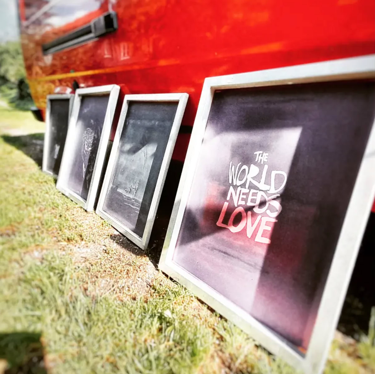
Billboard (6 x 4 meters) – Blueback - Large format print on 115 gsm Blueback paper.
Decoding the Street: My Intervention in "Willemstraat.def"
When I participated in the exhibition "Willemstraat.def" at Kunstcentrum KuS in Heerlen, the overarching goal of the project was to look at how contemporary art could integrate into urban development. The Willemstraat is a historically significant area north of the central station, and it was going through a massive redevelopment. The city's broader urban plan aimed to revitalize these spaces, bridging the gap between residents, entrepreneurs, and creative expression to make it more appealing to younger generations by fostering a sense of community. But as an artist, I didn't want to just showcase art inside a gallery. I wanted to directly hijack this transitional landscape. I wanted the street itself to become a living canvas, broadcasting a giant, human dialogue.
Turning the Street into a Live SMS Conversation
For my intervention, I designed a series of monumentally scaled, vibrant yellow billboards. I wanted them to function collectively as a live SMS conversation. In a very literal sense, I made the Willemstraat the sender of these messages, broadcasting fragments of digital dialogue out into the physical world to breathe life and energy into the neighborhood.
To do this, I borrowed the aggressive, authoritative visual language of urban restructuring—bold black typography on a striking yellow background. It's the kind of aesthetic that demands your immediate attention because you expect it to be a municipal warning or a detour sign. But instead of regulatory instructions, I filled them with text messages, abbreviations, and emoticons borrowed from early digital youth culture and SMS language.
I positioned these billboards near the station, running directly alongside the railway tracks. This railway line acts as a heavy, metaphorical border, slicing through Heerlen and separating the developing Willemstraat from the busy city center. That’s exactly why I placed a massive billboard reading "ZOZ" (Zie Omzijde / Turn Over) right at this urban divide. It was a direct conceptual prompt from me to the viewers, challenging them to look past the physical barrier of the tracks and literally "turn their gaze" to see the rest of the conversation unfolding on the other side.
Hidden Irony and Intimate Confessions
The true weight of this project for me lay in the contrast between its loud visual presence, its quiet emotional undercurrent, and a healthy dose of situational humor.
Take the piece "VMAZJ", which stands for "Voel mij alleen zonder jou" (Feel lonely without you). By blowing up this deeply intimate, vulnerable confession into a massive street installation right along a harsh transit zone, I wanted to expose the invisible, emotional layer of the city. In the middle of an anonymous station district dominated by concrete and constant change, this silent cry for connection became public.
But I also wanted to play with the environment and reward the curious onlooker. I intentionally installed the billboard reading "LKKR BLNGRK" (Lekker belangrijk / Whatever) in a place where nobody could easily or clearly see it—tucked away right behind the local police station.
This deliberate placement completely upended the traditional idea of public advertising and turned the artwork into a hidden easter egg. For the viewers who were curious enough to stray off the beaten path and take the effort to track down what the hidden message said, discovering this sarcastic phrase behind an authoritative building brought an immediate smile to their face. It was my ironic, playful shrug toward grand bureaucratic urban planning and institutional power.
Through these coded, site-specific interventions, I wanted to prove that the true revitalization of a city doesn't just happen through bricks and infrastructure, but through bridging the raw, human experiences and shared moments of curiosity that inhabit its streets.
scroll down
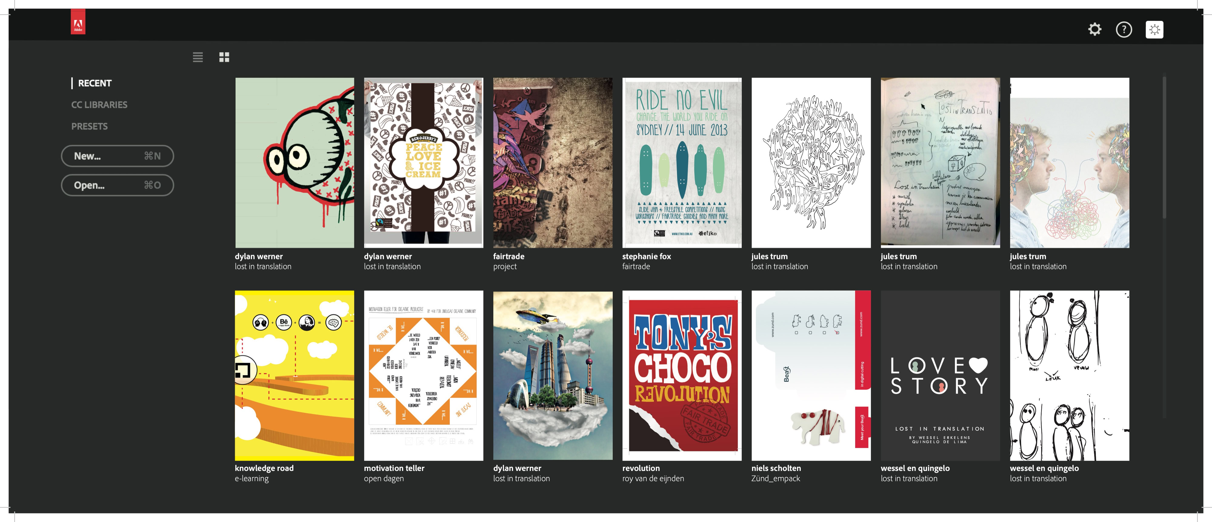
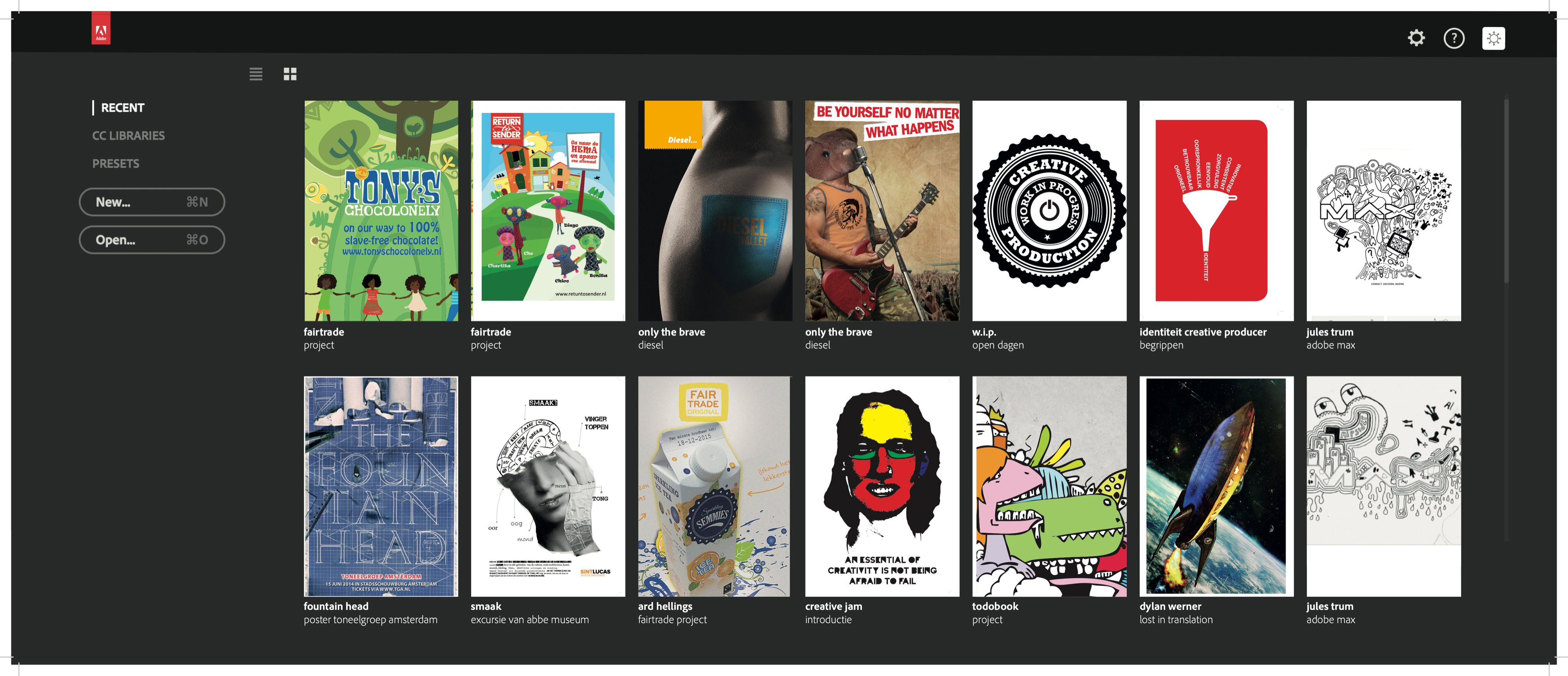
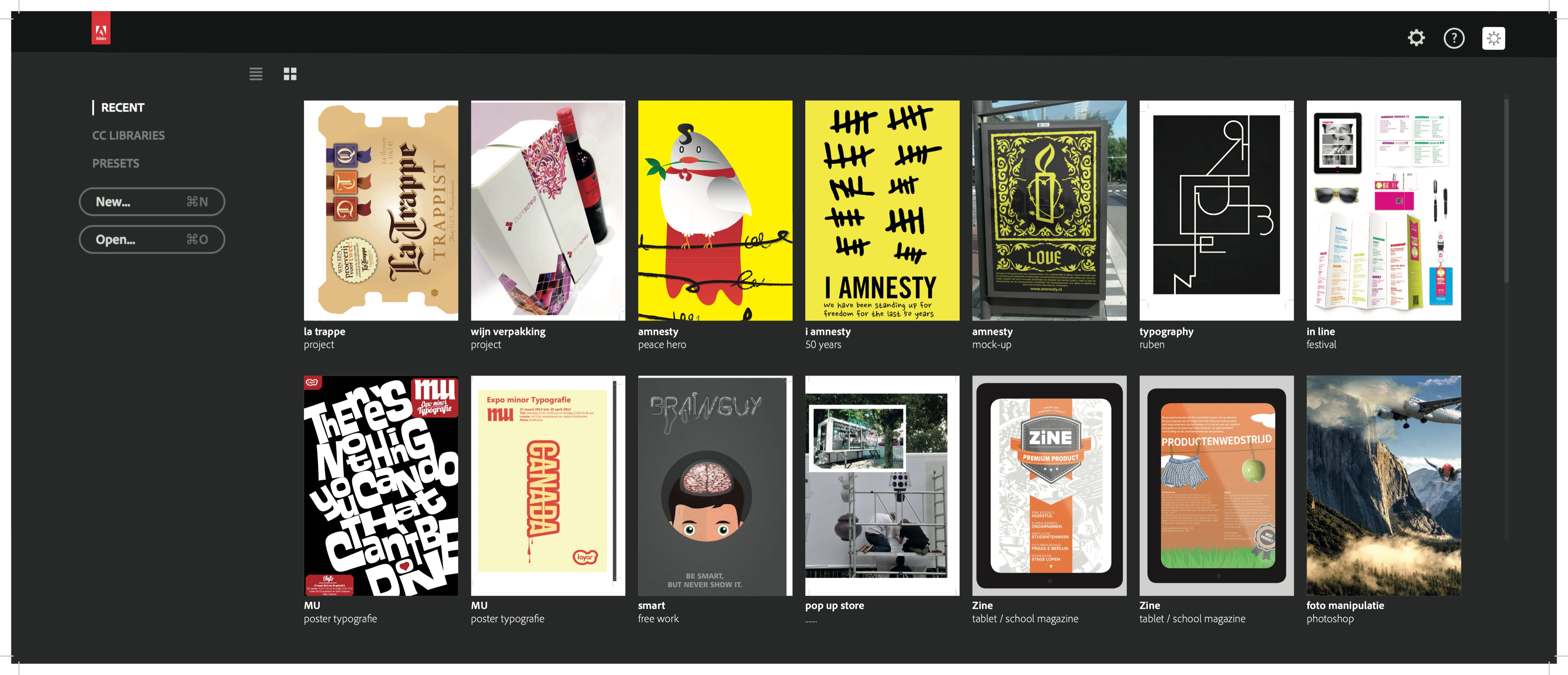
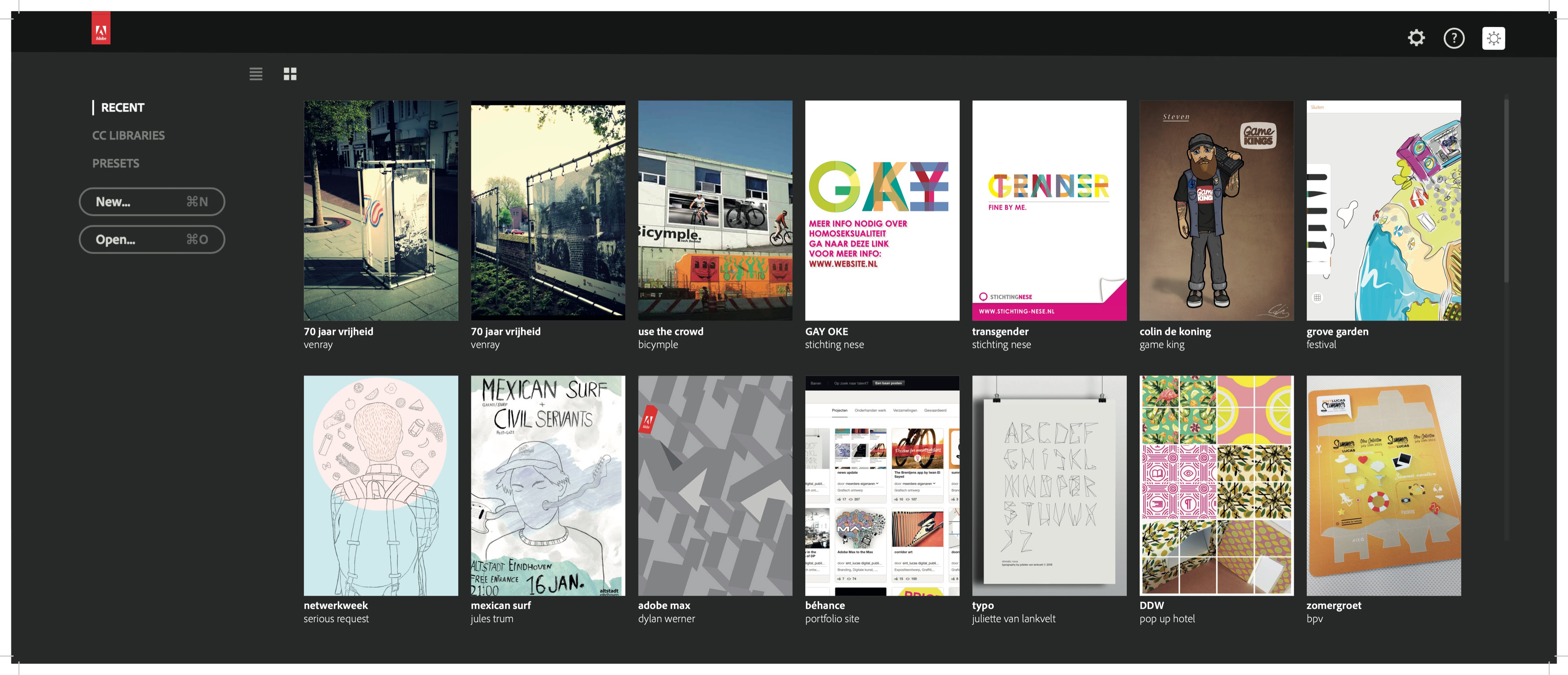
By staying adaptable, the curriculum continues to challenge
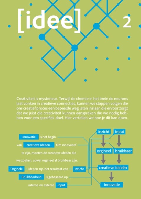
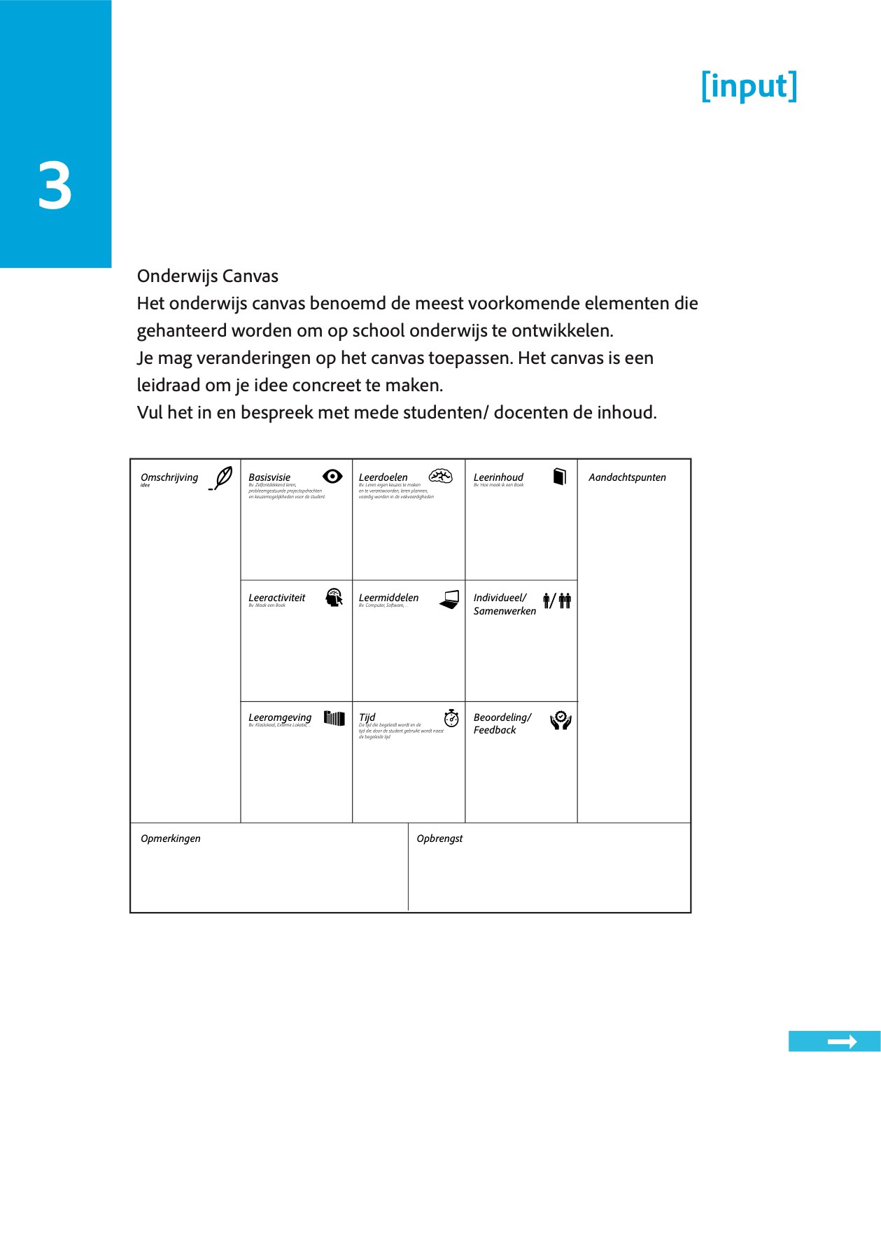
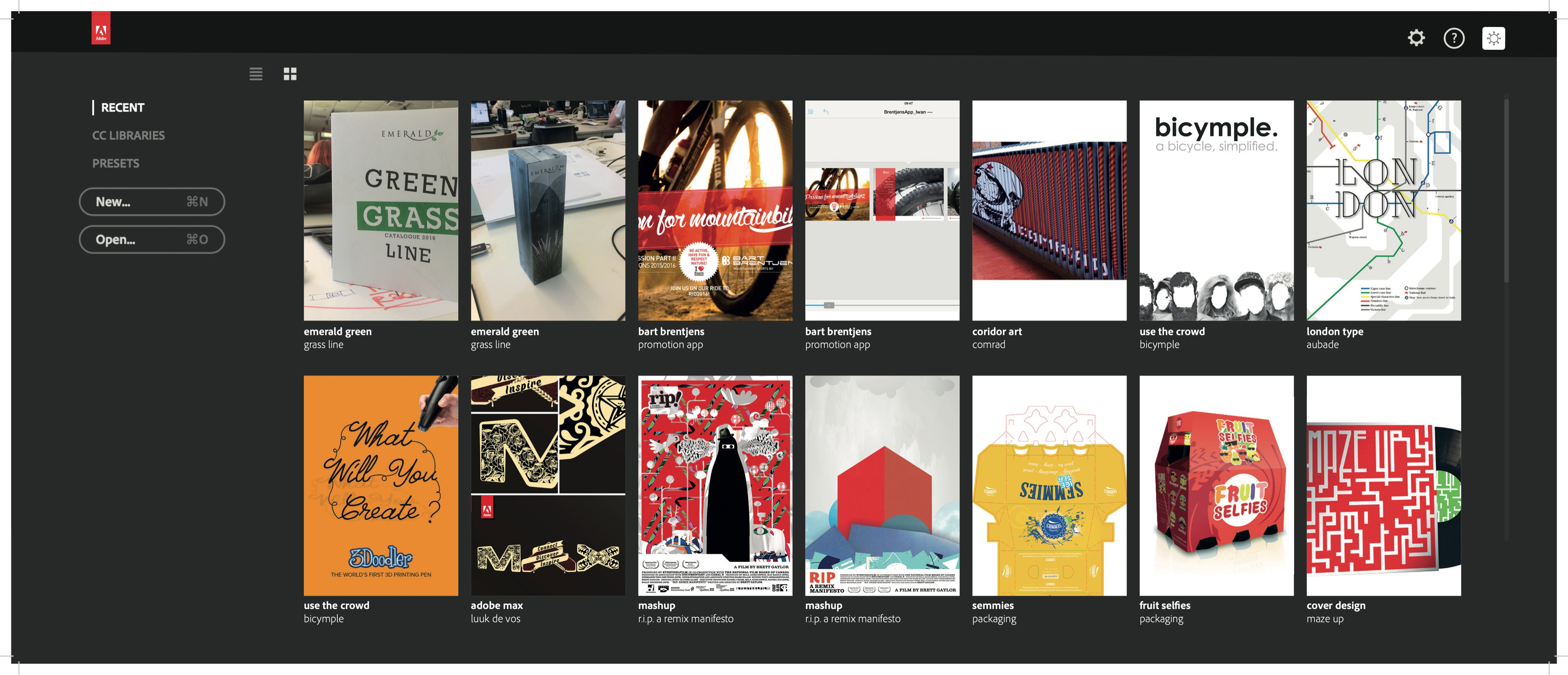
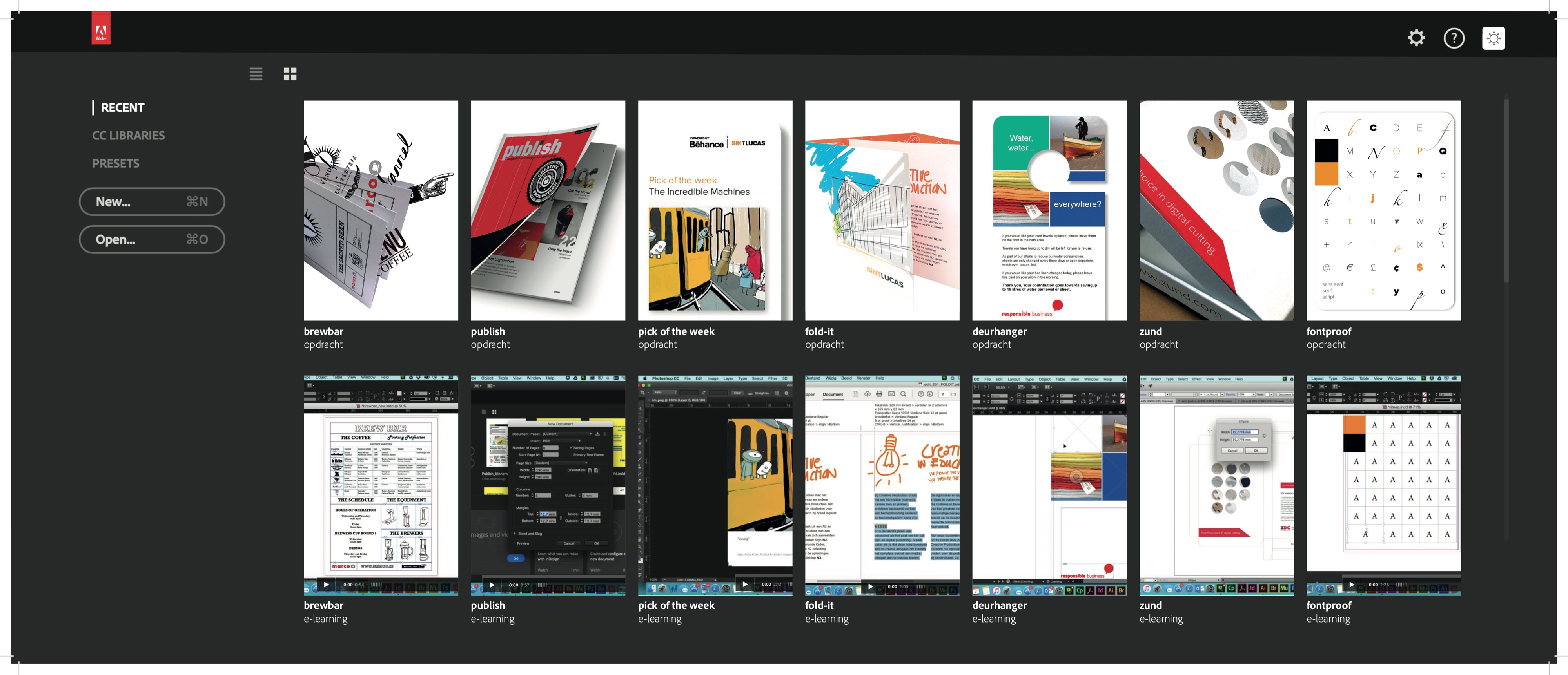
Over the years, a wide range of materials has been developed that form an inspiring and diverse curriculum. From comprehensive readers and engaging presentations to interactive e-learnings, each component is designed with a single purpose in mind: to give students the space to discover and nurture their creativity.
Instead of offering rigid, step-by-step instructions, many of the assignments are intentionally open-ended. By working with minimal prompts—such as simply being tasked to 'create a book' or 'design packaging'—students are challenged to define their own parameters, take full ownership of the process, and develop a distinct personal vision.
I believe that a curriculum must be alive—an evolving entity that is open to change, responsive to what is happening in the world, and ready to embrace new, innovative developments. It should not only prepare students for the future but also inspire them to shape it. By staying adaptable, the curriculum continues to challenge, engage, and equip students with the tools and mindset needed to thrive in an ever-changing landscape.
This collection of educational resources represents a journey through design and innovation, with personal growth and problem-solving at its core. It tells a story of curiosity, courage, and discovery, empowering students to push the boundaries of their creativity and uncover new possibilities—for themselves and for the world around them.
Project:
What are you thinking, absolutely nothing
scroll down
Project Description
What are you thinking, absolutely nothing is a large-scale urban projection that addresses the psychological tension of modern life with sharp visual clarity. Projected in luminous green, handwritten typography across the façade of
a high-rise building, the work confronts the viewer with a message that is absurd, sincere, and deeply resonant.
The central phrase — “What are you thinking — absolutely nothing” — refers to the familiar social-media prompt but subverts it with a radically honest answer. In an age defined by overstimulation, information overload, and digital performance, the piece creates a moment of emptiness and pause — one that is both ironic and meaningful.
The hand-drawn style deliberately breaks with the visual order of the architectural surface.
The green hue evokes both vitality and artificiality — a tone balanced between nature and screenlight, between genuine thought and digital void.
The concept is presented through four accompanying digital pieces and a documentation of the projection on the building façade. Together, they form a cohesive visual and philosophical statement on attention, mental absence, and the quiet rebellion of not thinking.
This work reclaims the urban surface as a space for reflection — glowing, direct, and lingering.
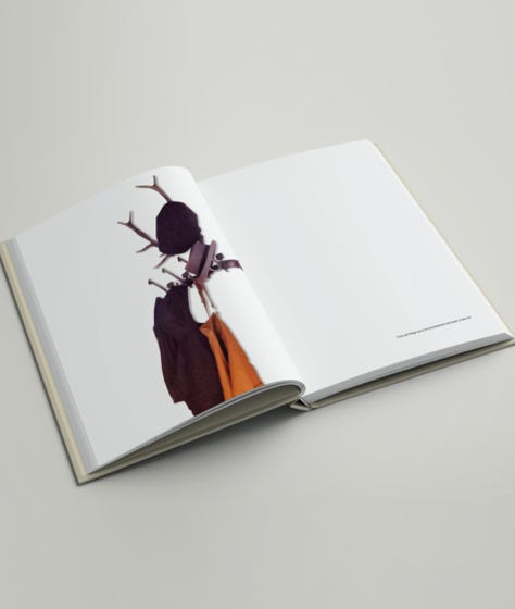
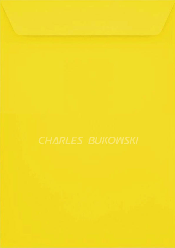
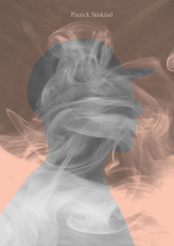
Untitled Covers
A book cover is usually a promise in words. A title that frames the story, a signal that tells the reader what to expect. In this series, I chose to silence the title. Only the author remains, while the image itself carries the narrative weight.
By removing the obvious, the cover becomes an invitation to look deeper. The visual does not illustrate the story in a literal sense but acts as its voice, its atmosphere, its unspoken title. Each image is both recognition and riddle: familiar to those who know the book, yet open enough to suggest new interpretations.
This decision shifts the hierarchy between text and image. The cover no longer explains—it whispers. It asks the viewer to engage, to read visually before they read in words. What emerges is a space where imagination steps in, where absence becomes presence, and where the cover itself becomes part of the storytelling.
scroll down
Kitsch Hotel: A playful exploration of pattern, space and excess
During the Dutch Design Week in Eindhoven, students from the Sign, Printmedia and Digital Publishing programmes were challenged to explore one of design’s most provocative and playful themes: kitsch. The result was Kitsch Hotel — a temporary, imaginative hotel in which pattern, colour and decoration take centre stage.
Students were asked to design patterns specifically for the interior of the hotel. Rather than treating pattern as a decorative afterthought, they explored how bold graphics could shape the atmosphere and identity of a space. Bright colours, unexpected combinations, repetition and deliberately excessive imagery became the ingredients for a visual language that celebrates kitsch in all its glory.
From pattern to place
An important part of the project was the transition from two-dimensional pattern design to three-dimensional space. Using scale models and maquettes, the students experimented with how their designs could be applied throughout the hotel. Walls, ceilings, floors and architectural elements became surfaces for their patterns. The maquette allowed them to test scale, repetition, colour and composition — and to see how individual designs could work together as part of one larger environment. The process moved back and forth between graphic design and spatial design: patterns influenced the architecture, while the architecture gave the patterns a new context.
Embracing the extraordinary
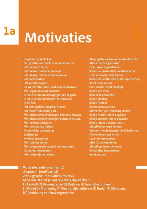
Kitsch Hotel is not about creating a subtle or restrained interior. It is about more: more colour, more pattern, more contrast and more visual stimulation. From citrus-inspired graphics and botanical prints to playful illustrations and exuberant combinations, each pattern brings its own character to the hotel. Together, they create an interior that feels surprising, theatrical and slightly surreal. The project invited students to question the boundaries between good taste and bad taste, decoration and design, graphic work and spatial experience. By deliberately embracing kitsch, they discovered that excess can be a powerful design tool.
Designed, built and brought to life
What started as a collection of individual pattern experiments ultimately became a shared spatial experience. Students developed their ideas, translated them into physical materials and worked with the maquette as a testing ground before bringing the final designs into the actual hotel environment. During Dutch Design Week, Kitsch Hotel opened its doors in Eindhoven, offering visitors an immersive glimpse into the students’ world of colour, pattern and playful excess.
Kitsch Hotel is a celebration of experimentation — where graphic design leaves the page and takes over the room.
Why Education is Not a One-Way Street
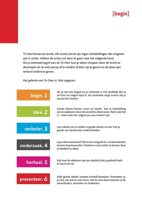
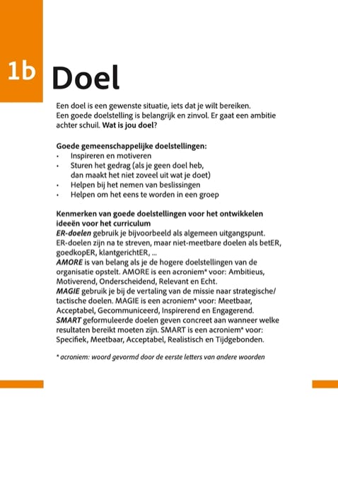
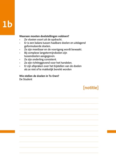
Education is still too often designed for students, rather than with them. But what happens when we flip the script? That is exactly the premise of project To-Own: an initiative that hands complete ownership of the curriculum back to the students.
Why is a project like To-Own an absolute necessity for modern education? Here are the three core reasons:
1. Students are the ultimate stakeholders
In the business world, it is unthinkable to develop a product without consulting the end user. In education, however, this happens surprisingly often. Students are the primary stakeholders of any educational institution. Their worldview, input, and feedback are not 'nice-to-haves'—they are of fundamental value to keep education up-to-date and impactful. To-Own gives students the tools not just to observe the world as it is, but to reimagine it as it should be.
2. Ownership unlocks true motivation
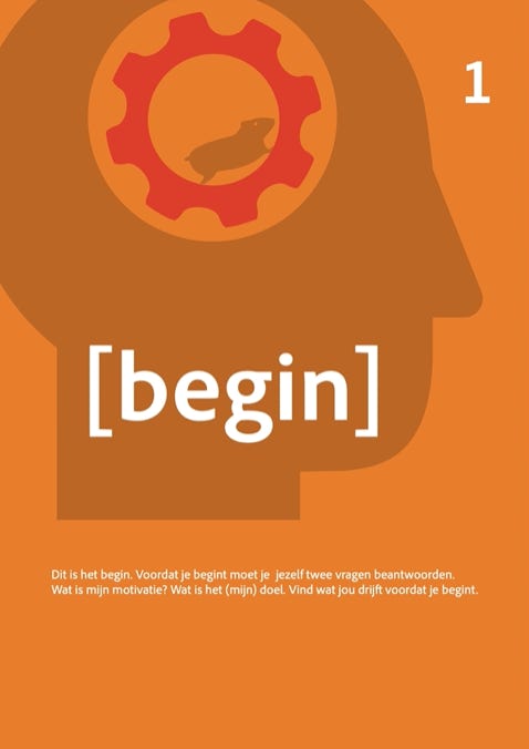
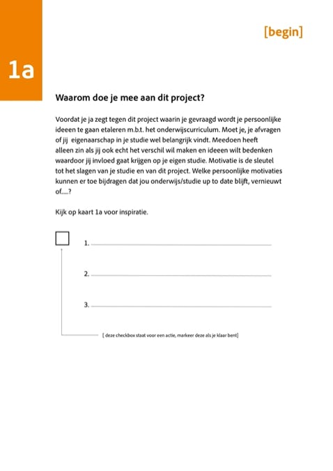
When students are given the freedom to shape their curriculum through their own eyes and thoughts, a profound shift happens. Education stops being an obligation and becomes a personal journey. This sense of ownership ignites an inner drive. Participating in To-Own means gaining real influence over your studies, defining your own future, and learning how to transform innovative ideas into tangible reality.
3. Education is a partnership where everyone learns
Learning is never a one-way street where the teacher transmits and the student merely receives. It is a dynamic collaboration. Within the To-Own team, school leaders, educators, and students collaborate as equals. By opening up to the boundary-pushing perspectives of students, the teaching staff also learns to look at their own fields with a fresh, innovative lens.
In short...
To-Own proves that innovation thrives when we take students seriously. It challenges them to imagine big, experiment boldly, and map out their own learning paths. Because changing education isn’t a solo mission—it’s a collective effort.
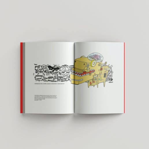
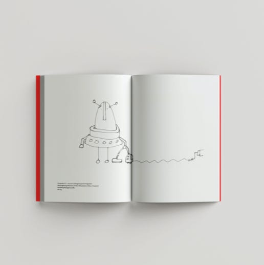
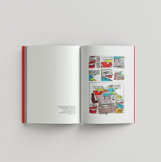
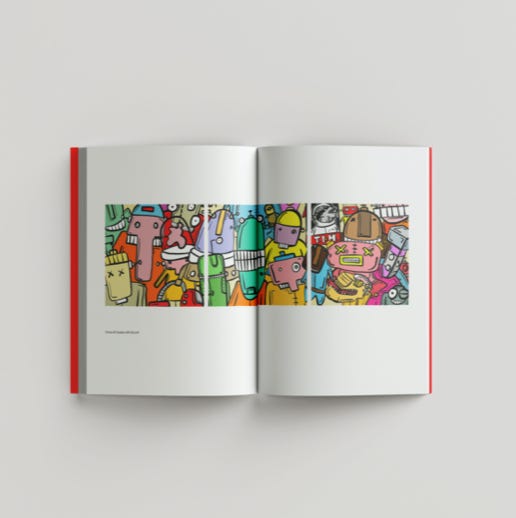
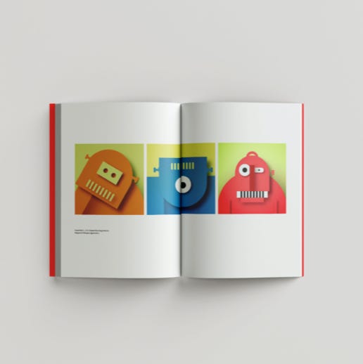
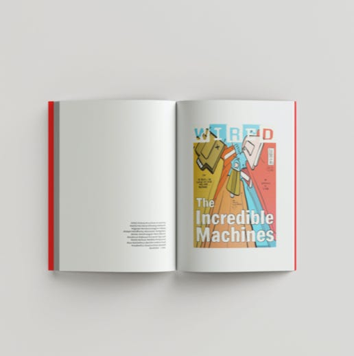
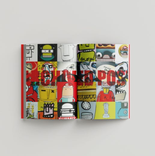
The Incredible Machines
A visual playground of endless possibilities
The Incredible Machines is my ultimate visual playground. It is a space where I claim absolute artistic freedom and simply execute whatever takes shape in my mind. A place free from predefined rules or expectations, driven by an almost uncontrollable urge to create, to structure, and to compose.
What began as an experiment with vector shapes rapidly evolved into a journey of discovery through various illustration styles, techniques, and visual worlds. It is an ongoing exploration of form, color, rhythm, composition, and the endless possibilities that emerge when you dare to think outside the box.
Although the digital realm plays a significant role in the final artwork, the analog process remains the foundation of everything that comes to life. Sketching, drawing, cutting, experimenting,
and starting over. The physical act of making serves as the point of departure; the digital world then provides the room to play, combine, and build further.
Sometimes I immerse myself in a specific style or visual language for an extended period. I explore the possibilities, look for variations,
and keep experimenting until something completely new surfaces. Because precisely at the moment a style begins to feel familiar, the urge arises to break away and head in an entirely different direction.
As a result, The Incredible Machines is constantly expanding. Not according to a pre-mapped plan, but organically, intuitively, and without a final destination.
The outcome is an ever-shifting visual society where contrasting styles, shapes, and ideas coexist. There is no fixed face, no recognizable formula that must be maintained at all costs, but rather a collection of distinct worlds that together form a single, unified whole. Diversiteit is not a goal in itself within this process, but a natural, self-evident part of the creative journey.
Ultimately, The Incredible Machines is more than an illustration project. It is a personal playground, a laboratory for ideas, and a place where curiosity dictates the direction. It is a space where experimenting matters more than perfecting, and where the next image is always a new adventure waiting to unfold.
No rules. No fixed style.
Just an endless urge to create.